In the 1920s, the art deco movement was characterized by metallics, geometric shapes, curved elements and sun bursts. Patterns and textures were layered and luxurious. The look was hopeful with an eye toward the future.
“There is something innately modern about deco influences,” says Ryan Salvatore, co-founder of Burr Salvatore Architects in Darien, CT, who recently designed a sleek home bar with art deco inspiration. “They came of age at an important time in American culture and concurrent or just before the onset of capital-M Modernism in this country. The inspiration of machinery, of exposed fasteners, or motion and power are all themes that naturally evoke a certain industrial progress.”
A century later, the country in a similar post-pandemic, industrial revolution, many of the quintessentially art deco details, such as curved furniture, metallic details and patterns, starbursts and luxe fabrics, have returned to design.
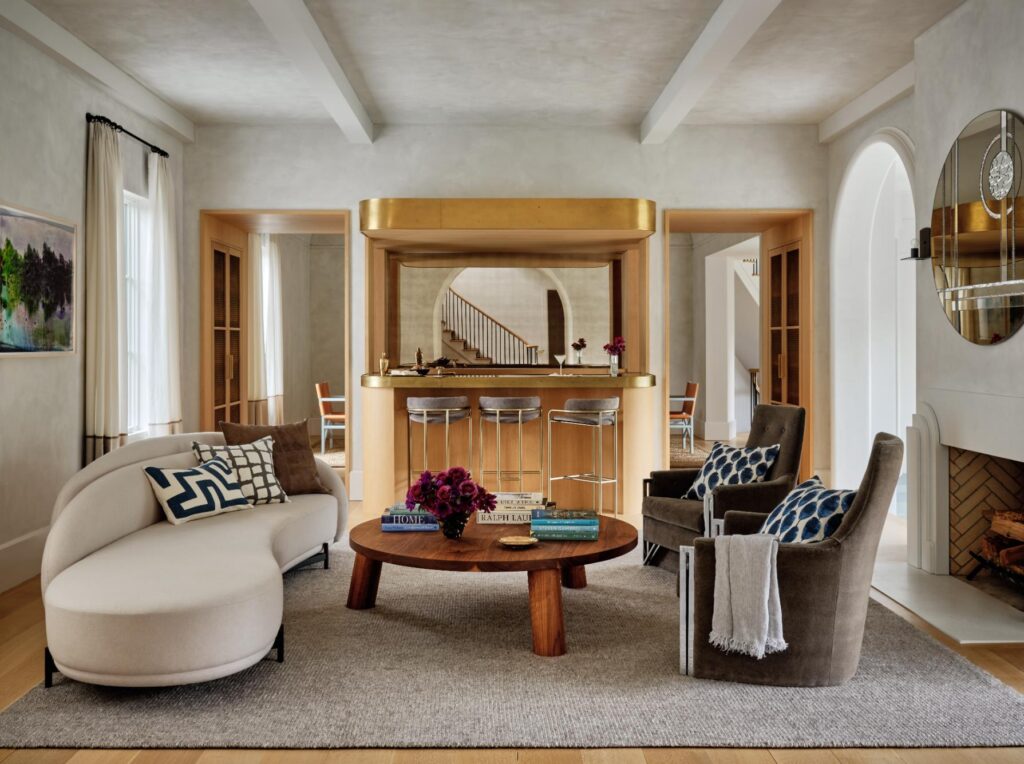
“When we re-appropriate this style today, we risk losing some of the spirit that drove it in the first place, so we like to try to think how we can reflect the culture of today, of the here-and-now, even though we’re making reference to a style that is a century old,” adds Salvatore. For his clients who wanted a home bar, curved edges, warm wood and custom brass finishes, all of which are quintessential art deco elements give the room a strong presence as a destination within the house. “We tried hard to make it do double duty—to be able to be a workhorse during a larger party, but also add some sexiness or drama to the experience that one might have by having a cocktail party at home.”
The original art deco style was the bridge between antique and mid-century modern design, says Jonathan Gordon, owner and lead designer of Design by the Jonathans, LLC, a Stamford, CT, native and Woodbridge, CT, resident who founded the New Haven, CT-based design firm. “There’s an antique element to it but also a little bit of modernity and even futurism to it. Art deco eventually evolved into mid-century modern; it’s a transition between the old and new, so you’re sort of mixing styles,” says Gordon.


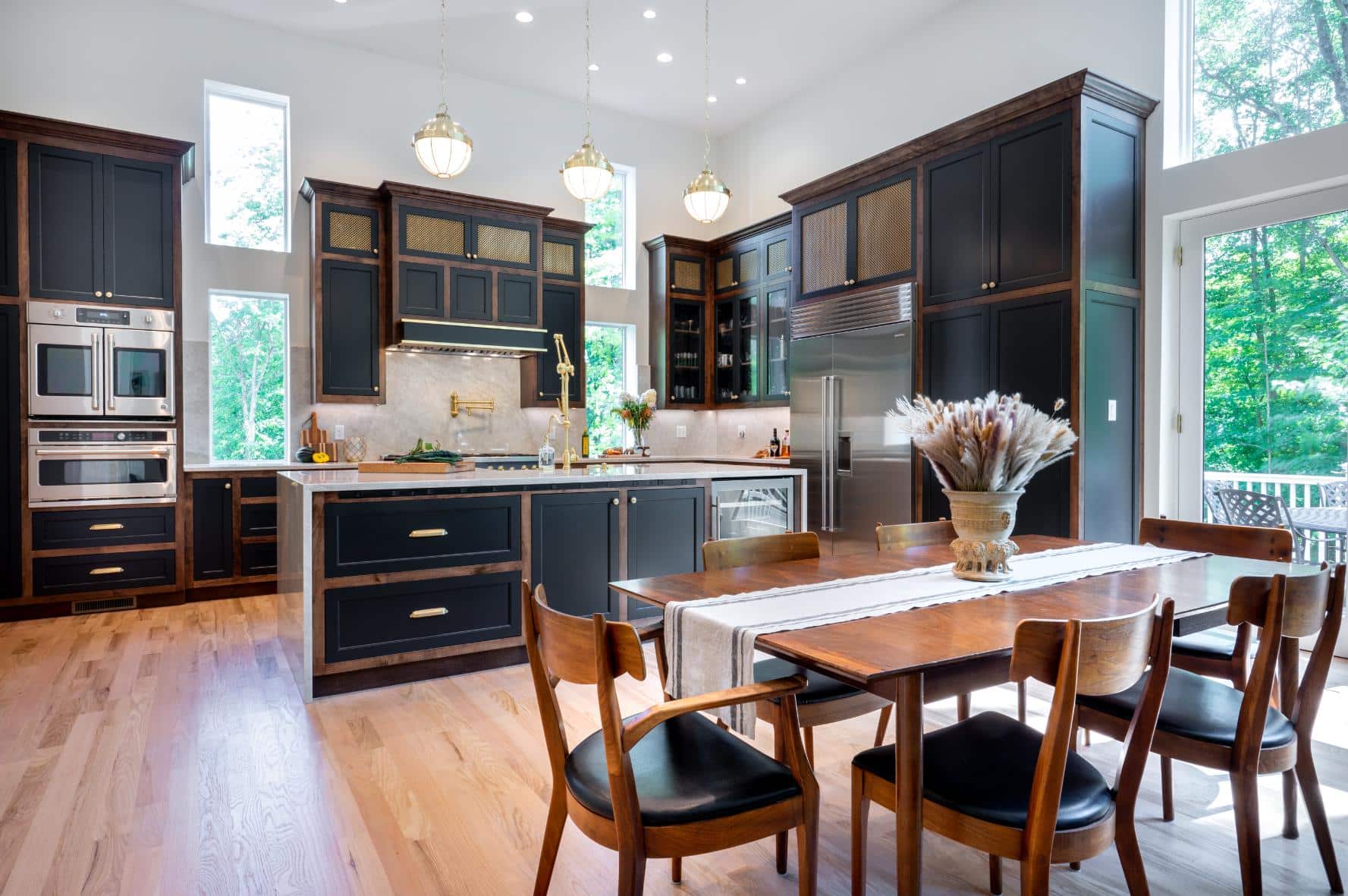
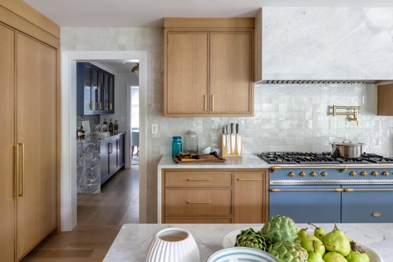
He recently designed the kitchen of his newly built home with an art deco aesthetic to provide a bridge between the traditional front rooms of his home and the more casual and modern great room in the back. Brass details throughout the kitchen, milk glass lighting and a smooth Taj Mahal quartzite backsplash and waterfall countertop on the island give the space an art deco feel without making it look stodgy. A blue range and gold tones in the countertop and backsplash bring in the colorways popular during the art deco era. Brass meshwork in the cabinetry has a geometric look reflecting the art deco style.


Cindy Rinfret, principal designer and owner of Rinfret, Ltd., added some art deco style to her client’s Manhattan pied-a-terre because her clients wanted the apartment to embody the creative energy and sophistication of Manhattan. They had amassed an art collection over decades of time that inspired the design. “It was also essential that the building’s original 1930s architecture be honored and elevated with the furnishings,” says Rinfret.
The art deco aesthetic was an easy solution to give the home a sophisticated and restrained color palette that highlights the art and the architecture. “The art deco is all about angular geometric designs and silvery, sophisticated color palette,” says Rinfret. A large J.D. Staron rug in the living room, which was custom-designed in two pieces and assembled inside the apartment, evokes that period with geometric design. Custom-designed furnishings with metal accents and bespoke details, like a gray wave sofa upholstered in Cowtan & Tout fabric.
“My favorite feature is the custom-made entertainment cabinet,” says Rinfret. “Finished with wooden doors and shiny silver accents, it beautifully anchors the living room and stands in contrast to the white walls. The piece embodies the glamorous art deco vibe of the entire apartment.”
The interior of the cabinet has reflective mirrors to add another layer of glamor. “It feels absolutely fabulous to open up these cabinet doors to mix a cocktail for friends,” says Rinfret.
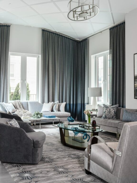
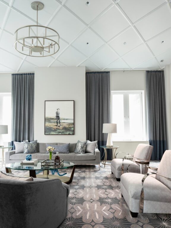
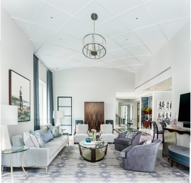

She attributes the attraction to art deco today to everyone wanting to feel at once casual and glamorous. “There is an ease and quiet elegance that makes the art deco elements feel current and chic,” explains Rinfret. Paired with contemporary art and clean white walls, the look is modern and formal while also comfortable and not too precious for today’s casual lifestyle.
For those who aren’t ready to go all-in on the art deco vibe that is trending right now, a nod to the era can work well with contemporary trends, too, says Tansu Ulu, design and brand manager at Country Floors. The line is sold at Rye Ridge Tile in Port Chester, NY, Lima Ceramic Tile in Stamford, CT, and D & D Homes in Darien, CT. She said many of her clients today are selecting tile evoking an art deco element including geometric shapes, gold touches and texture. “Sunburst and zig zag motifs are modern interpretations of art deco motifs and patterns which can be introduced to a room via the floor, wall, backsplash, accent wall or fireplace surround,” adds Ulu. “Chevron, sweeping curves and triangular shapes often found from this era have a timeless appeal that transcends specific eras. The geometries and bold colors can complement a wide variety of interior styles from modern to traditional.”
Peter Salgado, co-founder of Salgado Saucier, a luxury to-the-trade line of lighting, furniture and accessories, says many designers are choosing to add touches of art deco elements with accent pieces. “A table lamp in polished nickel with deco detailing can add a very modern detail to a gentleman’s desk or sofa console table,” says Salgado. “The Noel table lamp with polished nickel and stingray shagreen inlays are two deco materials reinterpreted for today.”
Likewise leather wrapped furniture, popular during the 20s and 30s, is seeing a resurgence. “The narrow Monty table works seamlessly alongside a sofa arm or between two club chairs,” adds Salgado. Likewise, the brand’s Mitchum sconce is often paired with a geometric wallpaper.”
“Art deco styling with its clean lines has had a resurgence because it can seamlessly blend in with many pieces of furniture and architecture,” says Salgado. “The repeating lines and step detailing also add tremendous visual interest.”
“Design has transitioned away from something very sleek and modern to something with a bit more warmth and color than years past,” says Gordon, at Design by the Jonathans.
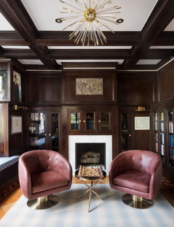
For many who choose to add art deco elements, it’s a way to blend history with the future, which is what Think Chic designer Malka Helft’s clients wanted when they designed a former office as a library and sitting room.
“The inspiration for this space came from the home and its owners, the love of old and new with a great dose of personality,” says Helft. “We’ve infused it with stunning art deco elements that evoke nostalgia while remaining on-trend. In line with current movements towards bold colors and glamourous décor, this room features dark, moody woodwork and brass accents, plus a showstopping Jonathan Adler light fixture that adds a touch of glamor without going over the top.”
Ironically, the art deco has returned to vogue when we are once again at the start of a new century, coming out of a global pandemic, facing economic uncertainty and global unrest, just as we did 100 years ago. We want our homes to be a source of comfort and warmth and we want to look ahead to the future with hope. True to the movement, today’s art deco has to infuse contemporary elements with details from the previous iteration.
“Like with all things in design, it’s about layering in different time periods and an array of creative elements for the best results,” says Rinfret. “The most interesting rooms have antique and current pieces. For an updated art deco look, I recommend integrating a stylistic design that you love but making it feel fresh by pairing it with something that feels very today, like an edgy piece of art. Otherwise it may look like a dated stage set.”

