Pattern is one of those elements of design that is essential for giving life and personality to a space, and layering patterns has been a technique of sophisticated design for centuries. But oftentimes, when we see layers of pattern in a room, though we are wowed by the look we are intimidated by the thought of “doing it right.” In fact, layering patterns isn’t easy to do. Scale, color and spatial relationships come into play when selecting patterns to layer together. “Scale is the first thing I look for, so you don’t have competing prints,” says Andrew Gillick, principal and founder of Concordia Design in Rowayton, CT.
He put his skills to work in New Canaan, CT, when a young couple from New York City bought a 1950s cottage to renovate as their permanent residence. “They wanted it to feel like a country retreat, but not be too sweet,” says Gillick. “We walked a line between keeping an edge but also including a lot of traditional touches that my client really loved.”
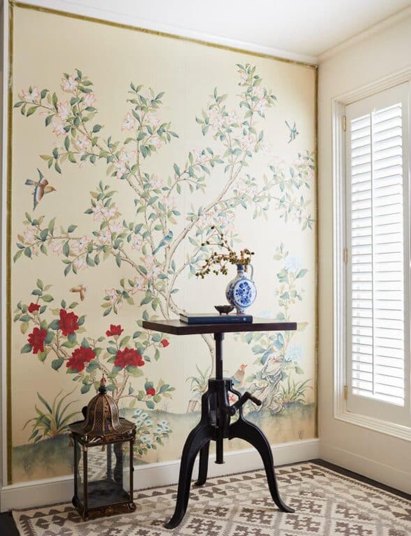
His inspiration began with a custom hand-painted mural by Gracie in the foyer. With a soft neutral background and a delicate botanical design of birds and flowers, it set the tone for the country residence. He lined the wall in a velvet trim from Samuel & Sons (a technique he learned from his tenure with design legend Robert Couturier before opening his own design firm.) From there, he pulled in mossy greens, rosy pinks and blues.
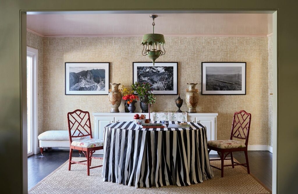
In the dining room, Gillick chose a wallpaper from Sister Parish with a small paintbrush stroke, which forms a larger check pattern, to complement the medium-scale floral print on the dining chairs. “I like the way the diagonal lines of the cockpen-style dining chairs contrast the strong verticality of the wallpaper and tablecloth,” says Gillick. An antique green French tole chandelier from Odesmith & Richards in New Canaan complements the pink lacquered ceiling. “I read that Sister Parish often lined the interiors of lampshades in pink silk to cast a more flattering light. This inspired me to lacquer the dining room ceiling in a soft pink. It makes everyone look great at night with low light and candles,” says Gillick. Last but not least, the bold black and white striped tablecloth completes the look and gives it a bit of edge. “It adds some drama and strength to the room, while also referencing the black and white photographs on the wall,” he adds. The photographs are from a trip the couple took to Peru.
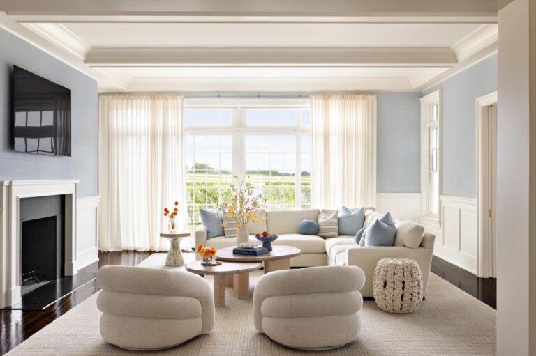
In the living room, blue, green and burgundy all blend seamlessly together with a few key pieces. “I was inspired by the earthy greens from the leaves in the Gracie mural,” says Gillick. “The color is from Farrow & Ball. All of their colors have a beautiful depth and complexity really suited to a house in the country.” For a modern twist on a classic, he created pattern on the wall by applying an oversized board and batten rather than wallpaper. “It creates a nod to the stripes elsewhere in the house,” he adds.
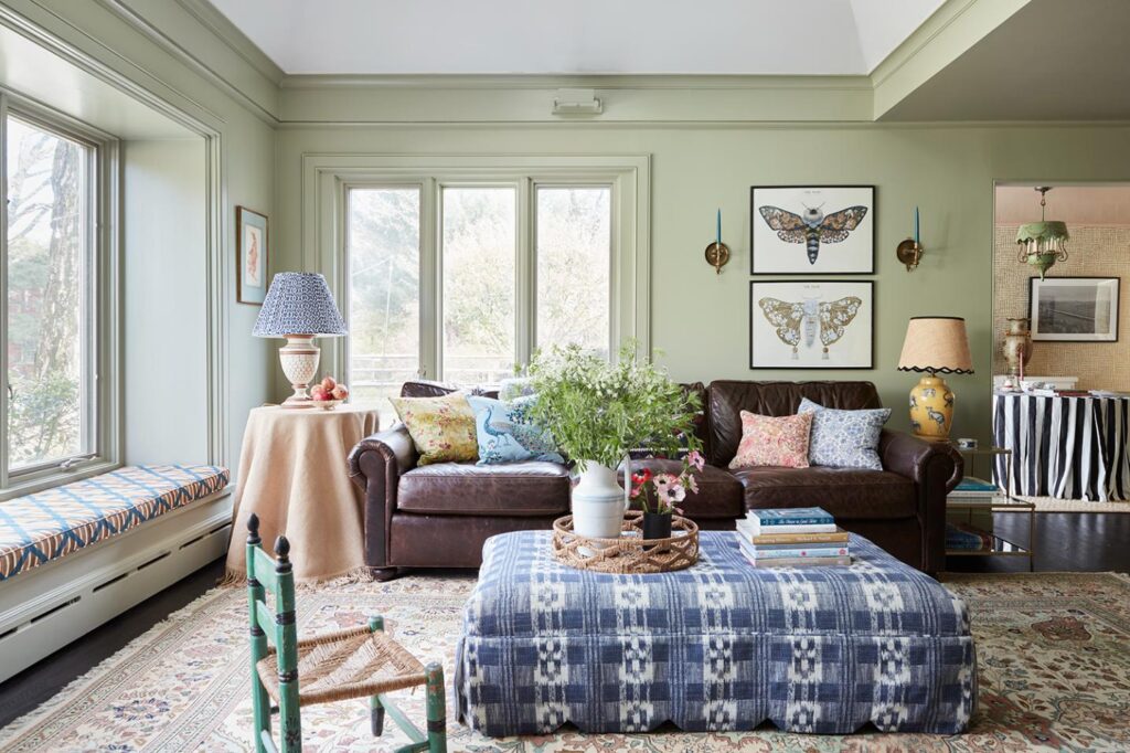
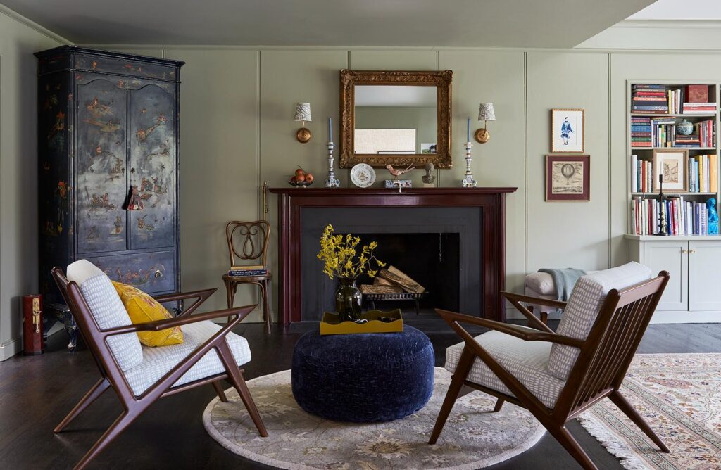
He painted the fireplace a deep beet purple and chose brass sconces and a gold mirror to speak to the gold in the dining room. A print on the modern armchairs is the same Sister Parish print as on the dining room walls but done in a custom blue and white. The upholstered ottoman is done in a cut velvet blue by Metaphores for a contemporary touch. The armoire from an antique shop in Hudson, NY, ties all the colors together. Near the windows, a soft leather brown sofa, window seat and cane chair are cozy spots to curl up with a book.
The home had an office upstairs, but the couple wanted a second office space, so Gillick reimagined a small nook off the kitchen. Glass walls with black framing enclose the space without making the small office feel too confined. I took inspiration from iconic steel Crittall windows, which date back to the mid-1800s,” adds Gillick. “They’re a nice foil to the beautiful floral wallpaper from Antoinette Poisson.”
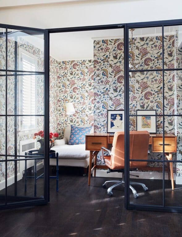
The couple already had a desk from West Elm and a chair from Design Within Reach. Gillick had a pillow custom made from an 18th century French textile remnant from Katharine Pole in the UK. “I like the contrast of the black and glass with the traditional wallpaper and textile.”
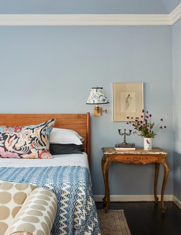
Upstairs, Gillick infused the bedrooms with color and print. The primary bedroom began with the colorful Clarence House curtains on the closet doors. The clients wanted to incorporate an antique French desk given to them by a family member but the small scale didn’t work with contemporary chairs, so Gillick found a small vanity stool to scale at 1st Dibs. He had the wall painted in Parma Gray, a Farrow & Ball blue inspired by the Clarence House print. To complement the large-scale animal pattern on the closet curtains and pillow, he chose a small-scale floral for the desk chair and the custom wall sconce shade from Sister Parish. A very bold dot on the settee by Schumacher is graphic and modern. The vintage coverlet on the bed breaks up the neutral bed linens and adds another layer of pattern and texture. “Robert taught me that vintage textiles live really well in almost any room,” says Gillick. “They have a way of always fitting in, whereas a room full of all new prints can be overwhelming. I like to throw something into a room scheme that doesn’t necessarily go, but is special or meaningful to my clients.”

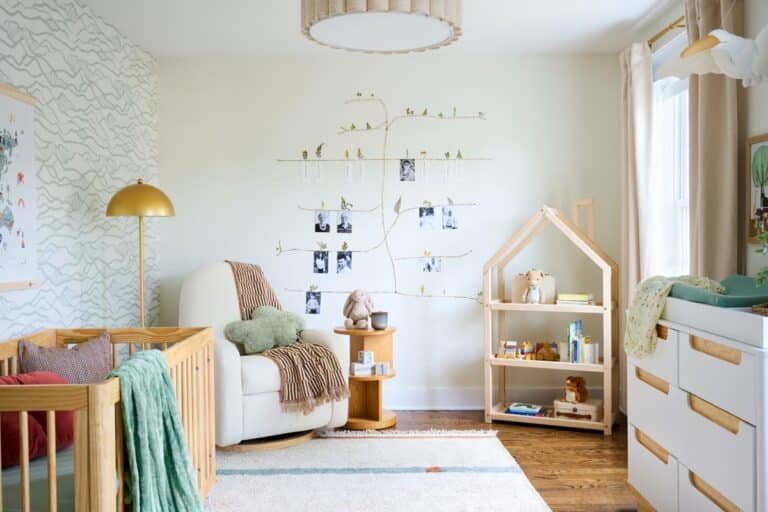
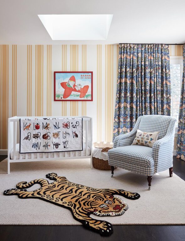
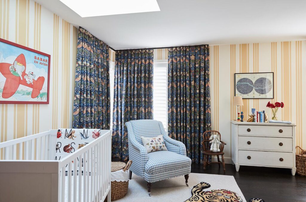
While it might have an undone feel, everything was planned to precision. In the nursery, the couple did not want a wallpaper, so Gillick had a specialist paint it to look like the Farrow & Ball stripe he originally considered. It also enabled him to adjust the scale of the pattern, which couldn’t have been done with a stock wallpaper. “Yellow is such a happy color,” says Gillick. “The client originally wanted a blue nursery, but the colorway of the William Morris print we selected for the curtains could have felt a little heavy if we weren’t careful. A bold yellow wall feels sunny, joyful, and somewhat unexpected. The yellow also sets off the greens and blues in the curtains.” A wool herringbone carpet, a custom armchair from George Smith, and a Swedish antique dresser are all pieces that will outlive the nursery setting and will serve the family for years to come. The sweet alphabet quilt was from FreshwaterQuilts in Chicago, (also on etsy.com) owned by a friend of the clients.
Gillick’s most bold pattern contrast happens in the guest room where an earthy green and cream tree of life wallpaper by Sister Parish wallpaper pairs with curtains in a Clarence House linen depicting a French interpretation of a Chinese celebration. “It’s pushing the envelope on pattern mixing,” says Gillick. “The pattern scales of the window treatments and wall covering are more similar than I would normally choose, but the client fell in love with both and the colors work beautifully. The wallpaper also reads as a stripe from far away with the solid green ground, so that helps.” The colorful pleated silk lampshade by Nushka, handmade from a vintage sari, sits atop an antique alabaster lamp.
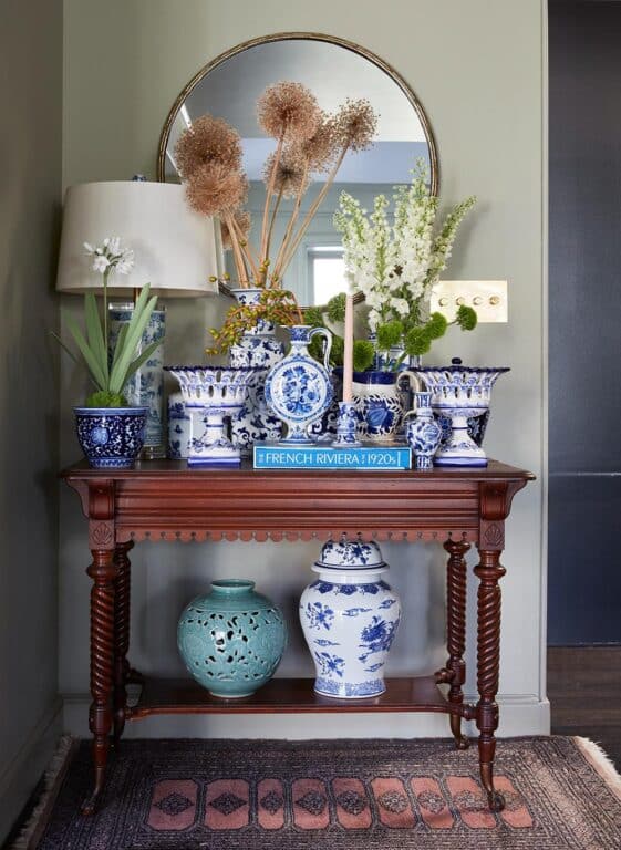
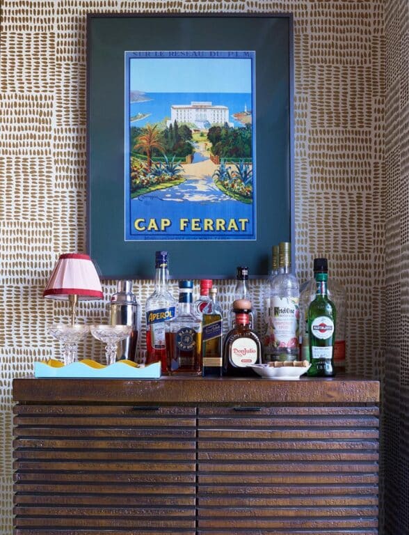
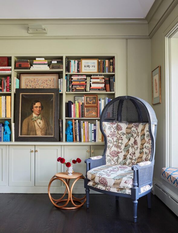
Art adds a layer of pattern and color to each space as well, and the couple’s art collection played a big role here, adds Gillick. Gillick uses it to tell a story as you walk through the home. The couple’s Delft collection is gathered together on one table for big impact in an awkward corner in the living room. In the dining room, a colorful vintage poster depicting the hotel where they celebrated their engagement hangs over the bar. “They don’t buy art as an investment or chase trends,” says Gillick. “They gravitate towards what they like. It’s so authentic that it works. They have antique oil paintings in the same room with contemporary pieces and inexpensive posters. Their art kind of tells a story, making it personal and sweet.”
Get the Look
Layer pattern and color with a few of these versatile favorites inspired by this week’s featured project, a country cottage with a bit of edge in New Canaan, CT, designed by Andrew Gillick, principal designer at Concordia Design in Rowayton, CT.
-
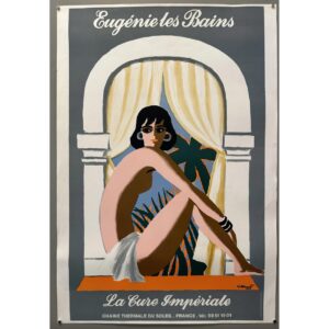 Eugénie les Bains La Cure Impériale Poster$400.00
 -
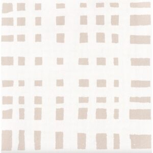 Ginger Sand Clay Coated Wallpaper$130.00
 -
Product on sale
 Fisher ChairOriginal price was: $1,699.00.$1,499.00Current price is: $1,499.00.
 -
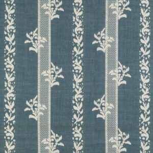 Brio Fabric Blue$214.00
 -
 Nathalie Lete Marais Bird Curtain$108.00
 -
 Delft Blue large hand-painted vase flower basket by Royal Delft$9,506.05