When you don’t want stark white walls but painted accents are a thing of the past, consider a wood accent wall—but not your grandmother’s veneer paneling of the ’70s. Today’s wood accent walls add lots of texture and architectural interest, giving nod to the past in a fresh, modern way.
“The pendulum swings,” says Lina Galvão, co-founder of Curated Nest in Greenwich, CT, with Erin Coren. Galvão and Coren put a few wood architectural accents into play in their client’s finished basement in Croton-on-Hudson, NY. In the early 2000s, the design world saw a lot of minimalism with no embellishment—tailored looks with a lot of Swedish influence. Now, says Galvão, “we are seeing, not necessarily maximalism but something more layered. We want more mood, more personalization and a lot of suppliers are beginning to offer it, even among consumer brands.”
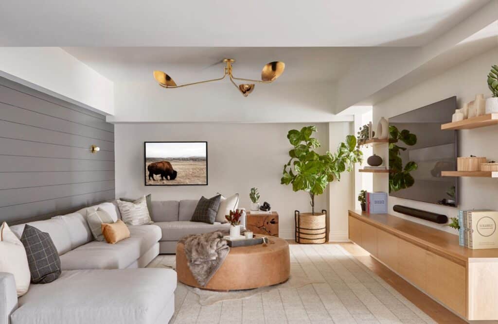
For this walk-out basement, Galvão took advantage of the numerous wood wall accents available today, and used them in different ways for each space. The clients wanted a lower level that would allow for frequent entertaining of friends and family. With a preference for all things ski chalet and mid-century modern, they preferred a look that was modern but warm and cozy. The Curated Nest team not only redefined and reconfigured each room of this finished basement, but also infused a bit of the dual styles the clients loved.
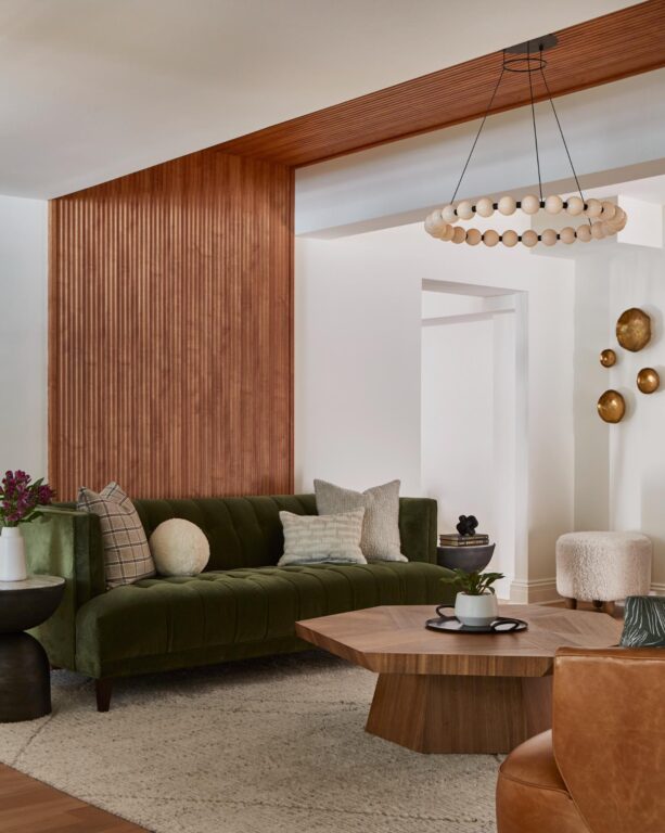
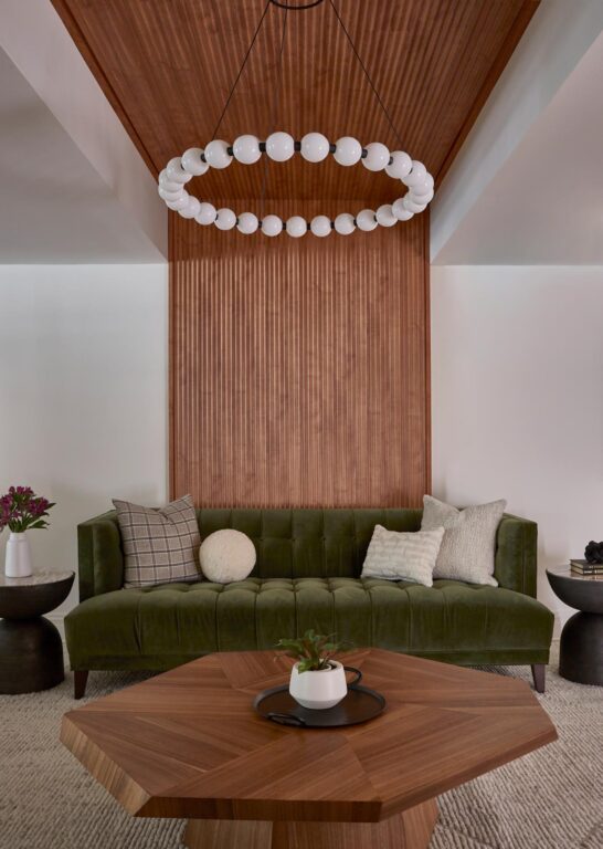
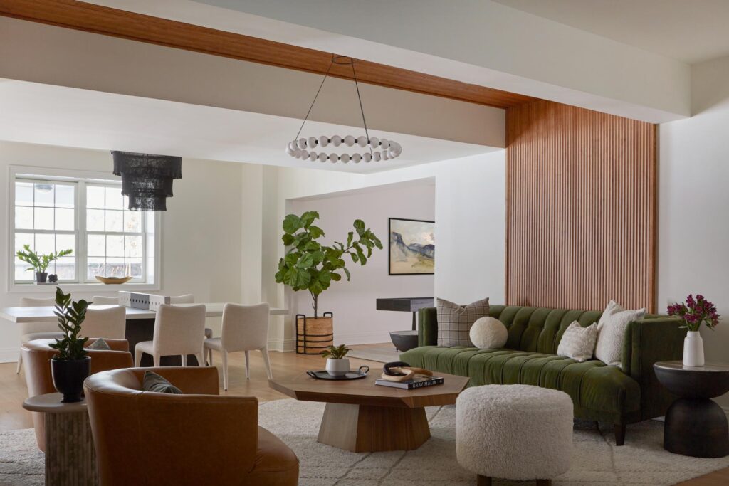
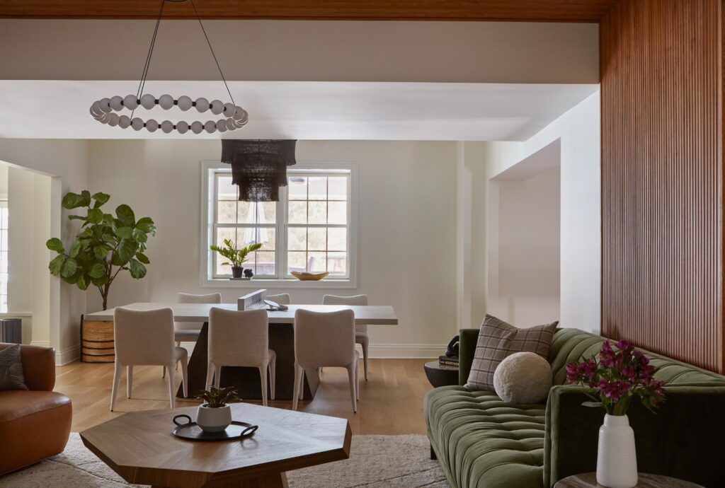
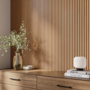
The main living space features a tambour wood paneling, which consists of narrow slats of wood spaced evenly apart. “We wanted to define that space,” says Galvão. What was once a pass-through area with uneven ceiling now has purpose. The tambour was a way for her to frame the seating area and separate it from the table and chairs seating area, where Coren and Galvão picked a table that doubles as a ping pong table. The walnut color reflects the mid-century modern aesthetic, particularly when paired with the green velvet tufted sofa. Boucle stools and a textured rug and pillows give a little taste of ski chalet style and texture to the space as well.
In the TV room, Coren and Galvão chose shiplap for two reasons: it’s not only a classically cabin-chic choice, but also helped break up a very long solid wall behind the sectional. She chose a soft gray color for the shiplap wall. “The horizontal application felt more relaxing,” says Galvão. “It’s a long wall and when something stretches out a long way it feels serene, like a deep breath. It’s a quieter space.”
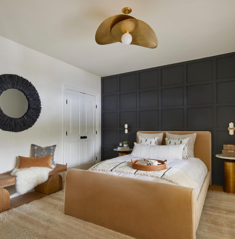
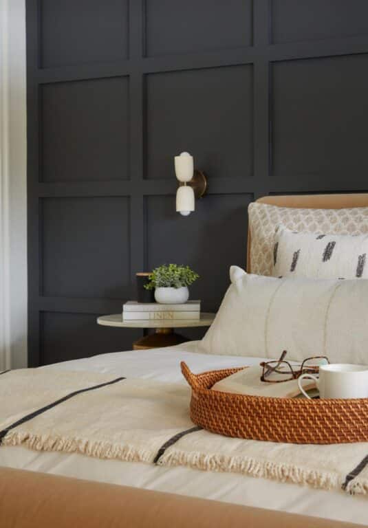
For the guest bedroom, a board and batten accent wall frames the guest bed. Since the room had only one window, the designers leaned into the moodiness of the space and painted the board and batten a dark gray. A rich camel colored velvet bed is the star of the room. An accent pillow with dark gray lines on it was the inspiration for the paint color on the wall. “We loved the juxtaposition of the pillow color and the bed,” says Galvão. A thick bench almost looks like timbers and pairs well with the Tibetan wool rug. While the space doesn’t scream ski chalet or mid-century, it nods to both styles. “Sometimes, it’s about how something makes you feel and not a literal interpretation of it,” says Galvão. “It’s a vibe.”
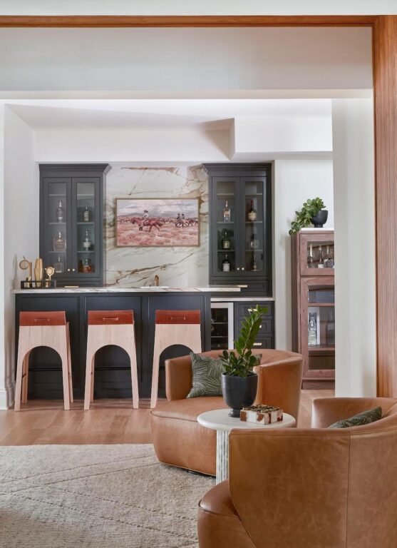
The juxtaposition of dark gray and warm camel furniture continues at the bar, where the cabinetry was painted the same as the board and batten in the bedroom. A marble architectural panel adds visual interest and picks up the brown and caramel color of the stools. “The marble adds so much reflectivity, which is nice in a basement where there isn’t a lot of light,” says Galvão.
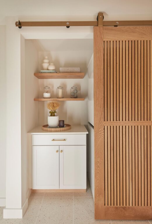
Just inside the French doors to the pool area, Curated Nest chose all white built-in cubbies to provide a place for guests to drop their things when they are visiting for a party. A bench on the opposite wall, also in all white, and a mirror are a must-have for any entryway, says Coren.
While this project allowed for Galvão to incorporate three different wood wall accents, she advises clients not to go overboard with architectural details in a space. “Use them thoughtfully and sparingly,” she says. “The more detailed the architectural feature, the less you should use of it. For instance, shiplap could be done in a whole room, but with tabour I’d stick to one wall.”
She also recommends homeowners get a good installer and make sure walls are well-prepared before application of any architectural detail.
While architectural features like wood panels seem to be a trend, Galvão says she doesn’t see their application going out of vogue any time soon. “There is a lot more juice to squeeze,” says Galvão. She just recently visited a showroom where she saw new applications coming down the pike, including sustainable options and puzzle piece applications that interlock. No matter the technique, it’s a great way to define a space, says Galvão. “That’s part of why we are so emphatic about using architectural features in our designs,” she adds. “To have something consistent, helps us as humans to feel grounded and understand our space harmoniously. It’s the psychological part of design.”
GET THE LOOK
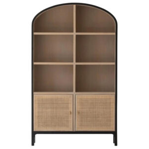
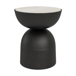
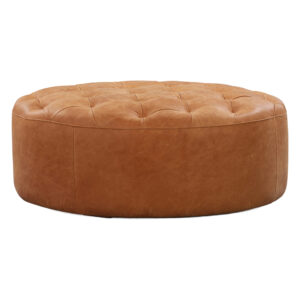
Layered and textured, this week’s Curated Nest-designed finished lower level blends hints of Scandanavian ski chalet with a few mid-century modern touches for a uniquely modern look. Get the look with a few of these fun essentials.


