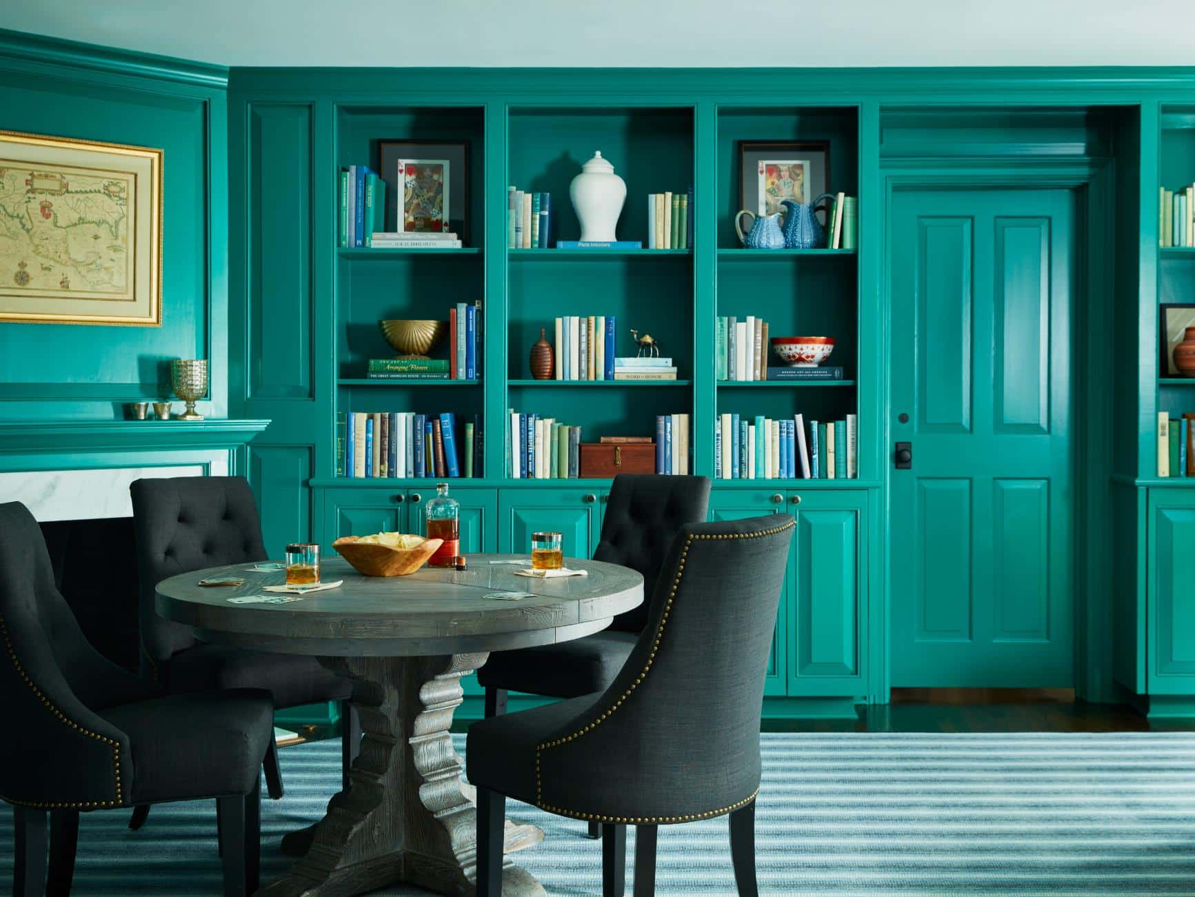
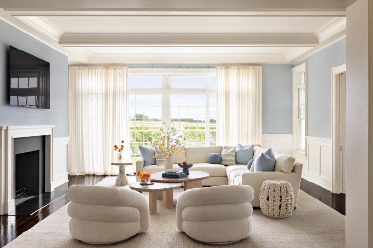
Instagram has been blowing up with cocoon-like moody spaces drenched in color from ceiling to floor, which seems like a big shift from the all-white décor from the last two decades. “People are using their homes more and I think they want to make it feel special,” says Ariane deBraux Triay, designer and founder of La French Goose in New Canaan, CT. “Color drenching feels decadent and special.” But while color drenching—the technique of painting the walls, trim and built-ins all the same color—feels bold and trendy, it’s a time-tested approach to color that has been used by design pros for centuries. All it takes is a little know-how to do it right. So, if you are nervous about going full bore on your favorite shade of teal in your den, just remember there is a reason this look never goes out of style. Just follow these three time-tested rules and snuggle in.

Set the Mood
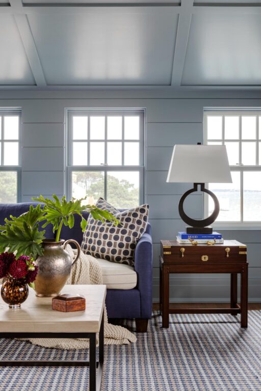
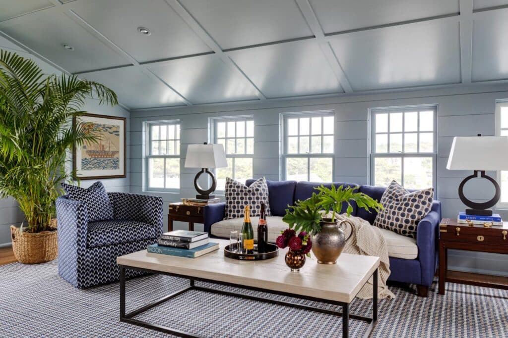
“If you want a lively dynamic living room, I recommend a much lighter tone, such as a cream sofa against emerald-green walls. If you are going for a cozy space, a navy linen on a sofa in a small library bathed in navy grasscloth will fit the bill,” says Jocelyn Chiappone, owner of Digs Design Company in Newport, RI. Her team recently reimagined a client’s Cape Cod summer home, including a color-drenched third-floor study all in blue.
“A single color feels luxurious and modern and all-enveloping, like it’s wrapping its arms around you in a way that a painted wall with white trim can’t,” says deBraux Triay. During a recent whole house renovation, she helped her clients turn a former office into a sitting area for receiving guests. “The client wanted it to feel formal enough to greet guests at the front of the house while being relaxed enough for their family to play board games and have homework sessions,” she adds. The green singular color was painstakingly chosen to match their family business logo. “Because they walked through this room multiple times a day, they wanted it to be something they could live with,” she says.

Consider the Color
“Paint color choice is always important,” says Chiappone, “especially when it is the leading element of the design.” Before committing to a color, take note of how light moves through your room throughout the day and determine how you want the space to feel when you are in it and how that color might look at different times of day. “I chose a medium gray blue for my client’s home office because it has just enough saturation without being too dark,” she adds. “The color changes with the light. I enjoy how that interaction with natural light adds a dynamic layer to the room.”
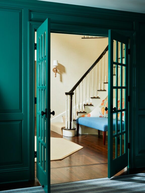
Not only should you consider the space itself, but how it relates to the rest of the house. “See what colors are in the room and what colors are in neighboring rooms,” advises deBraux Triay. “You want to be able to look from one room to the next and feel like the rooms are related to each other. If you’re not sure what goes together, look up the old-fashioned color wheel and play around with complementary colors to find some new combinations.”
Consider the Ceiling
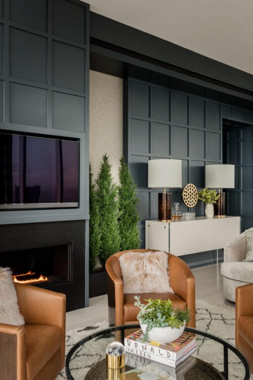
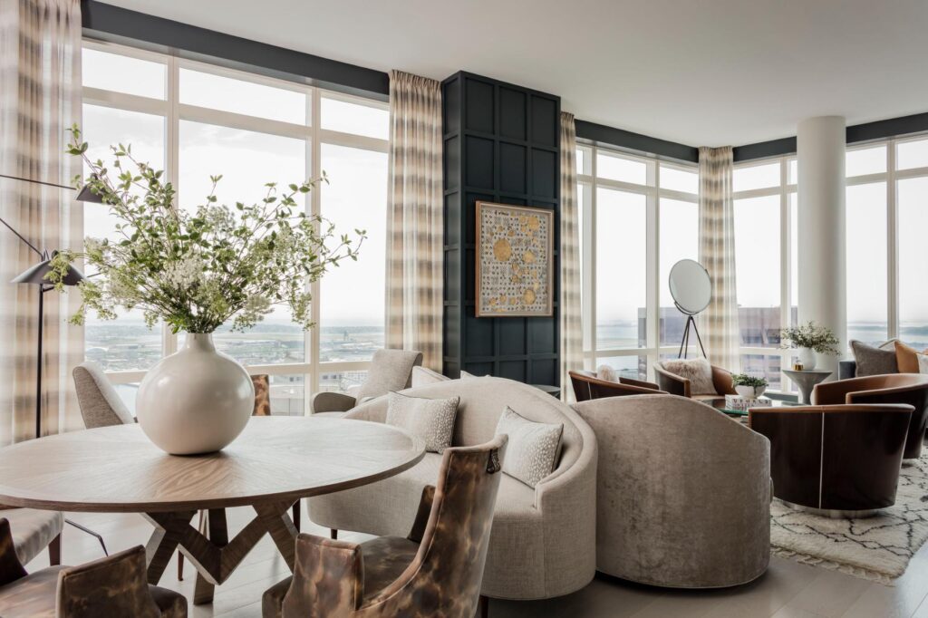
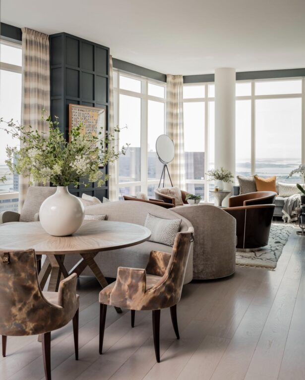
While the technique of color drenching always includes painting the millwork, walls and built-ins the same color, the ceiling is optional. “Our decision usually comes down to when the client most uses the room,” says Robin Gannon, owner and founder of Robin Gannon Interiors, a full-service design firm in Lexington, MA. For her client’s color-drenched living room in a penthouse apartment in Boston, they opted to leave the ceiling light but do the walls almost black so at night the walls of the apartment, which was on the 58th floor, would give the feeling that you were floating among the stars. “Our decision usually comes down to when the client most uses the room (at night or in the day) and whether they want to feel a little lighter or a little cozier,” says Gannon. “I love the envelope that the drenched ceiling creates, but for some people, that is one step too far.” To add visual interest and texture, she adorned the walls with rectilinear paneling. Then, she selected furniture and drapes in a contrasting neutral but in repeating shades and tints so as to make the room feel less busy even though there is a lot of seating. Around the fireplace, she uses more wood and leather so that seating is more prominent than others. “The space definitely lives bigger than it is,” she adds.

Typically, designers recommend painting the ceiling the same color for secondary rooms like libraries, bedrooms or powder rooms. “It’s not my first choice for places like a kitchen or family room where you will be having breakfast and living out more of the regular moments of daily life,” says deBraux Triay. “It’s meant for jewel boxes, smaller and more intimate spaces where you can afford to be daring.”
For Chiappone’s Cape Cod client, because the husband’s office had a pitched ceiling, color drenching the ceiling in the same blue helped prevent the room and windows from feeling low. “It created an envelope, which further masked the low ceiling and window problem,” says Chiappone.
“I love covering every element with a single color,” says deBraux Triay. “Fewer paint colors in greater concentration has more impact.” The bottom line is, if you like it, go for it, she says: “Paint is the simplest tool we have. The worst thing that could happen is, you need to repaint.”

