The trend of quiet luxury is sweeping the design world right now, and we can see why: what’s the point of luxury if it isn’t comfortable? Subtle, simple, elevated and sumptuous, the look combines lived-in comfort with easy sophistication. But frequently, when we hop on a trend train what’s lost is our voice. To make a house a home, you have to say something about who you are, where you’ve been and how you live. With her clients’ country home in Avon, CT, Interior Designer Georgia Zikas, principal and founder at Georgia Zikas Design in Boston, MA, and West Hartford, CT, takes the notion of quiet luxury and lets it speak to her clients’ personality.
Step one of any professional interior designer is getting to know your clients. Zikas met her clients, owners of a family home on an apple orchard, through a fellow Boston designer who recommended Zikas to longtime friends. With daughters now teens, the couple said they were “ready for a grown-up space.” It had been their family home for nearly two decades and had seen different versions of life, but it still felt “quite unfinished.” The formal living room was, in fact, still empty. They wanted the home to be functional, since the girls were busy with school and activities, luxurious and elevated but not too precious, and comfortable for spending time together with friends and family. Plus, they had a few special items they had collected while living in London, including family heirlooms and antique pieces.
Design for How You Live
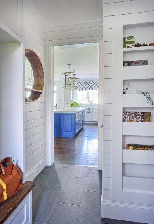
They frequently enter and exit through the mudroom into the garage, so Zikas chose a classic and utilitarian slate tile for the floor, and shiplap for the walls, which worked well with a custom paper management system. “The mudroom isn’t grand in size, but it’s really a central artery and daily workhorse,” says Zikas. Each family member now has a pocket to store papers, mail, glasses and the like for convenient access when they are coming and going. “I like to talk a lot about lifestyle with my clients early in the discovery phase, and how they operate during the day,” says Zikas. “I’ll say, ‘So tell me what happens when you wake up in the morning,’ whether we’re talking about a kitchen remodel or a full gut renovation. For me, it’s always about how the clients operate in their spaces. If we are designing and planning, why have a traffic jam in the corner where someone’s making coffee, and the other person is making a smoothie?” Considering these functional details make a space feel like it’s designed just for you, she adds.
Choose What You Love
Blue is waning as a trend and the house is not on the coast, but her clients love the color. Zikas says, it’s ok to choose what you love. There are always ways to freshen up a space with trending touches while still letting it be a reflection of who you are and what you like. What you love is always in style. “They have a family home in Watch Hill, RI, and they love casual coastal elements, but they also have notable family heirlooms and antique pieces from London and from their travels in England that needed to be incorporated,” says Zikas. With the finished look, “you’re seeing a balanced blend of heirlooms and some youthful freshness: It’s modern heritage,” she adds.
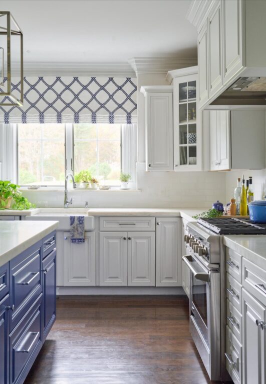
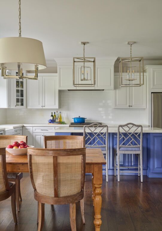
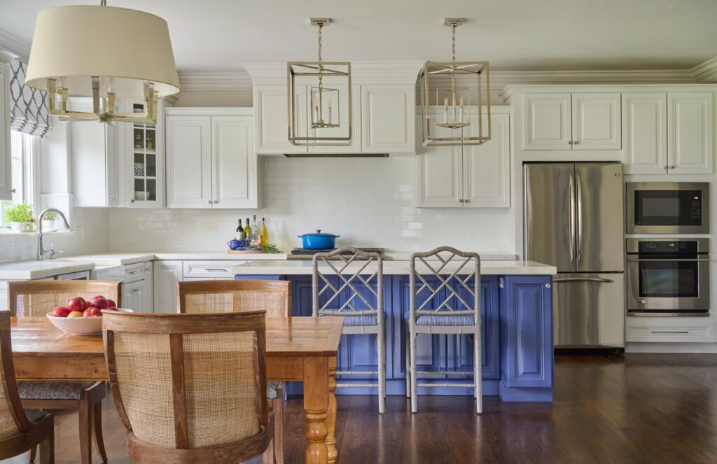
In the kitchen, rather than tearing out well-built cabinetry, she painted it and reworked the island, painting it a vibrant shade of blue. Thoughtful details set the room apart and give it richness. For example, the countertop is a two-inch thick Danby marble. A matching marble slab window sill elevates the look and provides a sunny place to grow herbs—something her clients liked doing. New and old blend together in their own unique way, rather than looking pulled out of a catalog. “We incorporated their beautiful antique kitchen table,” says Zikas. Modern chairs and lighting invigorate the look.
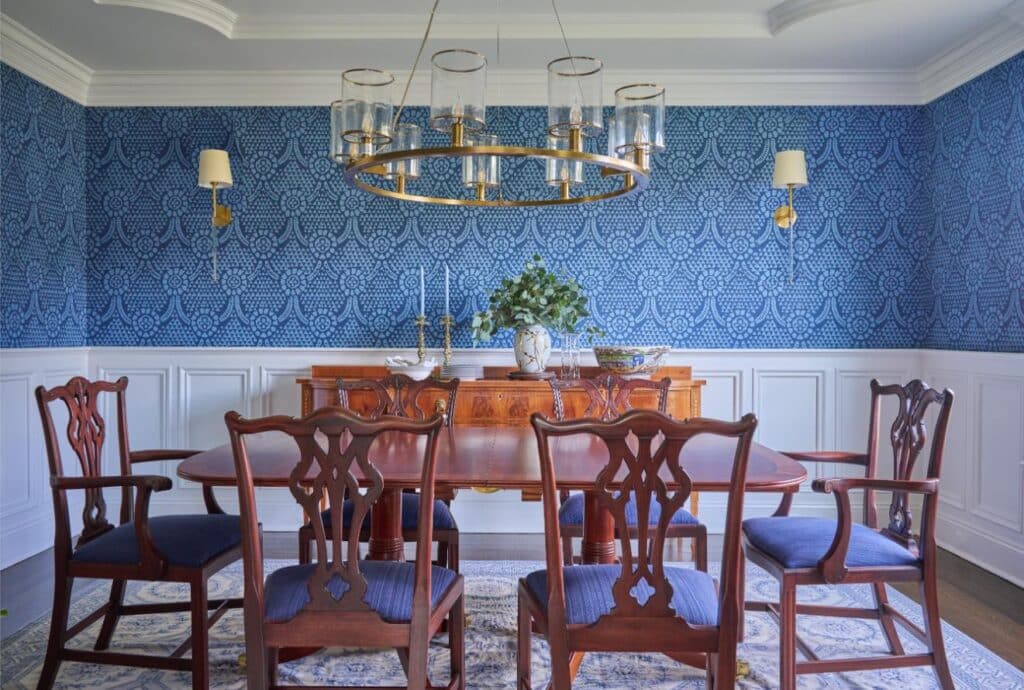
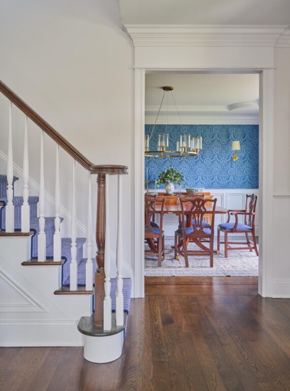
In the dining room, they wanted to keep a classically inspired wallpaper, and incorporate their antique dining room table. The contractor accidentally took the wallpaper down during demo, so Zikas chose an archival paper from England that had a similar feel but in a vibrant cornflower blue. She had the antique dining room chairs reupholstered in the same blue hue, and she finished the space with a cherished French Aubusson rug in blue and white. “The vibrant cornflower blue makes this space feel fresh and not like your grandmother’s navy blue dining room,” says Zikas. “The saturation of the color is nice and bright, so it has some youthfulness.” Just outside the doorway in the hall, the double staircase received a new blue and white runner. An antique chest paired with an abstract painting add interest to the entry hall and all the details provide continuity with the neighboring rooms.
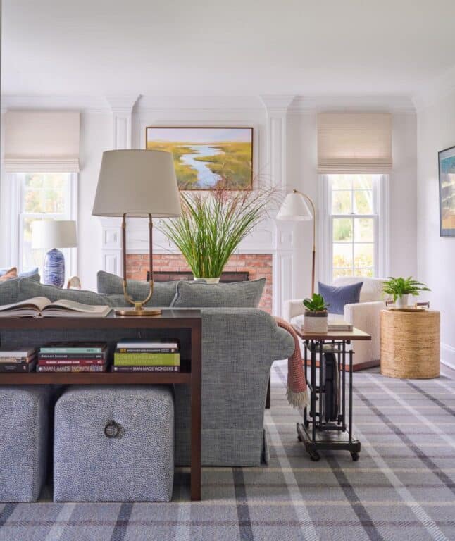
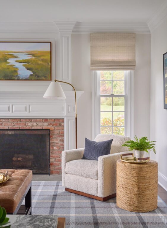
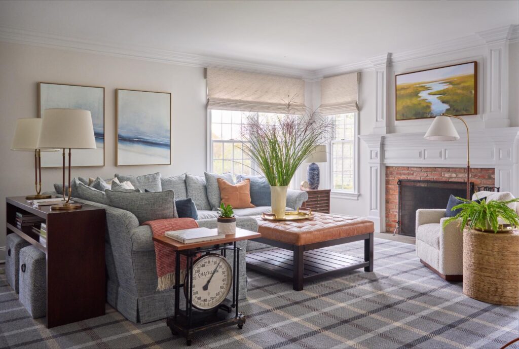
In the family room, Zikas leaned in on the family’s London travels. She restuffed and recovered their beloved sectional with an English roll arm. “I appreciate when clients bring things to us,” she says. “If it’s perfect for the project and it’s perfect for them, I always listen…I appreciate when people bring special things to us to incorporate into their design.” While restuffing and reupholstering the sofa was more expensive than buying a new sectional, it was part of their story and minimized waste, two priorities for Zikas and for her clients. “We paired it with Benson Cobb paintings that have an abstract coastal feel,” says Zikas. Then she chose a decidedly British tartan rug. “It relates back to that Anglo love affair they have.” The tufted leather ottoman is sable colored and speaks to the brick around the fireplace. Two antiques they picked up in England complete the space—a weighted scale and some architectural office drawers to store old drafting plans—both turned into useful side tables. “I think that in today’s design world, we’re often blending various decades and countless family pieces,” says Zikas. “It helps to hire an educated professional who has some reference with historical styles and the knowledge of how great designers of the past put things together.”
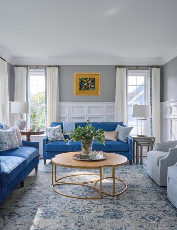
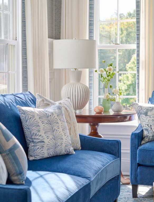
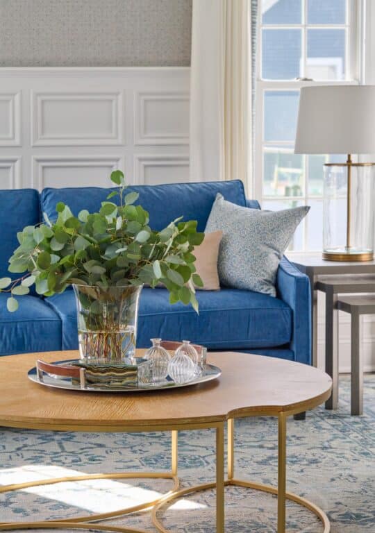

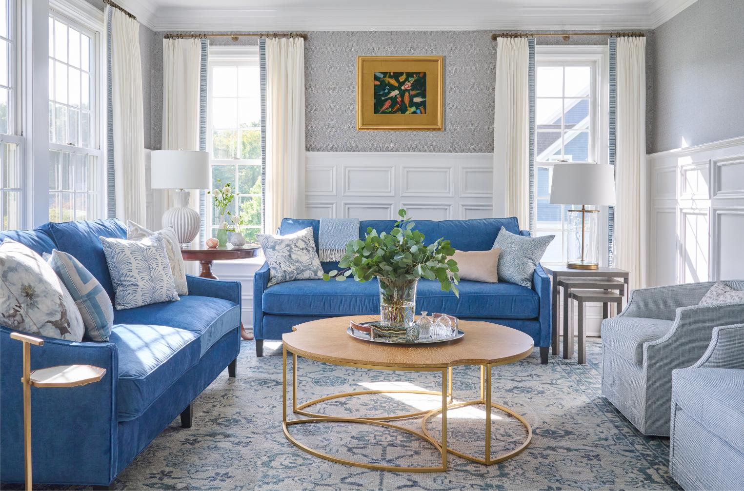
Sometimes, that knowledge helps a designer to break the rules in an educated and thoughtful way. For instance, in the living room, ZIkas paired a round pedestal table with sofas from her private furniture collection offered exclusively to her clients. While the antique table in the corner is taller than what is typical for a side table and taller than the side table on the opposite end, it worked in this space. Zikas chose lamps of different heights that help bridge the gap. “We knew the tables weren’t going to match, but we just embraced the height,” says Zikas. “When it’s intentional, it doesn’t look like a mistake. It’s about having confidence to break a rule.” The space is finished with custom curtains by Lisa Salvatore from Zikas’s workroom in Simsbury, CT. The simple linen drapes on a French rod with Samuel & Sons trim give a historical nod with a modern twist. The trim can be replaced over time if the client wants a change. “I know that I have a fiduciary role in each project to protect each client’s design investment, so my intention is to make thoughtful decisions with foundational pieces,” says Zikas.
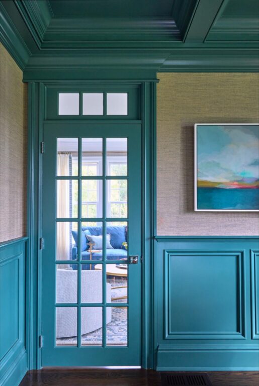
Off the living room, the office is drenched in a vivid blue green teal paired with a warm textured grasscloth wallcovering. A painting ties the colors of the office with those of the living room, which can be seen through the glass paned door.
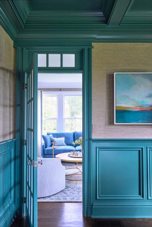
For Zikas, keeping focused on the details and the functionality of a home, is just as important to elevating a home as the quality of the materials selected. These considerations combined elevate the overall style. No matter your aesthetic, thoughtful details give your home a look all its own. “That’s what makes it feel special,” says Zikas.
GET THE LOOK
Why limit yourself to one aesthetic? Make your home a reflection of yourself and your family by blending a little bit of everything you love. Take a look at a few of these great finds, inspired by Georgia Zikas’s recent project: a family’s beloved home in Avon, CT.
-
Sale Product on sale
 Cosmopolitan Chandelier
$948.99Original price was: $948.99.$685.00Current price is: $685.00. -
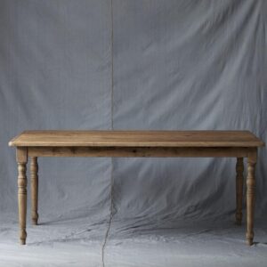 Farmhouse Dining Table$1,799.00
 -
 Organic Ceramic Vase, Tall Neutral$138.00
 -
Sale Product on sale
 Spencer Roll-Arm 4-Piece Sectional
$9,170.00Original price was: $9,170.00.$7,794.50Current price is: $7,794.50. -
Sale Product on sale
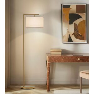 Montage Modern 60 in. Mid-Century Modern LED Floor Lamp with Fabric Drum Shade
$120.00Original price was: $120.00.$80.00Current price is: $80.00. -
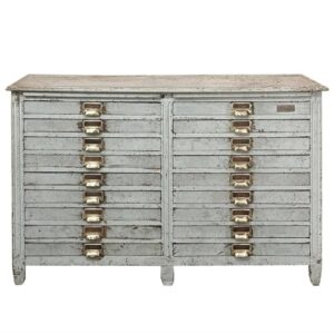 19th Century Architectural Plan, Collector’s Cabinet$4,700.00
Photo Credit: Jane Beiles

