There’s lots of talk in the design world about designing with kids and pets in mind, but once in a while, a project goes beyond the ordinary into the extraordinary. When Creative Director Erin Coren and Director of Business Development Lina Galvão of Curated Nest in Greenwich, CT, got a call from repeat Westchester County, NY, clients who said they wanted to do a full house renovation that would function well for children, they weren’t kidding. “They were the most child-focused of all the clients we’ve had,” says Project Manager Jennifer McCulloch. The couple felt strongly about a Montessori approach to learning and were very much focused on providing a home that was not only fun to hang out in but also educationally and developmentally focused. “Looking at all the pictures reminds me of how much fun we had with these clients,” she adds.
Graphic papers, pops of color, easy care fabrics and soft textures are just the beginning of the kid-friendly design decisions made on this family home. Nearly every room was designed to be a place for play, snuggles, games, learning and family time.
“This whole house is a kid’s dream,” says McCulloch. “It really comes back to the functional approach we have. We really wanted to design for the client and how they live.”
Heart of the Home
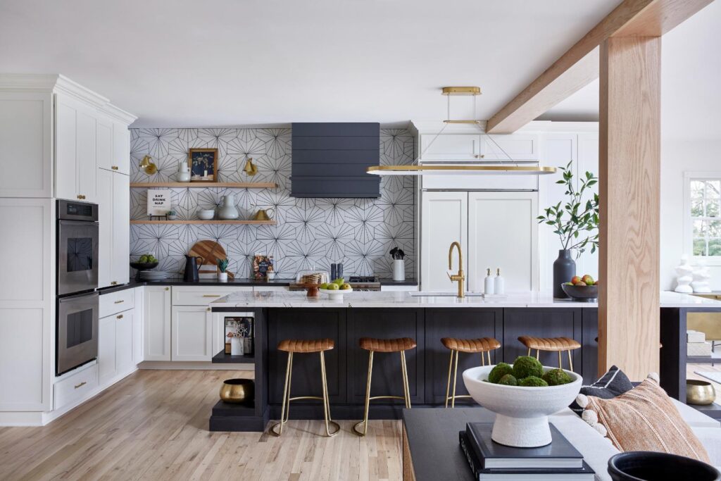
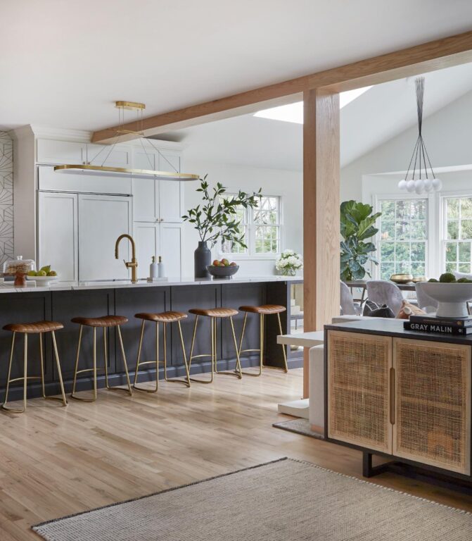
First, the great room, which includes a family room, kitchen and dining table, was reworked to create better flow. Coren and McCulloch removed the former kitchen island, which was cutting up the space in an odd way and had a column going through it. They turned the new island to face into the family room seating area and removed a column that was breaking up the space. The homeowners didn’t want upper cabinets. Curated Nest kept the original boxes of the lower cabinets, refinished them and added floating shelves and lighting above to open up the room. The wall above the cabinets was tiled in an eye-catching black and white geometric tile. “For me, my favorite feature is the oversized island,” says Coren. “Having a large family with a lot of kids, they now have two dishwashers, two trash cans, and an entire row of counter stools. The leather and brass has a nice pop against the dark island.”
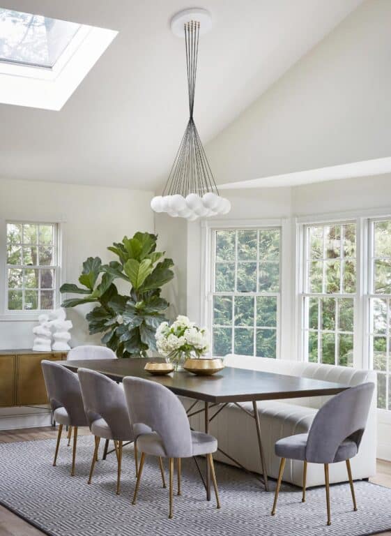
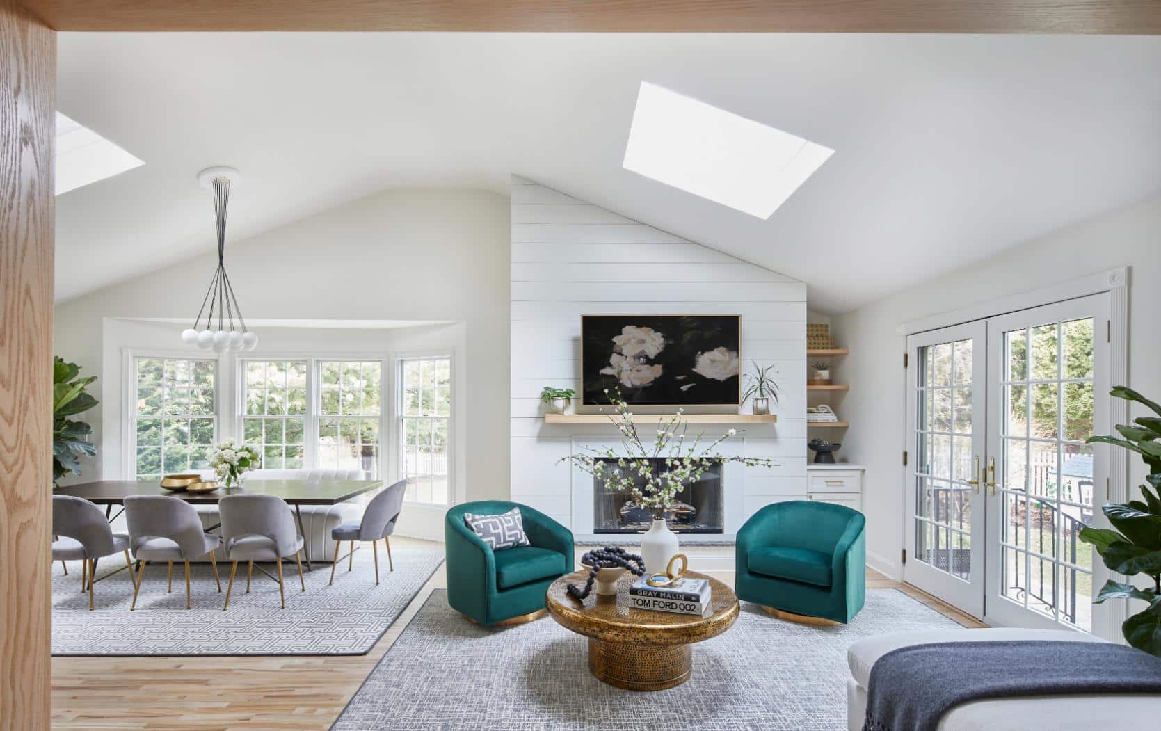
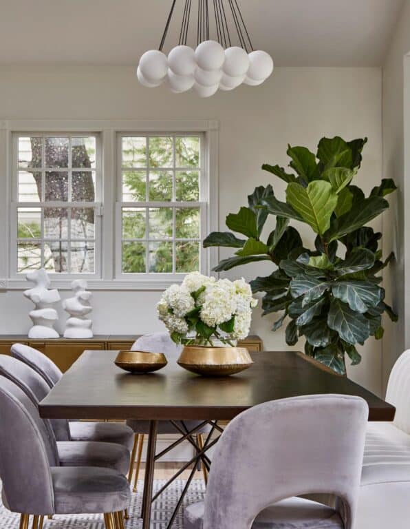
The breakfast nook was redesigned to be the sole dining table. It’s nestled among lots of windows for natural light. Coren says they selected velvet chairs and a white vinyl upholstered bench, both of which look elevated but are also easy to clean. “Velvet is performance but also elegant,” she adds, about the fabric she turned to frequently for this project. “It’s a great texture.” The dining area is topped with a fun and playful bubble-like chandelier from Lightology.
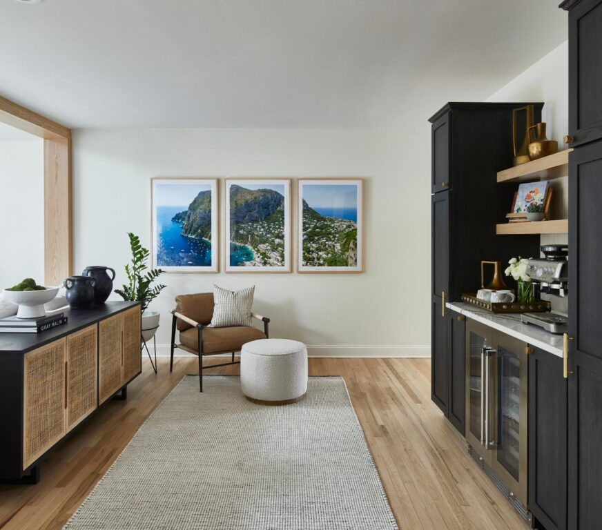
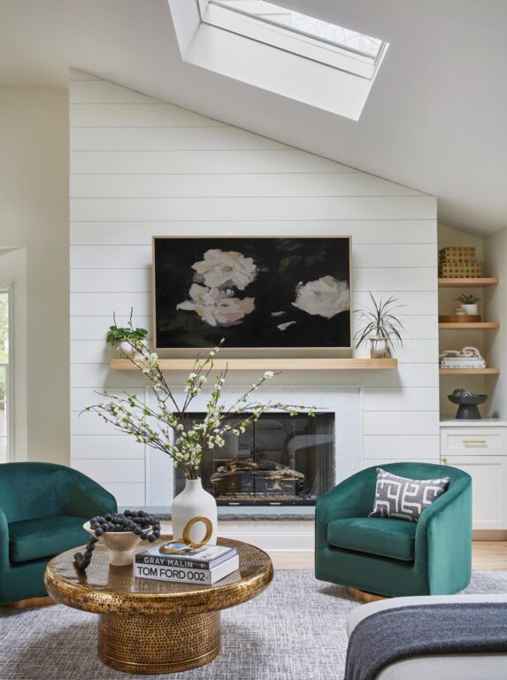

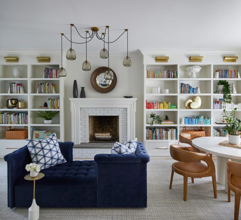
Knowing they were going to be busy with the children, to make things easier and accessible to the kids, the designers created a beverage center behind the family room seating where they could store cold bottles of water and snacks. A console table behind the couch provides concealed storage for toys. The brick fireplace was there, but they refaced the surrounding wall, added shiplap and installed storage on the side to make use of an awkward corner.
Designed for Learning
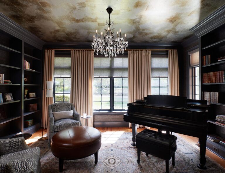
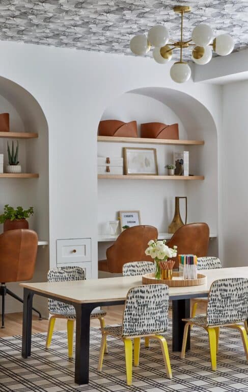
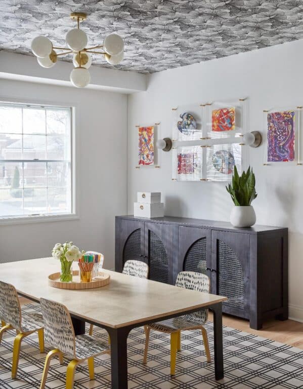
The formal dining room was replaced with a more practical homework and craft room. Curated Nest added arched desk cubbies with seating for four. In the center of the room they added a large crafting table. They wallpapered the ceiling with a black and white leaf print that complements the black and white of the rug below. “We added a lot of architectural elements to the house and added built-in bookshelves in a few different rooms,” says Coren. In the library, the books were then categorized by author and age. “We wanted this room to have a wow factor because you saw the library right when you walked in from the foyer, so we gave it a big archway. We also broke it into zones for reading, playing and socializing, including a game table and a tête-a-tête chair in front of the fireplace in a sophisticated but fun tufted navy velvet.”
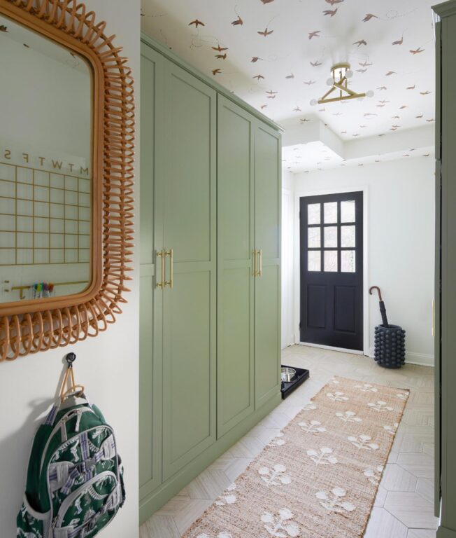
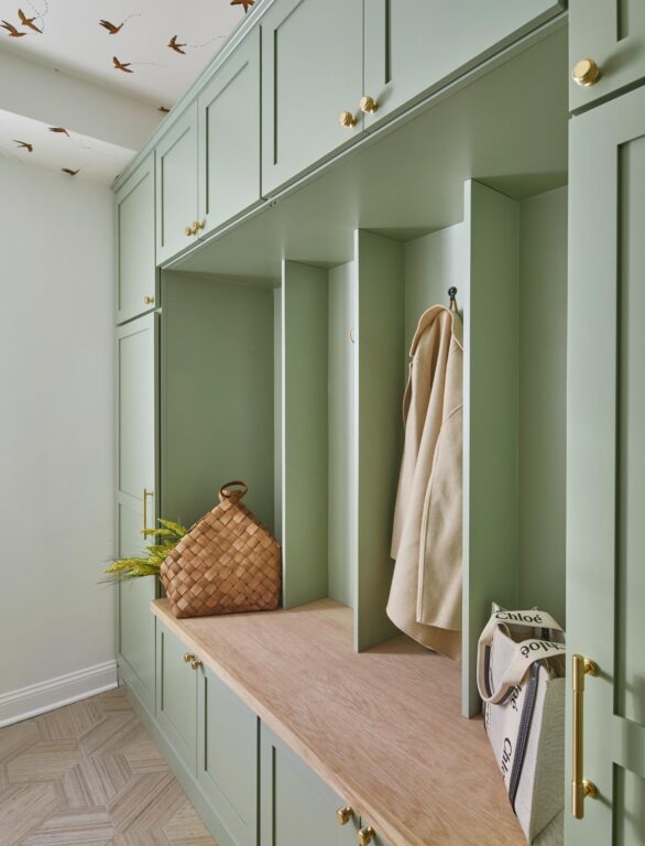
The mudroom is utilitarian with a wall of built-in storage in a soft green, a write-on calendar and wall hooks for backpacks and coats when coming and going, but a gold bird wallpaper from Lulu and Georgia on the ceiling and soft greige hexagon tiles on the floor up the style. Coren found a rattan mirror at Woven Home for taking one quick look before walking out the door.
Sleeping Sanctuaries
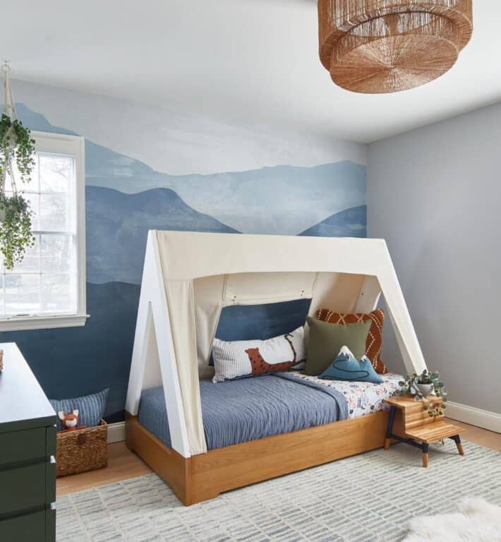
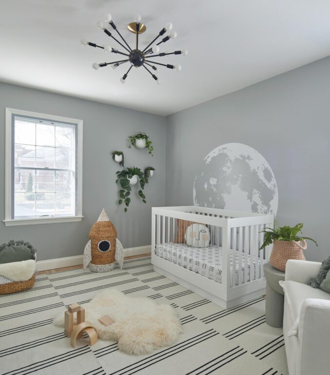
Upstairs, the bedrooms were designed with each person’s personality and taste in mind. Both rooms already had fun and stylish bed frames, which Coren said they used as inspiration for each room. For the wild cat-loving little one, tiger wallpaper in black from Studio Ditte pairs well with gold and white bedding, a teal velvet settee, a log-looking end table and a colorful striped rug. For the second bedroom, the tent organically led to a hand-painted mural of mountain peaks, an earthy green dresser and a few plants to bring nature indoors. A natural rope ceiling light from Woven Home provides warmth and balance and caps off the space.

In the primary bedroom, Curated Nest took a different approach. This was the only room in the house not dedicated to the kids, so the team wanted to make the parents’ bedroom feel like they were staying in a luxury hotel. The room has an elevated, but not stuffy, feel, says Coren. She chose a black ceiling light with a bit of whimsy, a deep green velvet headboard, a curved lounge seat, and a light and organic feeling wallpaper, and paired then with black and brass fixtures that have a more masculine feel. “There is a lot of contrast in this space but it’s very purposeful,” says McCulloch.c The finished look is serene and balanced.
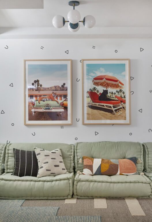
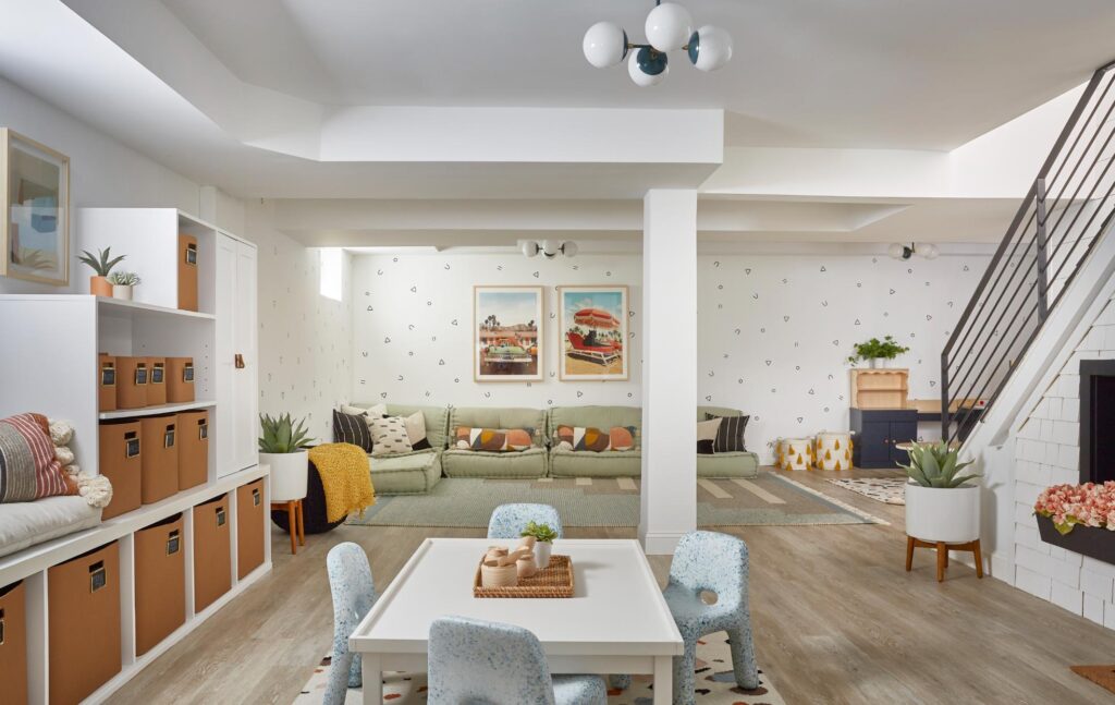
While the primary bedroom is a peaceful escape for the parents, the lower level is a kid’s dream, with a comfy cushion sectional, art table, play tent, lots of storage for toys and games, and a Montessori kitchen that models the family’s kitchen upstairs. Playful wallpaper with geometric shapes echoes an area rug under the art table. Built-in under the stairs is a playhouse that feels just like home and houses beanbags and books and even has shutters that open and close.
Getting Personal
As with all good design, Coren says, first getting to the root of a family’s tastes and priorities, and how they spend their day is critical.
“It’s really a big thing for us to get to know our clients personally,” says Coren, reflecting on how each of their design projects come together in partnership with their clients. “We get a nice trust factor because we are building a long-term relationship—it’s not just about looking beautiful on Instagram. It’s about creating a space that our clients love.”

“All the graphic pattern play comes together with wood tones and natural materials,” adds McCulloch, about this very family oriented home. “It feels so them. We feel really proud of that.”
Photos by Jacob Snavely

