Small spaces are a wonderful opportunity to give your home lots of personality. The small half bath on your main floor may seem insignificant but the powder room is sometimes one of the first rooms people see as you welcome travelers in to freshen up from a long journey. Why not give it the attention it deserves? A few stunning details will wrap guests in luxury, making them feel wowed and welcomed.
Create Drama
Really “punch it,” advises Dinyar Wadia, principal and owner of Wadia Associates, a full-service design and architecture firm in New Canaan, CT. “Dark colors in small rooms are not limiting and confining. Color adds warmth and sophistication. You never get tired of it.” His firm, led by Saranda Berisa, Wadia’s head of interior design, created this ruby red bathroom with that in mind when they designed this French chateau style home. The owners wanted the interiors to match the overall feel of the house. “The jewel box of a powder room shown here is painted in striking Rembrandt Red lacquer by Fine Paints of Europe,” says Wadia. “The fully paneled space is painted red from top to bottom, enveloping you in drama.”
A French-style gilt vanity is custom designed. Gilt silver hand finishes on the ceiling and a carefully sourced antique light are the crowning features. “The clients love that the room is a surprise for their guests—a dramatic pop of color and light delights each visitor,” he adds.

Layer Styles
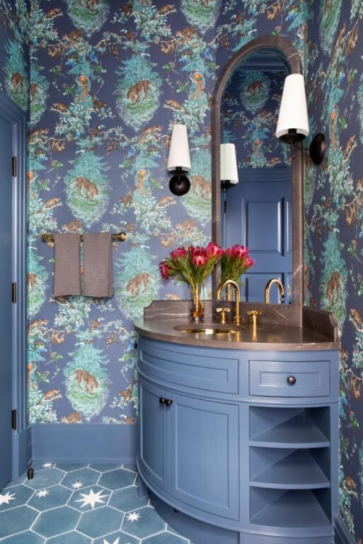
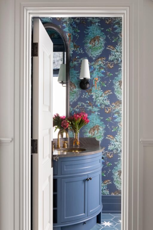
Brooklyn, NY-based design firm Chango & Co., mixed modern and Victorian elements to create this bold and beautiful blue bathroom for their clients in Austin, TX. Susana Simonpietri, founder and creative director of Chango & Co., helped the homeowners of a quintessential Victorian undergo an extension and gut renovation to their new home, once claimed as affordable student housing. “Bold original works of art and one-of-a-kind antiques took center stage, accompanied by colorful and quirky details, all enveloped in a backdrop of deep vibrant hues and ornate finishes,” says Simonpietri. A jungle wallpaper by Hermes is the setting for the cool blue curved vanity with gold faucet. Since the home was getting an extension, Chango & Co. took pains to blend the new construction in seamlessly. “We did this by constantly layering the design so that there were components of both the old and new,” says Simonpietri. “It’s important to incorporate as much layering as possible.” Sometimes, it can be difficult to make a small space seem forward thinking, she admits, but take the opportunity to take risks you might not consider in a larger space. “For example, in this powder room we took the opportunity to mount the sink in the corner of the bathroom to maximize the space.”


Balance Form and Function
When Claire Paquin designed this pearly powder room for her clients, it was an opportunity to retreat from an abundance of color on the clients’ first floor, but here, neutral means anything but boring. “We used a beautiful marble, which has a very warm undertone to it called White Haze,” says Paquin, founder and principal designer at Clean Design Partners in Scarsdale, NY. “It has soft, subtle veining and we felt like the organic gold splashes on the wallpaper would pair well with it.” Behind the sink, the full wall is tiled in the same herringbone as the floor. “I really love to do this because it’s extraordinarily functional but also decorative,” says Paquin, who recommends selecting at least one surface to make a statement with a bold color or pattern and letting the other elements be the supporting cast. Here the wallpaper takes the stage. Above the vanity, she selected a large round mirror, which reflects the geometric pendant light she chose for the ceiling. “Choose decorative lighting instead of recessed lighting,” she suggests. And select a vanity that is not only beautiful but provides practical storage, because no one wants to be in someone else’s bathroom without a roll of toilet paper. “First and foremost, you have to have all the practical things checked off, like storage, ventilation and proper lighting,” says Paquin, then add the elements that make it a beautiful and sophisticated space.


