Let’s face it. We all like to get something new. Who hasn’t had a moment when you just want to scrap an entire room and start over? Working with what we already have can be difficult whether we’re renovating our architecture or the interior furnishings. But upcycling and reusing is not only an inspiring way to create a look that is unique and personal but also an incredibly eco-friendly approach to design. Here, Emily Meszkat principal at Emily Meszkat Interiors in Rye, NY, transforms her clients’ tired Victorian into an enchantingly updated and unique home using lots of vintage and upcycled pieces.
“I don’t like to undo things that are already good,” says Meszkat as she sits down with Serendipity to discuss her recent interiors project for a family in Rye, NY. She was excited to work with these homeowners who asked her to update their home and barn “to reflect joy and color without compromising the home’s beautiful bones.” Much of the furnishings were sourced vintage and reupholstered and many of the pieces already belonged to the family, but were relocated to areas of the house that better suited them or from the family’s other house. “We bought hardly any artwork,” says Meszkat. “We just rearranged everything and created little vignettes.” Some of it was artwork done by the children, and some of the photographs were the homeowner’s photography found in storage, which Meszkat framed. “Not everything has to be perfect and not everything has to be new,” she adds. “It’s the color and the pattern that people respond to.”
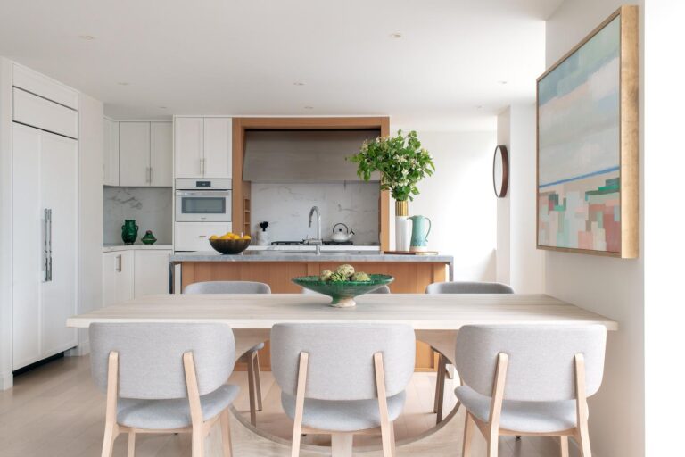
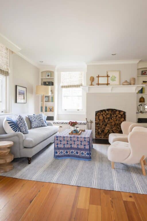
To begin, Meszkat used a liberal dose of paint, wallpaper and new textiles in every room. To unify the space, she weaved a theme of using the homeowner’s favorite color: an “is it blue, is it green?” shade of teal and mixed in various shades of blue and green throughout the home. The family room and breakfast nook were painted light, bright neutral colors. A new sofa, chairs and rug modernize the space but since they had trouble finding the perfect new coffee table they decided to keep the one they had and make a fun new skirt for it to bring in some blues. In the breakfast nook, she used the table the family already had. Then, she designed a built-in upholstered bench and bought new chairs in the same blue so it fits seamlessly into the space.
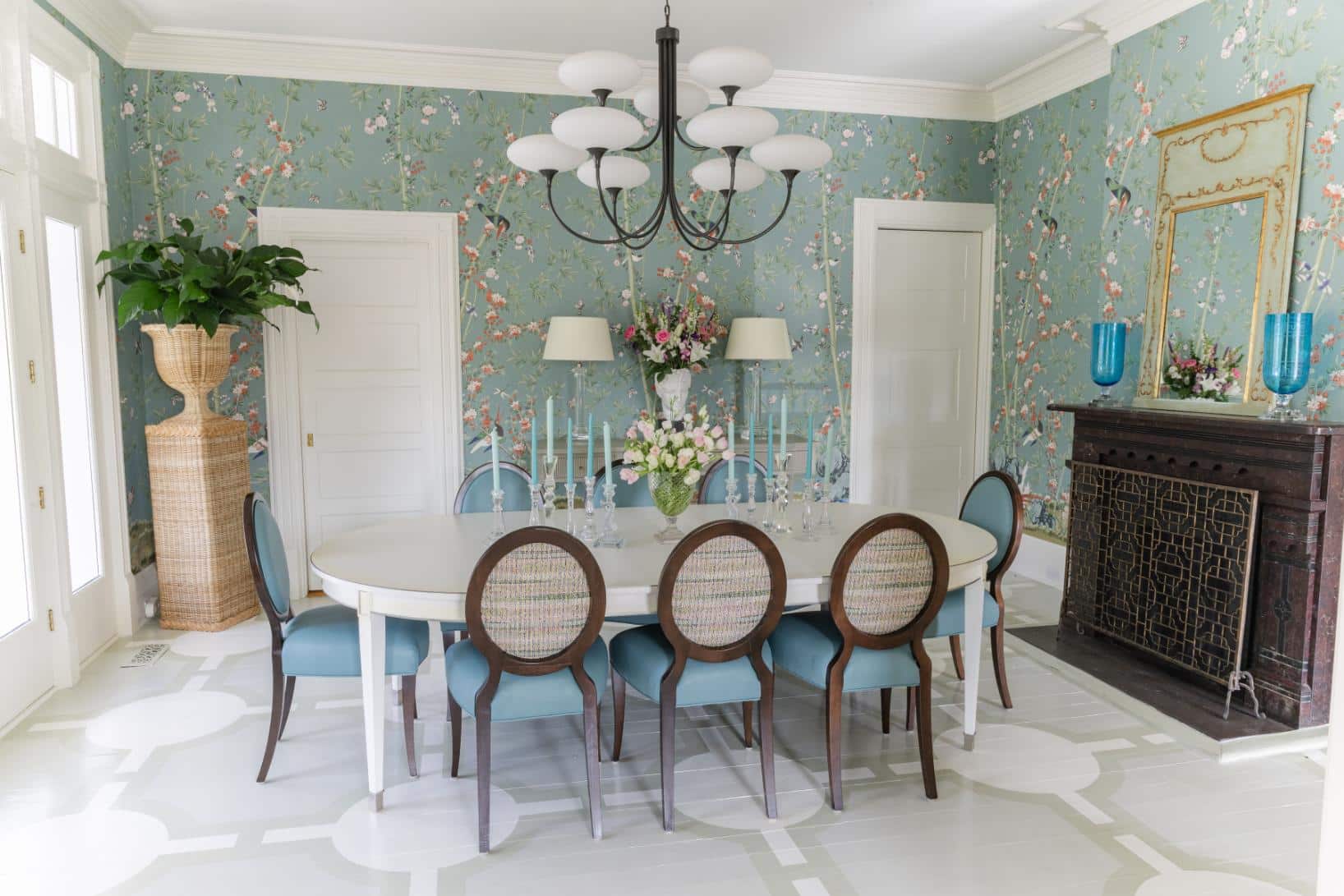
The dining room was wallpapered in a floral print by Miles Redd for Schumacher. “It’s a Victorian and it’s a historical home in Rye and in the old days they would make their dining rooms purposefully look like the outdoors so you would feel like you were eating in a garden,” says Meszkat. “It was a popular thing to do. I said, ‘Let’s make this room look like the outdoors because you do pass right through to your backyard.’ It has that effect and it pay homage to the house and the time period.”
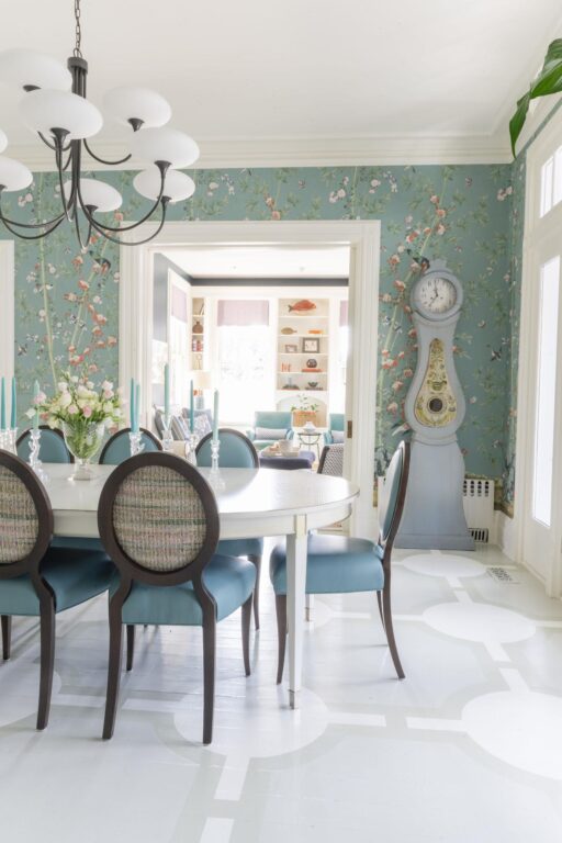
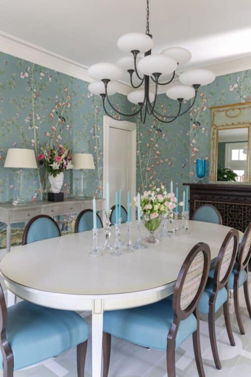
She kept the dining table and a console the couple already had and reupholstered the chairs in a custom fabric. The floor had been painted white so Meszkat brought in Shelly Denning of Connecticut who hand painted the dining room floor with a new trellis pattern. She moved an antique grandfather clock the couple already owned into the dining room where it was better suited. Then she selected an oversized chandelier to give the space a wow factor. “It was chosen to look like something you would see outdoors,” she adds.
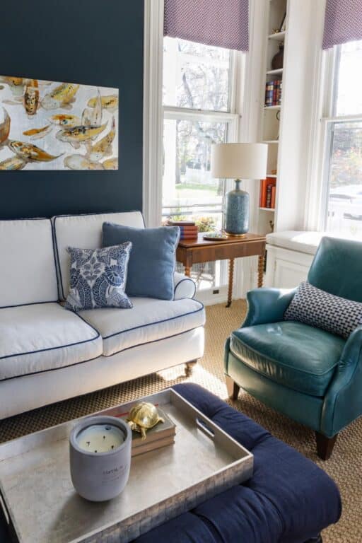
In the den, she kept a pair of turquoise leather chairs and reupholstered a sofa in a crisp and chic neutral with contrasting piping. “The dark and moody hue of the walls speaks to the brighter aqua of the dining wallpaper,” says Meszkat.
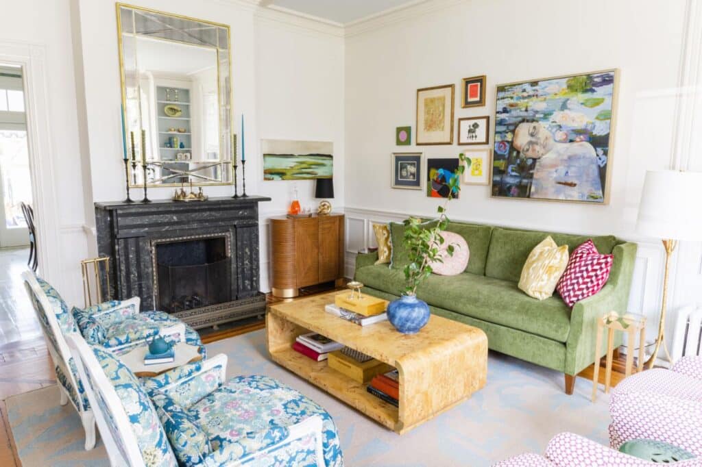
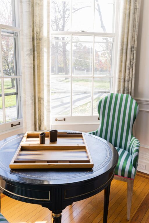
The living room is a rainbow of color to reflect the family’s fun and eclectic personality. All four chairs are vintage and reupholstered. The rug was cut down from a rug the family already had. The game table is vintage and brought in from the family’s other home. Meszkat curated a gallery wall of the clients’ own art and photos and mixed in a few new pieces. “We kept the aqua thread going and added a thread of pink,” she says. Despite the numerous colors in the room, weaving in a thread of pink throughout unifies the space. “It’s like a puzzle. We keep tying things back to each other. You can introduce as many colors as you want, as long as you keep one thread,” says Meszkat.
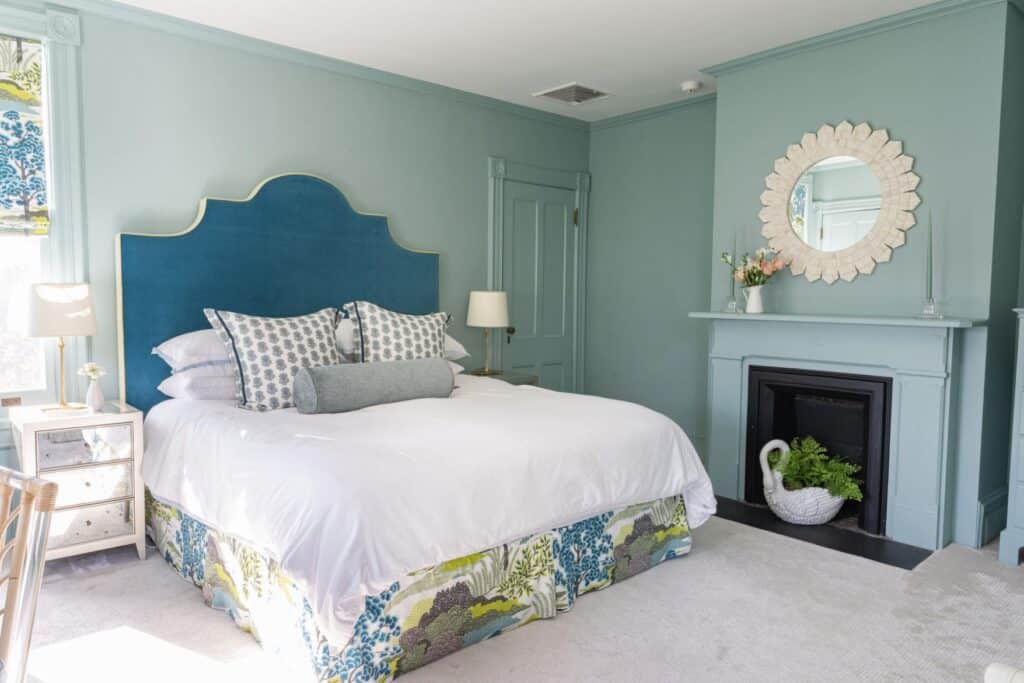
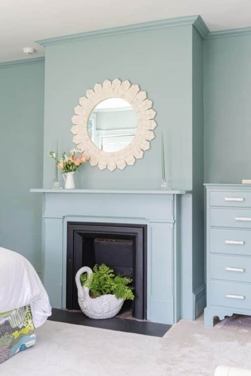
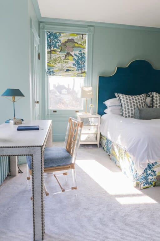
In the primary bedroom, there were a lot of windows, corners and moldings typical of a Victorian, so Meszkat wanted to quiet down the space to give it a serene feel. She painted the room and all the trimmings the same color. Then she painted one dresser the same color as the wall. A custom upholstered headboard coordinates with the custom shades and matching bed skirt. She kept the details simple and understated, selecting white or off-white for the comforter, mirror, nightstand and other accent pieces.
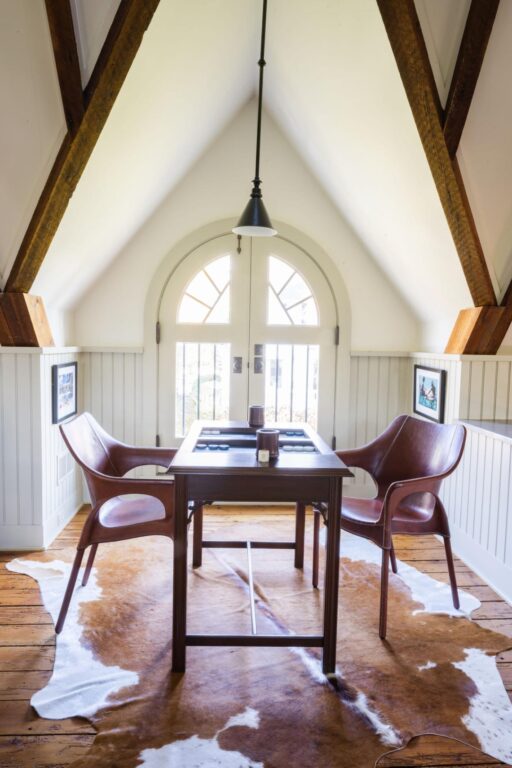
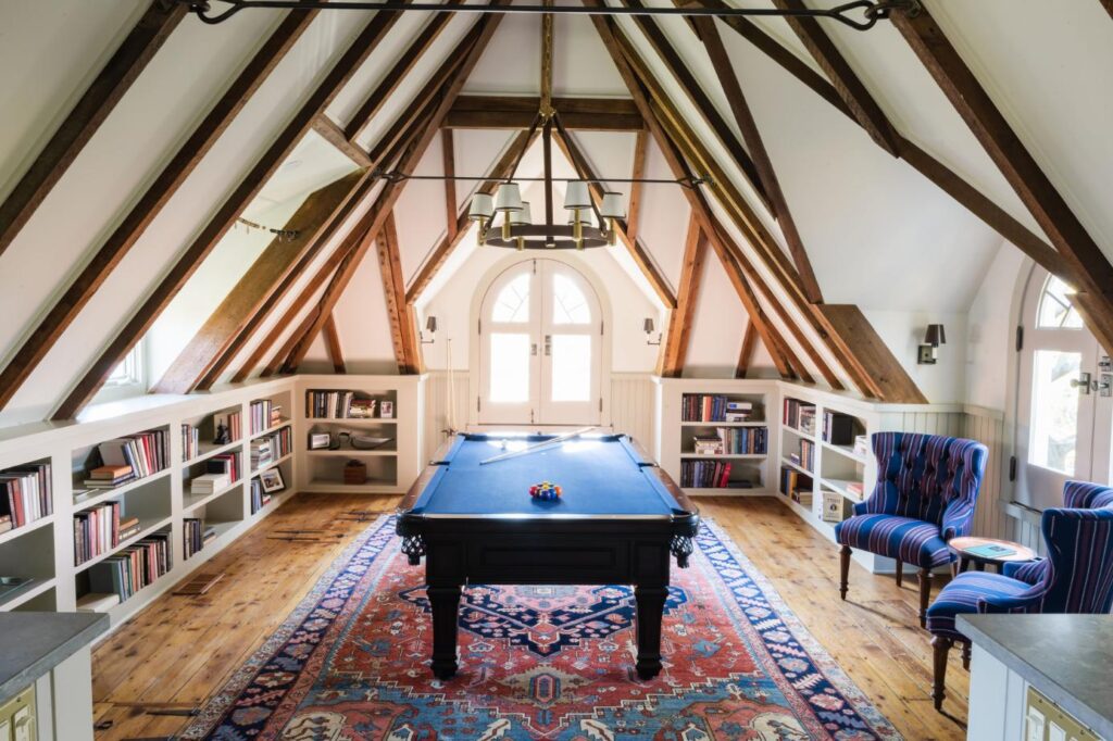
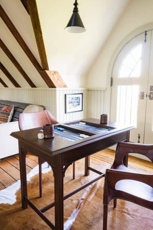
On the third floor, Meszkat really highlighted the beautiful hardwood floors and wood beams in that space by keeping bookshelves white and minimizing furniture. A vintage pool table is the focal point here. She reupholstered side chairs in a fabric that echoes a man’s smoking jacket. A vintage Hariz rug from Upstate Rugs frames the space. All elements weave in shades of blue-green—even the pool table donning navy blue.
It’s a common misconception, says Meszkat, that people expect reusing furniture they already have is inexpensive, but, she says, don’t do it to pinch pennies. Oftentimes, reupholstery and refinishing can cost as much as buying something new. And where you do save money on new furniture, she advises, it’s best to invest it back into other details that will give your design a wow factor, like wallpaper or a spectacular chandelier. But the benefit of reimagining pieces you already have comes in the finished results. “Vintage finds are usually way better construction,” says Meszkat. “It’s not fast furniture. If a chair has lasted 50 years, there is a reason, right?”
GET THE LOOK
We got inspired by Emily Meszkat’s vision for this upcycled Victorian using vintage and family heirlooms. Here are a few one-of-a-kind vintage, antique and new pieces that take a tip from her colorful aesthetic that blends past and future seamlessly.
-
 Brighton Pavilion Panel in Peacock
 -
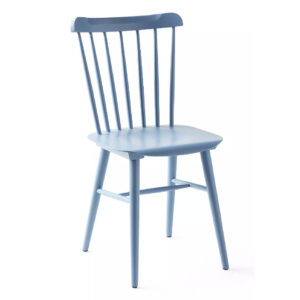 Tucker Dining Chair$298.00
 -
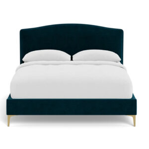 Celia Upholstered Bed$1,645.00
 -
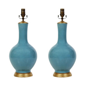 Pair of Blue Chinese Export Lamps$1,800.00
 -
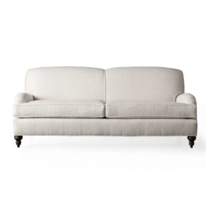 Granby Sofa$5,399.00
 -
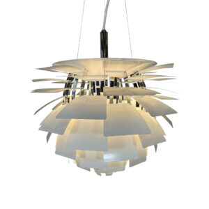 Louis Poulsen PH Artichoke Suspension Lights$6,525.00
 -
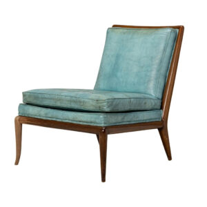 T.H. Robsjohn-Gibbings for Widdicomb Furniture Co. Blue Leather Slipper Chair$9,500.00
 -
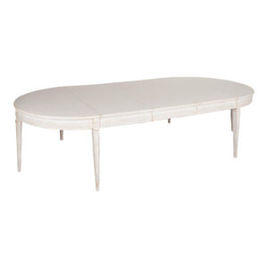 White Oval Dining Table With Three Leaves, Sweden Circa 1860-80$14,200.00
 -
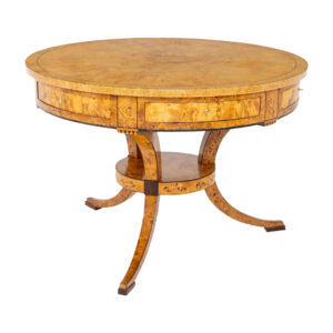 Biedermeier Game Table in Birch, Baltic States, early 19th Century$22,000.00
