When you live in Manhattan, sometimes a summer home in Nantucket isn’t enough getaway from all the hustle and bustle on the streets. You want the apartment you come home to day in and day out to provide an equal (maybe greater) amount of Zen. Neutral colors like beige, cream, white and gray can be soothing but also boring. When Prudence Bailey’s client wanted a neutral scheme for her family’s Upper West Side home, the color maestro knew just the right palette to make the space feel calm and “colorless,” but not vanilla. “She wanted me to bring in my love of pattern mixing and texture to a neutral space,” says the founder and principal designer at Prudence Home & Design.
The main living spaces are all open to one another and Bailey wanted to design something that looked cohesive but also gave each space its own identity. For this space, going neutral meant tapping into earth’s natural beauty with leaf and bark references and some earthy metals. “Nature really inspires me,” says Bailey.
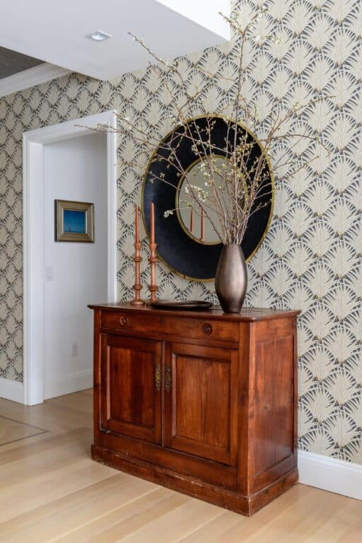
In the front entrance, which opens to the living room, she chose Zenada, a beige, leafy wallpaper from Schumacher, with blues, browns and grays to pick up on the different neutral hints of color in the gray media cabinet.
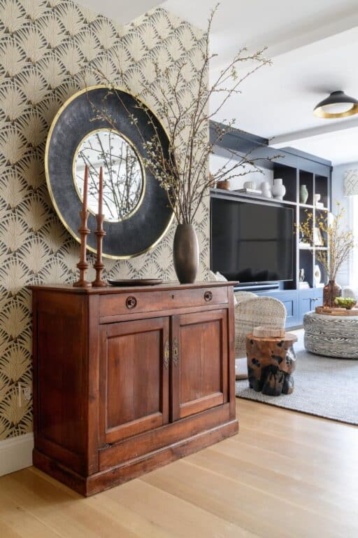
All the walls were painted in Benjamin Moore’s Chantilly lace—a clean and modern but warm white—that unifies the space. In an apartment you need a lot of storage, so she designed a custom built-in media and storage cabinet for the living room area. Bailey’s client loves displaying decorative items she has collected but didn’t want a cluttered look. Bailey chose Benjamin Moore’s Wrought Iron for the cabinetry—a very dark gray with blue undertones and lots of depth. “It’s such a great color because it can look very different in different lights,” says Bailey.
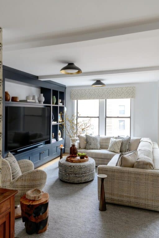
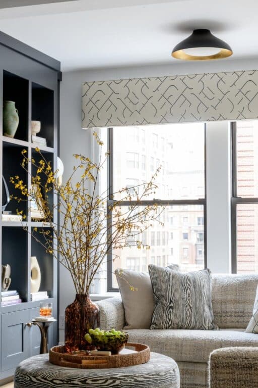
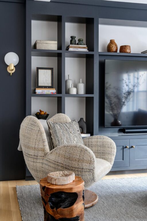
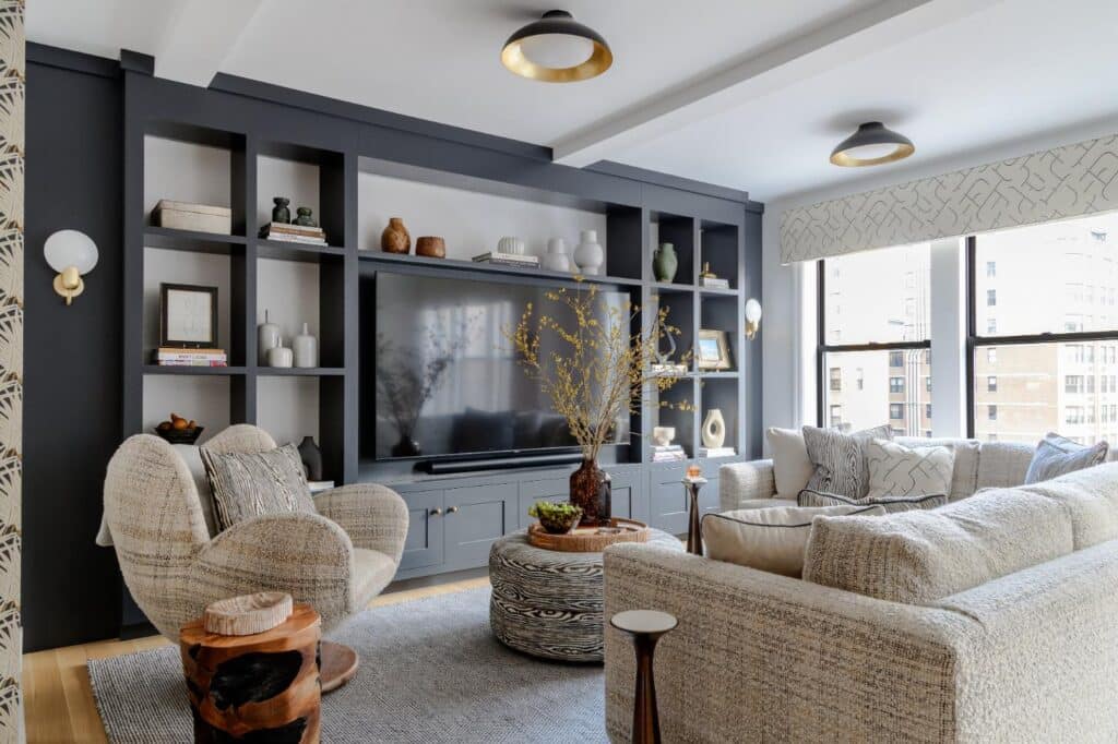
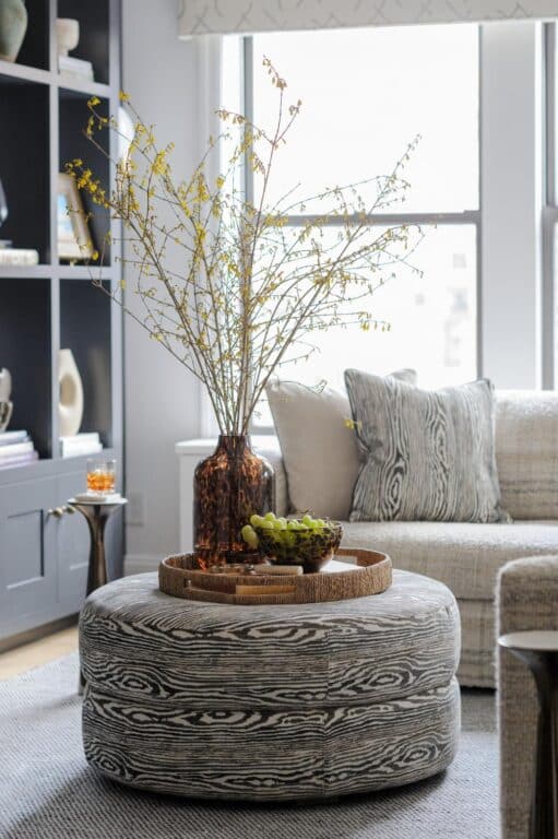
“They wanted their living room to be cozy but also stylish to entertain,” says Bailey. “They didn’t want to have to pickle that room.”
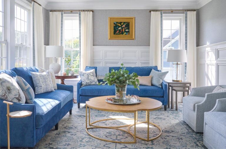
Furniture from Verellen is in a neutral beige with a faint plaid pattern in a rich textured bouclé called Karmin. She selected the largest sofa she could fit through the door to maximize seating and comfort. Faux bois patterns on the pillows and ottoman, a natural wood end table provide lots of texture and give an elevated look. “You have to be careful when you are mixing patterns that you don’t make it look too busy,” says Bailey. “It has to feel cohesive, so I was super intentional with how I did that. I don’t always repeat the same pattern on a sofa and chair, but I did here because it’s a smaller space and the fabric is really textural.”
Forsythia branches in a blown glass vase and gold and black accents, including light fixtures and a mirror, are modern and neutral touches. Beige and dark gray fabric cornices are a twist on a traditional décor element that looks clean and modern.
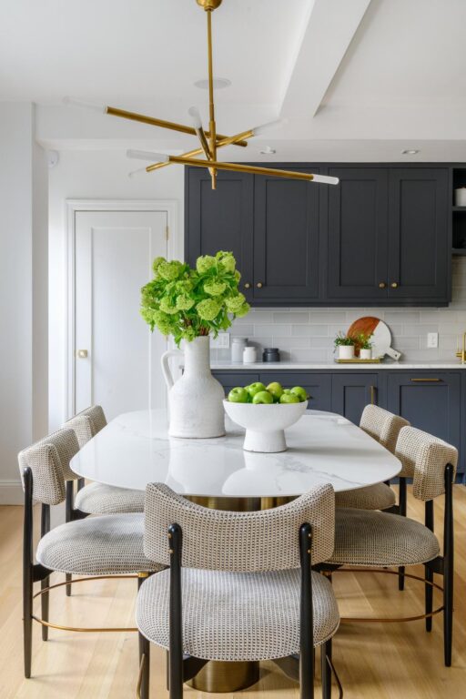
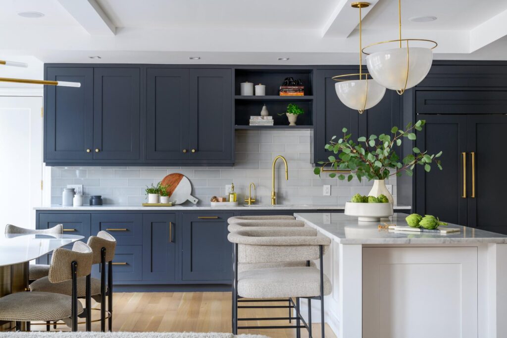
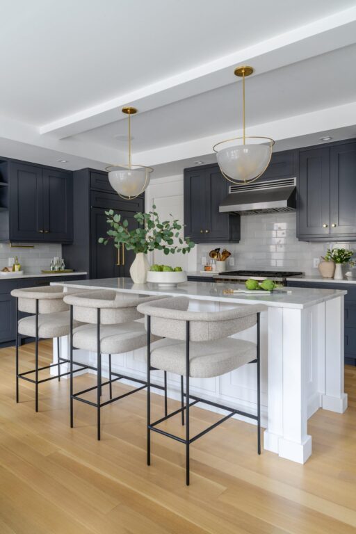
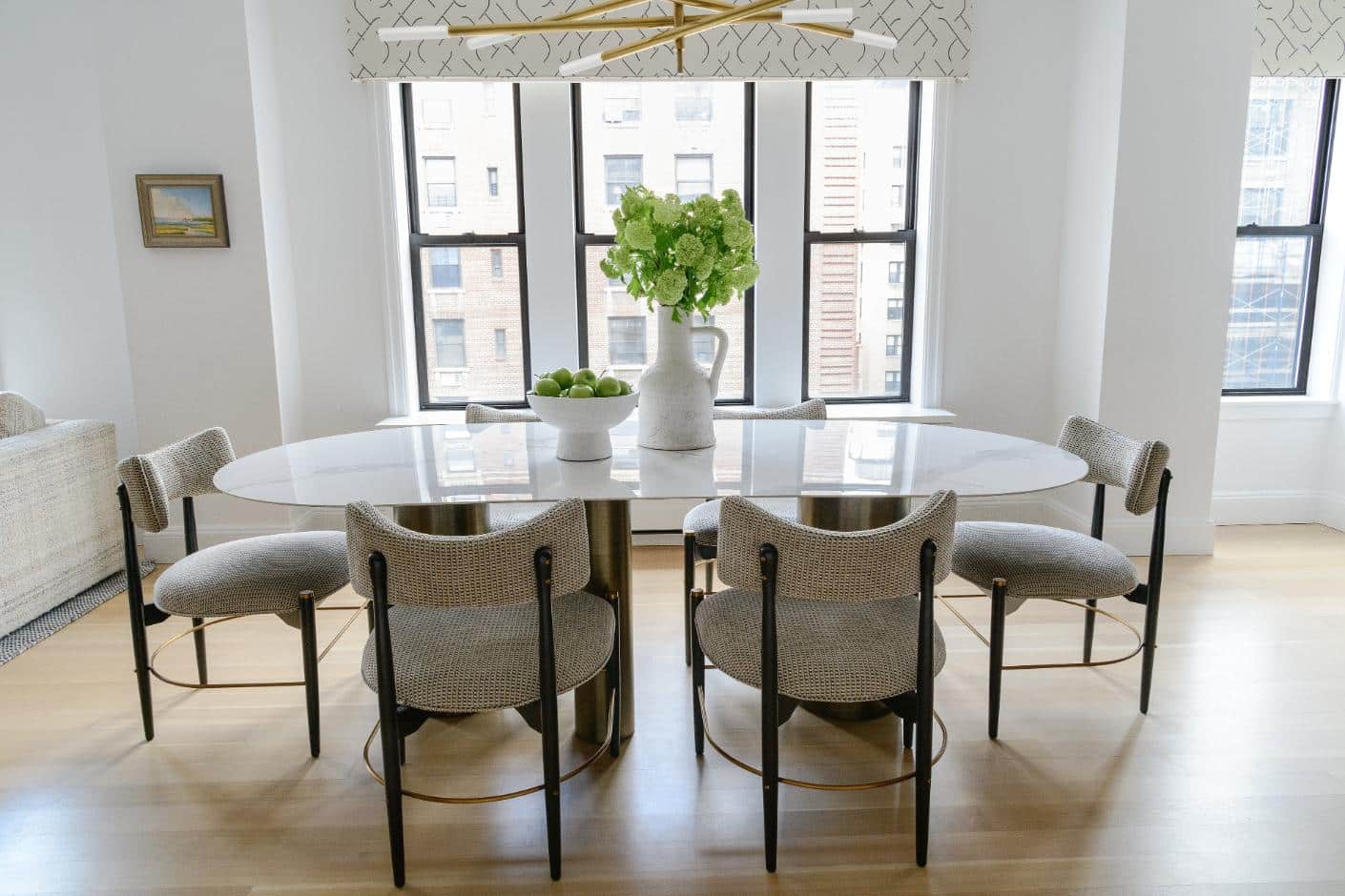
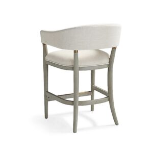
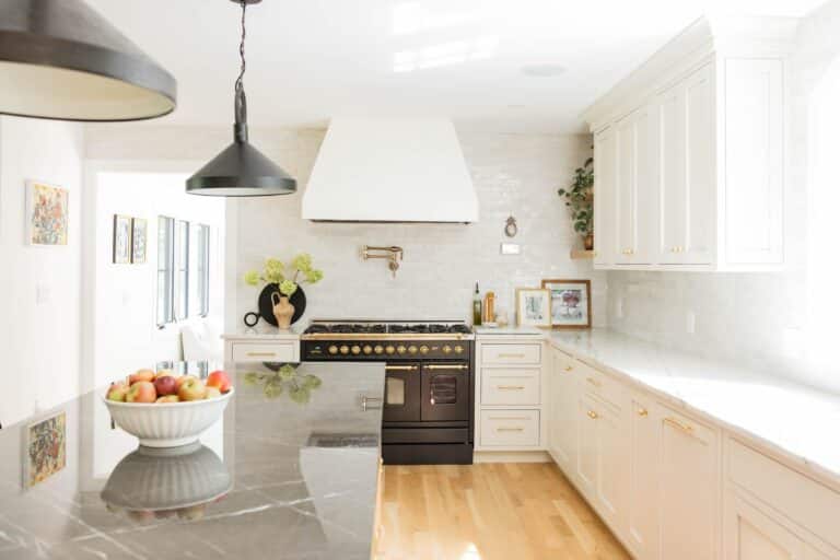
The trend of totally white kitchens has fallen by the wayside, but Bailey wanted a clean and neutral palette here as well. She kept the space unified by doing the same Wrought Iron paint from Benjamin Moore on the kitchen cabinets. Paired with snowy subway tiles on the backsplash, a white island, white quartz countertops and textured fabrics on the stools by Four Hands, there is just enough color in the space to add visual interest. Gold hardware adds a touch of shimmer. The dining table would be used for formal and informal dining alike so she selected a modern marbled table and mid-century chairs. “I think you can have a sophisticated design that still feels welcoming and says, ‘Come sit down and stay awhile. Let’s have a cocktail,’” says Bailey. “We fell in love with the light over the table from Kelly Wearstler. It’s just super cool and really anchors the space.”
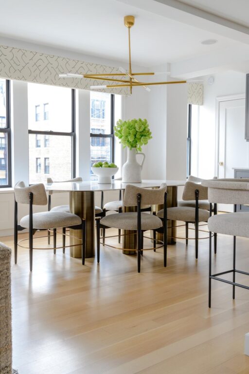
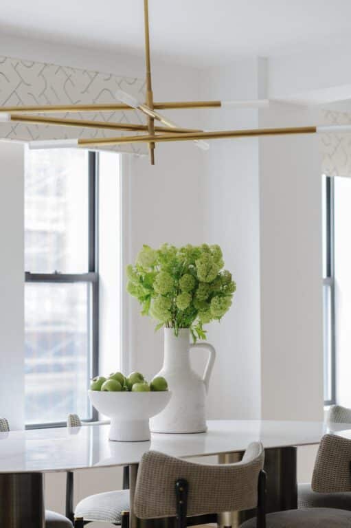
When designing a neutral space, says Bailey, select thoughtful details with visual interest but not so many that they are drowning each other out. “When you look across this room, there are a lot of cool things to look at, but they are not competing for attention,” says Bailey. She advises clients to not try to overcompensate for neutrality with “too many stars.”
A soft bedroom
“There is a fair amount happening in the bedroom but the wallpaper by Lewis and Wood is the star,” says Bailey. The sculptural lamps with scalloped mirrors are a complement to the upholstered bed in a textural beige. Linen Roman shades soften the windows and provide privacy.
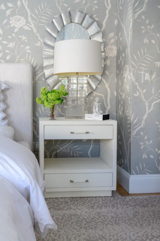
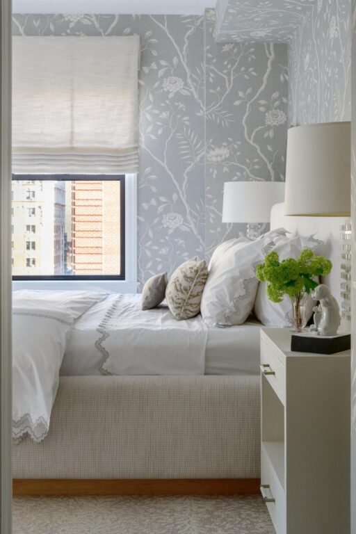
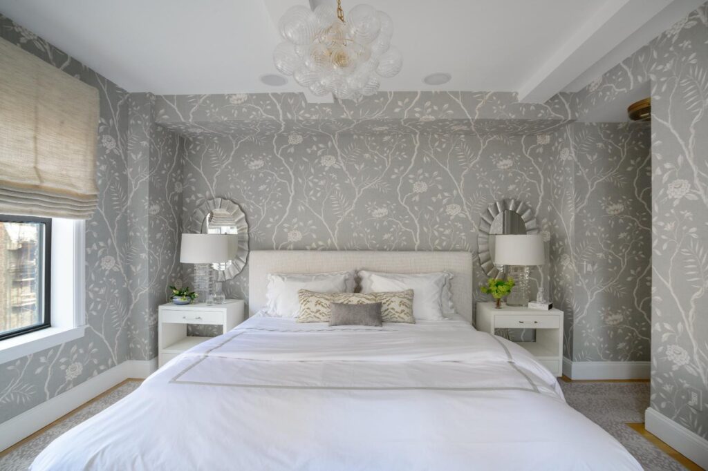
The rug, from Stark, is a bucolic print called Bali, which looks like a tree repeated and continues the theme of picking up elements from nature to accent the space. “I always feel like nature shows you the way,” says Bailey. “If you just look around you can be so inspired and bring it right into your space.”
GET THE LOOK
Photography by Stephanie Kossman
