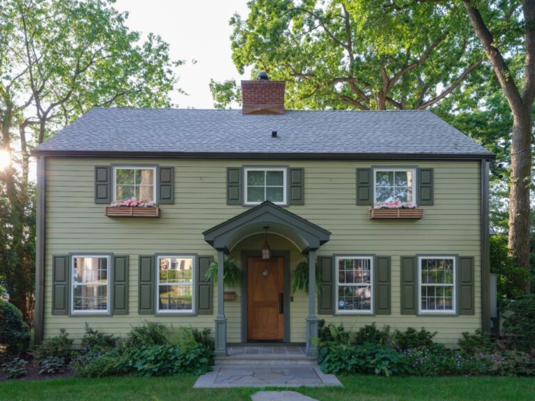
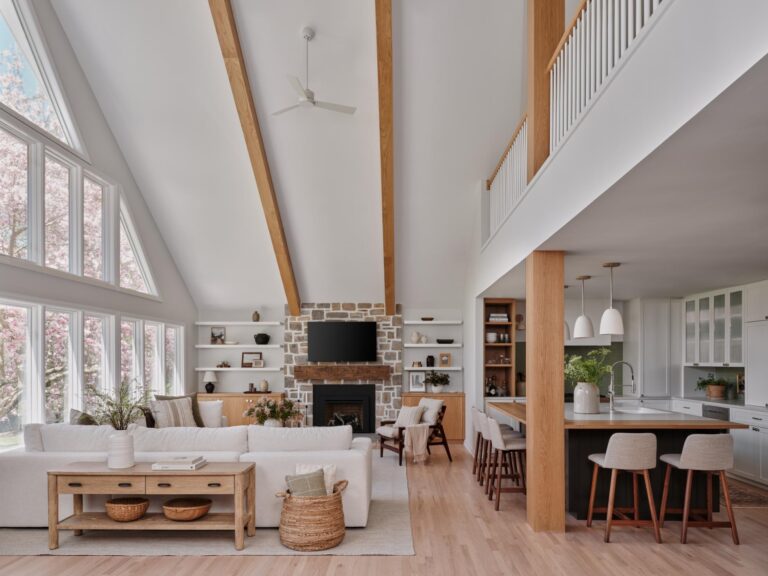
When the owners of this classic colonial on a quiet cul-de-sac called on Barrett Oswald to design the interiors of their peaceful home, they wanted to bring the serenity of their lush green property indoors. Oswald designed spaces that are simple with understated elegance and family functionality that complement the gardens beyond.
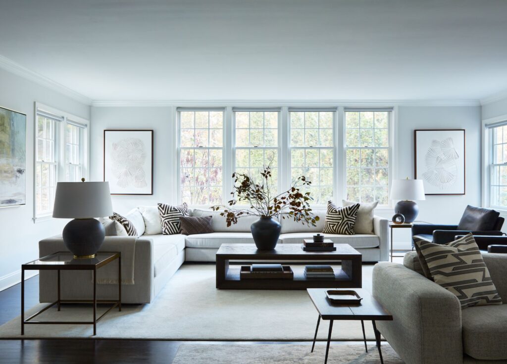
In the entry way she chose a simple farm style bench and accented it with a few modern details like a pair of end tables and a white vase. Oswald mixes a series of vessels and vases throughout the décor with neutral colors and lots of interest. In the living room, views of the garden take center stage but Oswald creates multiple nooks that provide places for conversation and focal points of interest with details that draw the outdoors in. While Oswald sticks to earthy tones, she mixes shapes and textures with geometric pillows, spherical lamps and a rectangular coffee table.
“The living room is quite large so we had to incorporate different seating arrangements to effectively fill the space without compromising cohesion and intimacy,” says Oswald.
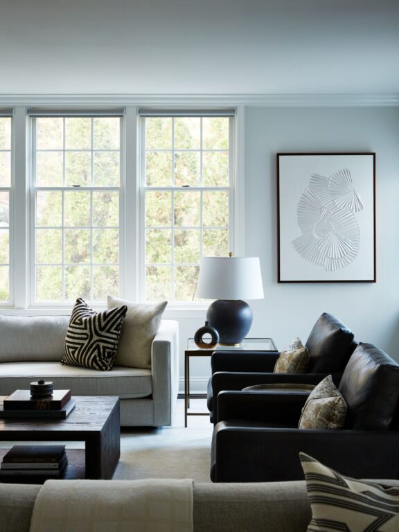
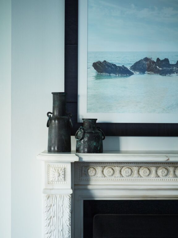
The finished look has depth and draws you in while still feeling open and airy.
“We love mixing materials and styles, which is particularly apparent in the dining room,” says Oswald. “The dramatic asymmetrical chandelier is playful and a bit unexpected when paired with the more streamlined dining table and chairs.”
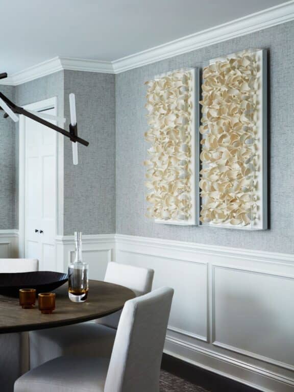
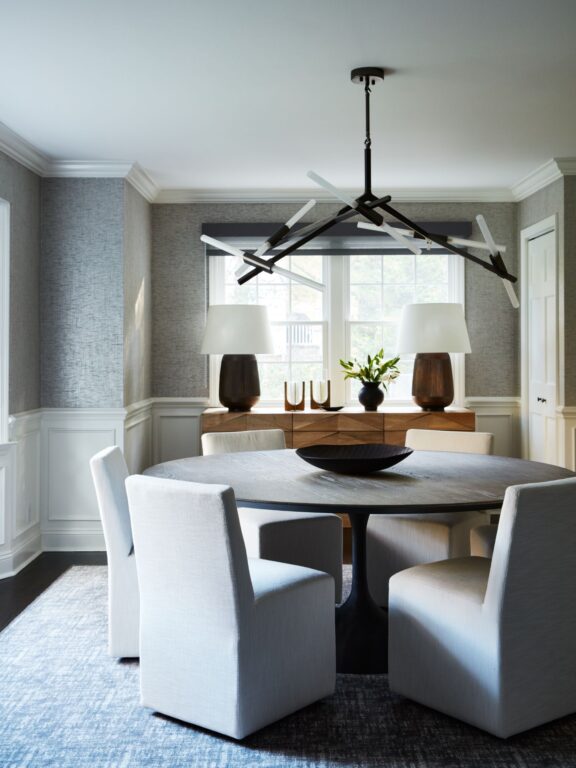
Accents and artwork are key to adding depth to any design, advises the designer. She worked with her clients to select the artwork for each room. “Art is incredibly subjective, so we are careful not to push a particular style on anyone,” says Oswald. “Once we know the style that speaks to our clients, we work within that genre to suggest pieces that complement the room’s design.”
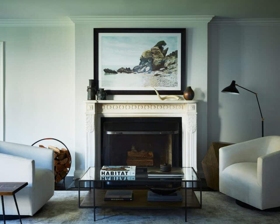
For this project, art was critical to making a simple design feel serene but not simplistic. “Several of the art pieces we incorporated in this design have dimensional elements that add increased layers of interest to the space.”
Photo Credit: Tim Lenz

