Let’s be honest, pastels are always a thing. Perhaps it’s their noncommittal use of color that emboldens us to embrace them, or their softness that envelopes you like a warm sunrise or a favorite sweater that makes us keep coming back to pastels. But this year, after a long score of whites and neutrals being the front-runners, and a post-pandemic dip into deep jewel tones, pastels have returned to runways and hallways in a big way. “I don’t want to say their trending because, like we said, they’re sort of classic, but there’s been a resurgence, especially with these warm soft peachy pinks and soft neutral blues with a softer gray undertone to them,” says Greenwich, CT-based Interior Designer Amy Andrews. Versatile and easy on the eyes, pastels also just so happened to be the perfect palette for Andrews’ clients, who just renovated their first-time home—a coastal cape in Riverside, CT.
With a baby on the way, Andrews’ young clients didn’t have much time to redesign the coastal cape they bought for their growing family, but they were bringing it down to the studs, residing it, and replacing the roof, windows and landscaping as well. Andrews helped them reconfigure the space, opening walls between the dining room and living room, removing some walls, and creating a proper mudroom and entrance. “We wanted to keep the 1950s cape aesthetic, with modern amenities,” says Andrews.
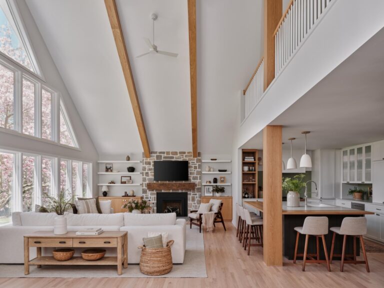
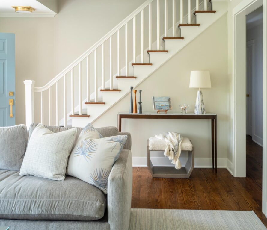
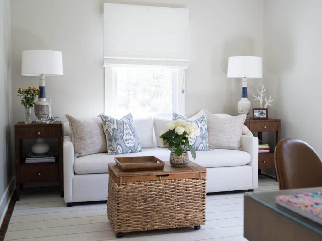
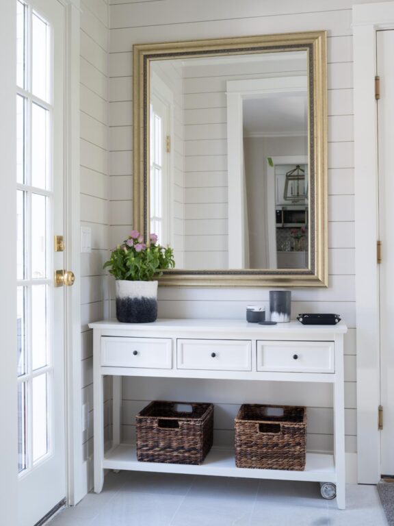
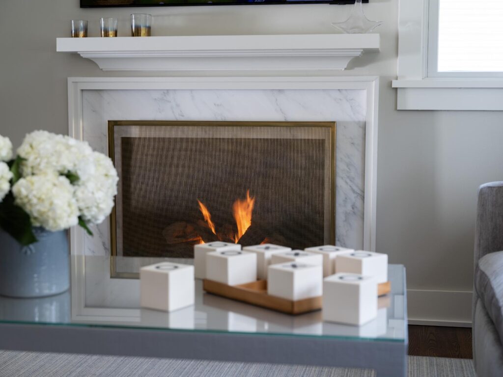
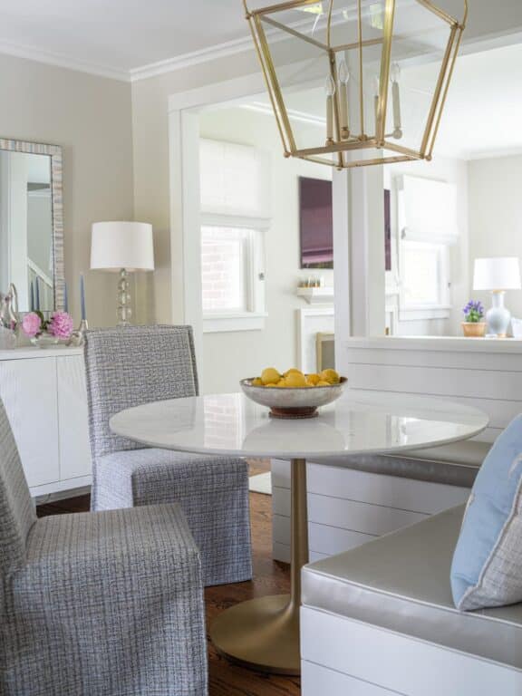
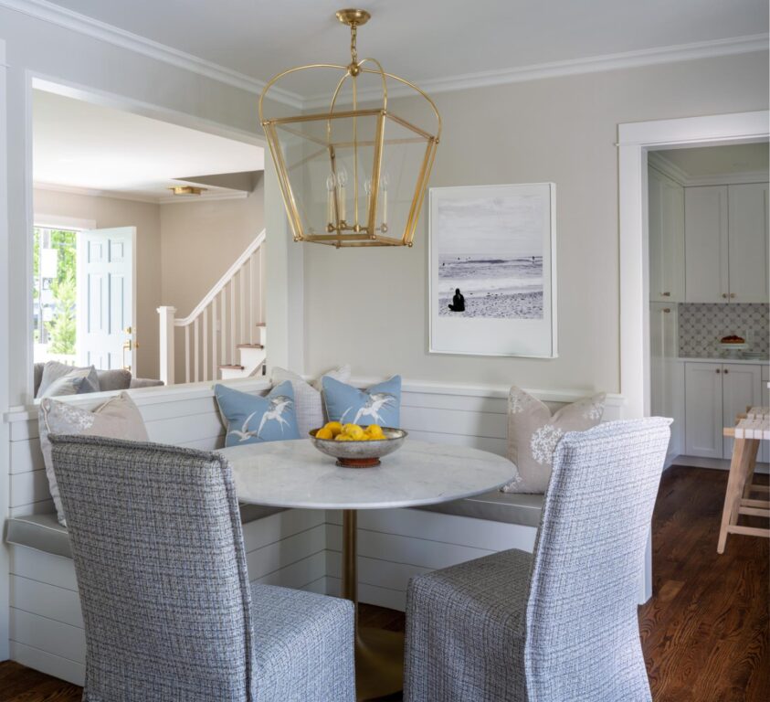
Shiplap white walls in the mudroom and dining room bring a coastal vibe into the space and keep things casual. Since the living room was going to be opened up to the dining room and they were keeping their living room rug, Andrews used the colors in the rug to set the color scheme for the dual spaces. “It’s this beautiful woven flatweave that has blues and grays and creams all woven into it. We picked up some of these colors,” says Andrews. The custom Rowe sofa from Fletcher Wakefield is a soft gray with blue undertone. She paired it with soft and buttery Benjamin Moore Nature’s Essentials on the wall. Touches of gold in the light fixtures, like the brass lantern from Visual Comfort in the dining room, and the fireplace screen from West Elm, up the sophistication. Crate & Barrel Parsons chairs in the dining room are reupholstered with custom slipcovers made of Pollack’s Tokyo fabric, an indoor/outdoor tweed with flecks of light blue-gray scattered in.
To open up the space, Andrews chose a dining nook with banquette in order to shift the dining room seating area to the corner and create more of a walk-through from the mudroom to the kitchen. They designed sliding glass doors and a new deck to further open and brighten up the space. “It not only opened up the entire space to the garden, but gives them really nice indoor/outdoor access for entertaining,” she adds.
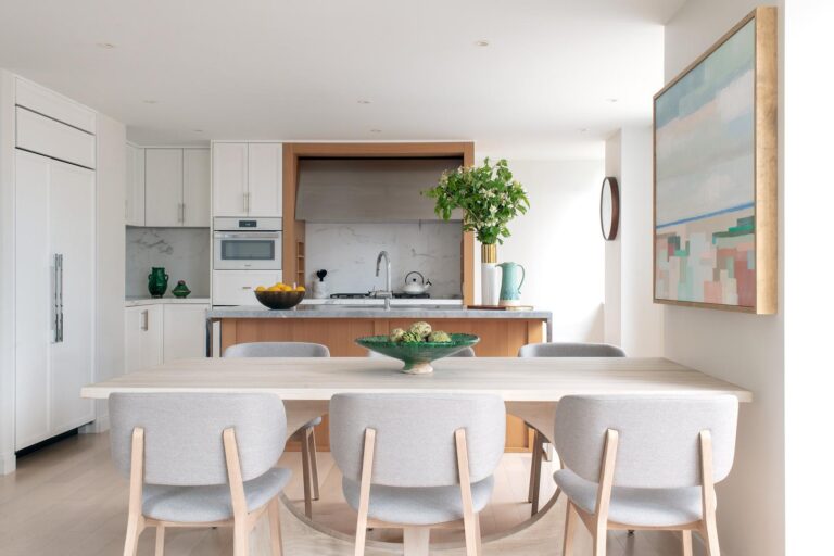
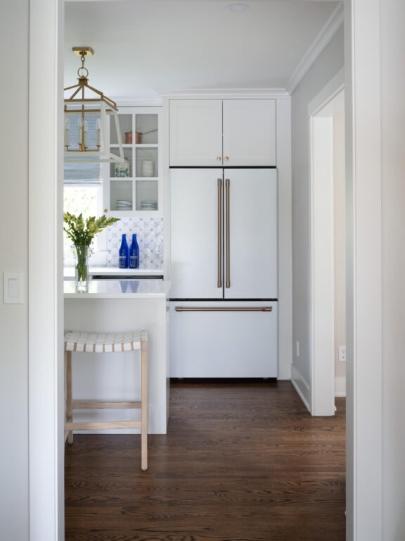
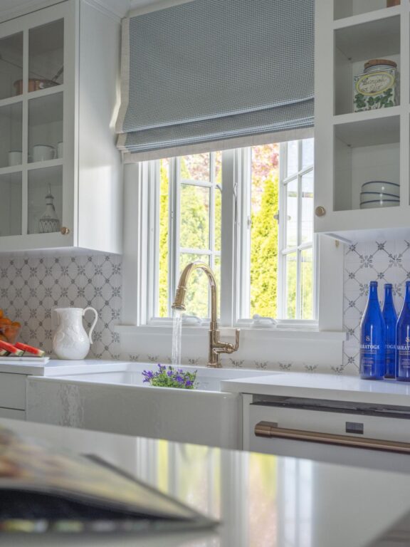
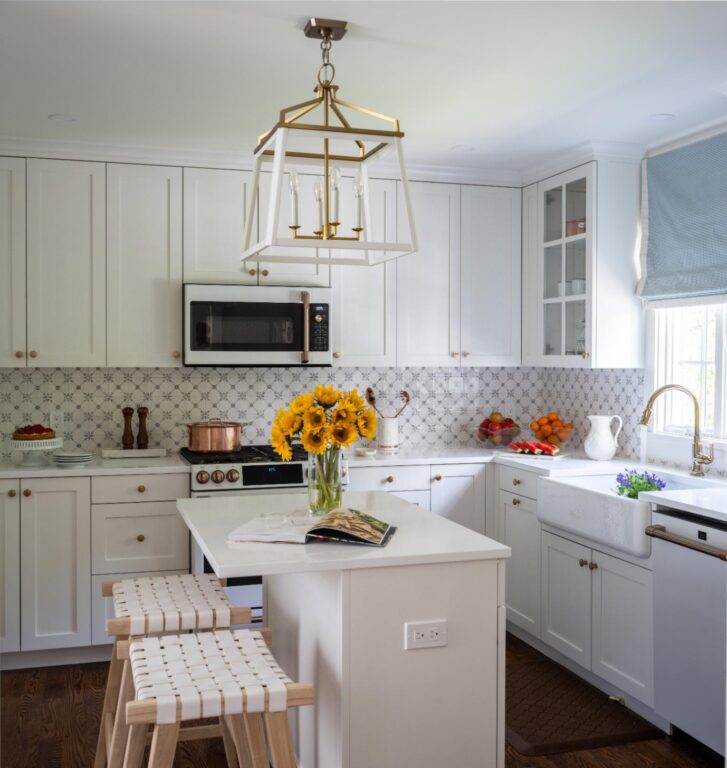
From the dining room, you walk into a bright and cheery kitchen almost entirely in white, except for a soft traditional tile called Deco Flora Meri from Fordham Marble. It has a traditional blue-gray motif. Simple shaker cabinets go all the way to the ceiling to maximize storage. Andrews designed a custom Roman shade in pastel blue from Brunscwig & Fils with Samuel & Sons trim. Classic marble countertops in white porcelain with a straight edge finish the look. “We wanted to keep it light and bright and fresh, but with a nod to the vintage feel of the original house,” says Andrews. “The goal while designing this house was to make it fresh and easy to live in for the couple who was just having their first baby…. I love the way the kitchen came out.”
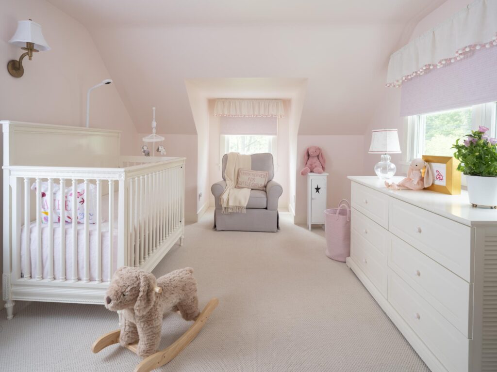
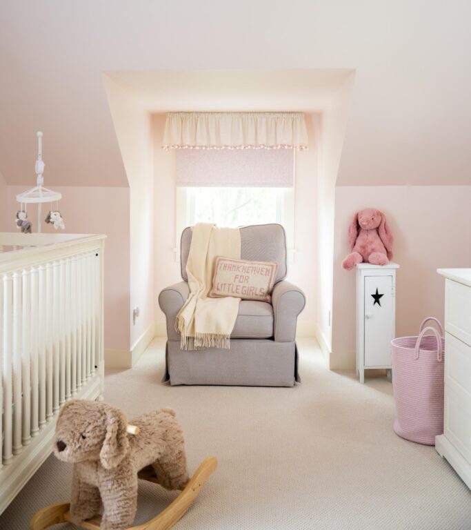
Upstairs, the nursery is enveloped in Benjamin Moore’s Cream Puff pink paired with pink and white patterned shades from The Shade Store and custom valances with pink and white pom poms. “We presented a scheme with the pink and white pom pom trim, which my clients flipped for, and the room evolved from there,” says Andrews. The crib, dresser and glider were given to them from friends, so Andrews repainted the crib and dresser to freshen them up. The dresser was painted with pink knobs to match the walls. On the floor, she chose a wall-to-wall wool blend woven carpet from A.T. Proudian in Old Greenwich, CT, for durability and softness.
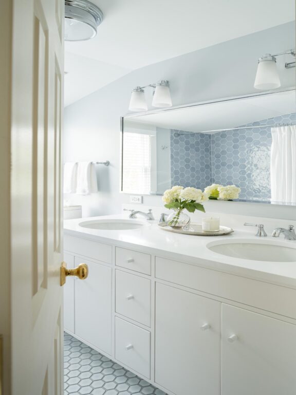
In the bathroom, Andrews chose to pair clean white cabinets with Brisa blue hexagon tiles in various shades of soft blues from Fordham Marble. On the floor, she mirrored them with white hexagons framed in a gray/blue grout. “Blue and white is always classic but the tile on the wall is multi-colored and matte finish in different hues so it is a modern taken on what could have been there decades ago,” she adds.
Like the millwork and tile choices, the soft palette creates a classic yet modern feel for the cottagey cape. “The house had good bones. Opening up and reconfiguring the interiors gave the home a fresh, bright new feel,” says Andrews. “It has a warm, happy, homey feeling.”
Get the Look
If you love the vintage feel of this 1950s cape remodel by Greenwich Interior Designer Amy Andrews, try a few of these décor selects.
-
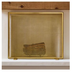 Thin Metal Fireplace Screen$325.00
 -
Product on sale
 Crossnought Tic-Tac-Toe GameOriginal price was: $101.00.$93.00Current price is: $93.00.
 -
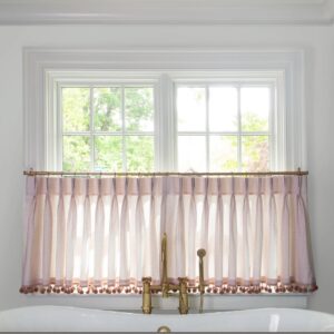 Loomi Pink Custom Cafe Curtain$108.00
 -
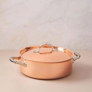 Ruffoni Symphonia Cupra Braiser with Lid$519.95
Photo Credit: Landino