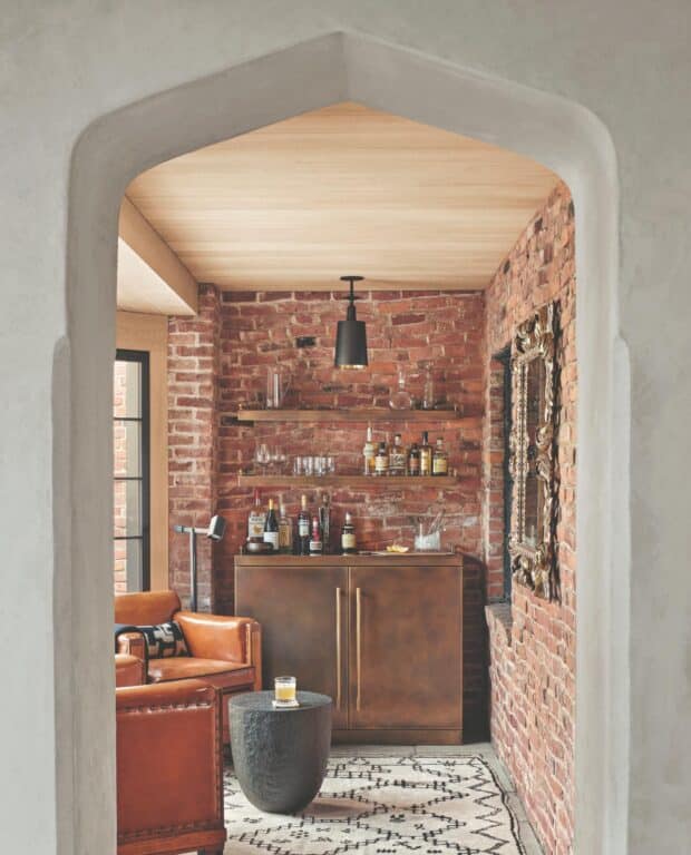
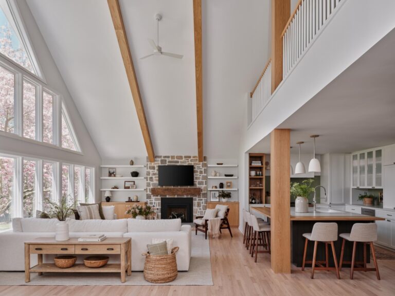
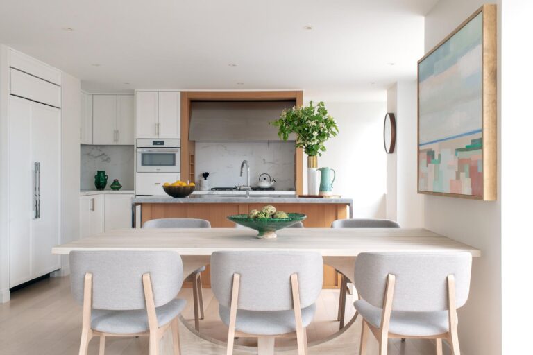
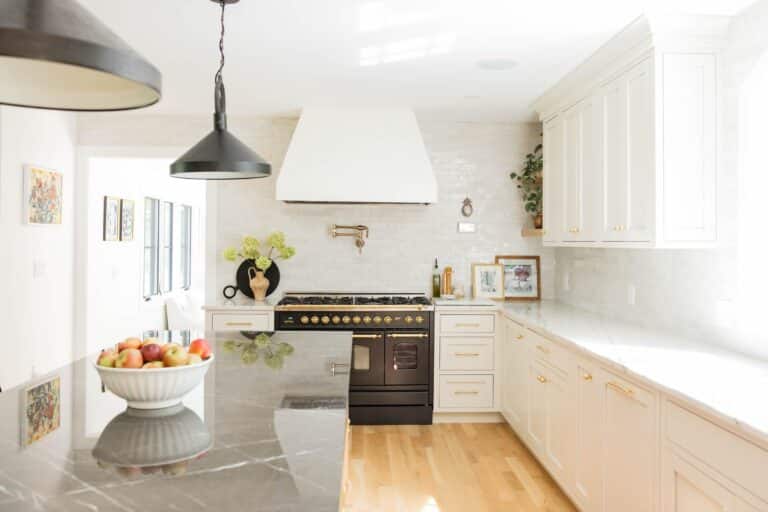
Tudors have a distinctive Old World feel to them, so how do you marry that with the modern aesthetic your client is looking for? Charles Haver and Stewart Skolnick, co-founders of Haver & Skolnick Architects in Roxbury, CT, had to think outside the box to blend their clients’ preferences when they designed this 1931 Tudor Revival. Most distinctive of all the rooms in the home is the kitchen, which blends classic elements with contempo- rary details. They selected lots of natural materials for the kitchen, including antique limestone floors that recall the rustic slate used in the original portions of the house, white oak on the ceilings for warmth—but a brighter version of the traditionally used dark wood in Tudors— and marble countertops. Open shelves, burnished brass hardware and a stainless steel island modernize the space.

For the island lighting they chose a grouping of small glass pendants to give the impression of free-flowing artwork and contrast the symmetrical design of the architecture. In the adjacent sitting area, they used a subtle palette with contrasting textures rather than colors so the two spaces felt united. The custom tufted sofas were made by Grant Trick and upholstered in Opuzen mohair plush. The iron coffee tables are by Gregorius Pineo and the sculptural bronze floor lamps are by Corbin Bronze. “We’re very good listeners and each project is a unique interpretation of our clients’ preferences and goals,” says Haver, who incorporated a few industrial elements the clients love. “We immerse ourselves in every aspect of design in each of our projects: architecture, interior design and landscape architecture.”


Photo Credit: Robert Benson


