Take a look at this carefully selected list of designers who innovate and inspire with every space they create.
STATEMENT KITCHEN
Mare Design
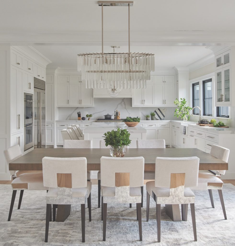
The kitchen is the first thing you see when you walk into this home so it was very important to the homeowner that it make a fabulous first impression. Although kitchens are typically a more casual space, the homeowner loves to entertain so Christin Engh, founder and principal designer of Mare Design, wanted to give the dining area a bit of glam. She merged her Scandinavian-influenced design sense with a bit of glam to create a décor that is truly unique. “A dramatic chandelier over the table represents the client’s personality and bring the wow factor she asked for,” says Engh. The minimalist cabinetry and white palette draws the eye to the beauty of the luxurious lighting. “Details like the dramatic veining in the kitchen backsplash and the luxe accents of the polished nickel lighting help to integrate the kitchen and dining spaces with a cohesive palette that takes it to the next level,” says Engh. “These details also pop against the clean white backdrop in a way that allows you to appreciate them more fully.”
INSPIRATIONAL PALETTE
Rinfret Ltd
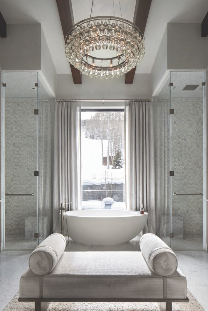
Inspired by the snowy mountain views of this Vail, CO, residence, Cindy Rinfret of Rinfret, LTD designed an elevated primary bathroom that provides a relaxing setting to begin and end the day. The homeowner had worked with Rinfret on a number of homes in the past and returned to her expertise to design a stylish modern mountain escape. A crystal chandelier is the focal point of the room and elegant soft sheers frame the window. “The bath has beautiful mosaic tile that sparkles like the snow outside,” says Rinfret. The organic lines of the bath and curvy bolster pillows on the seating emphasize the architectural symmetry and modern lines of the dual showers. “Oftentimes, bathrooms are an after-thought when it comes to furniture, window treatments and lighting, but I like to take the approach that a bathroom should be designed as a room and not simply a utilitarian space,” adds Rinfret. “The palette here is serene with layers of white that reference the landscape.”
CONTINUITY OF DESIGN
Barrett Oswald Designs
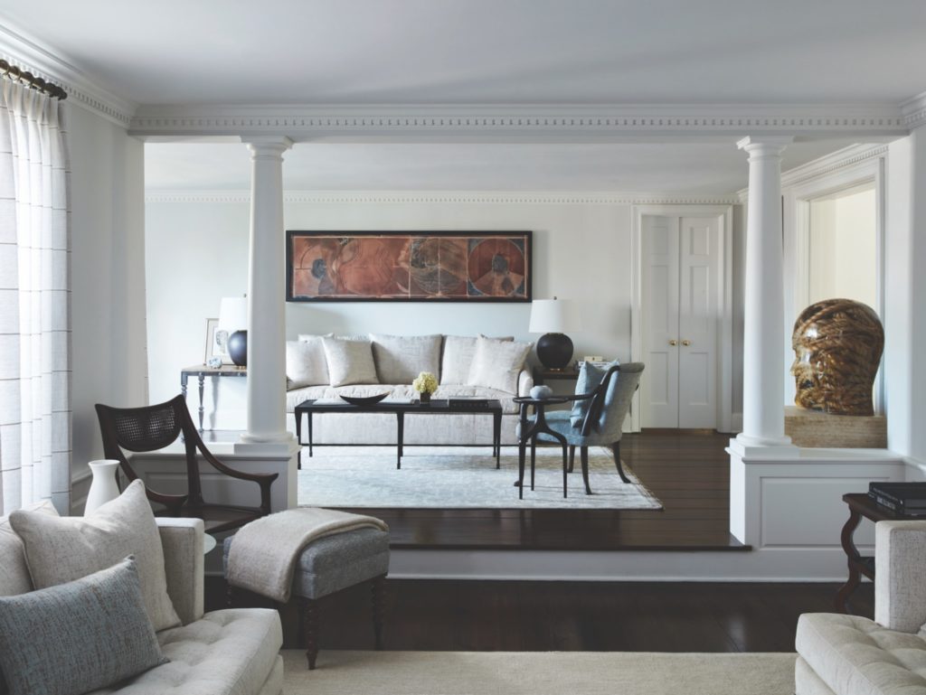
Reimagining an existing space is, in many ways, more challenging than starting from scratch, particularly when a home has nearly a century of history behind it. But in renovating this 1924 classic colonial in Greenwich, CT, Barrett Oswald, principal designer and partner of Barrett Oswald Designs, elegantly weaved the home’s historic charm into its future design. The anchoring element was the owners’ expansive art collection. “We approached the house as a ‘frame’ with its original broad oak floors as a base and detailed moldings as a border,” says Oswald. “Each room combines classic and natural textures such as hand-dyed linens, jute rugs and grasscloth wallcoverings infused with a contemporary color scheme to add interest and dimension to our ‘canvas.’” The final product: a work of art.
MULTI-FUNCTIONAL MASTERPIECE
Carol Kurth Architecture + Interiors
Peter Krupenye 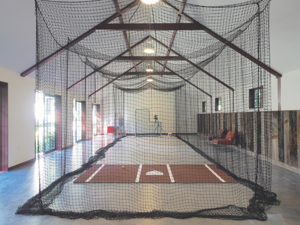
Peter Krupenye
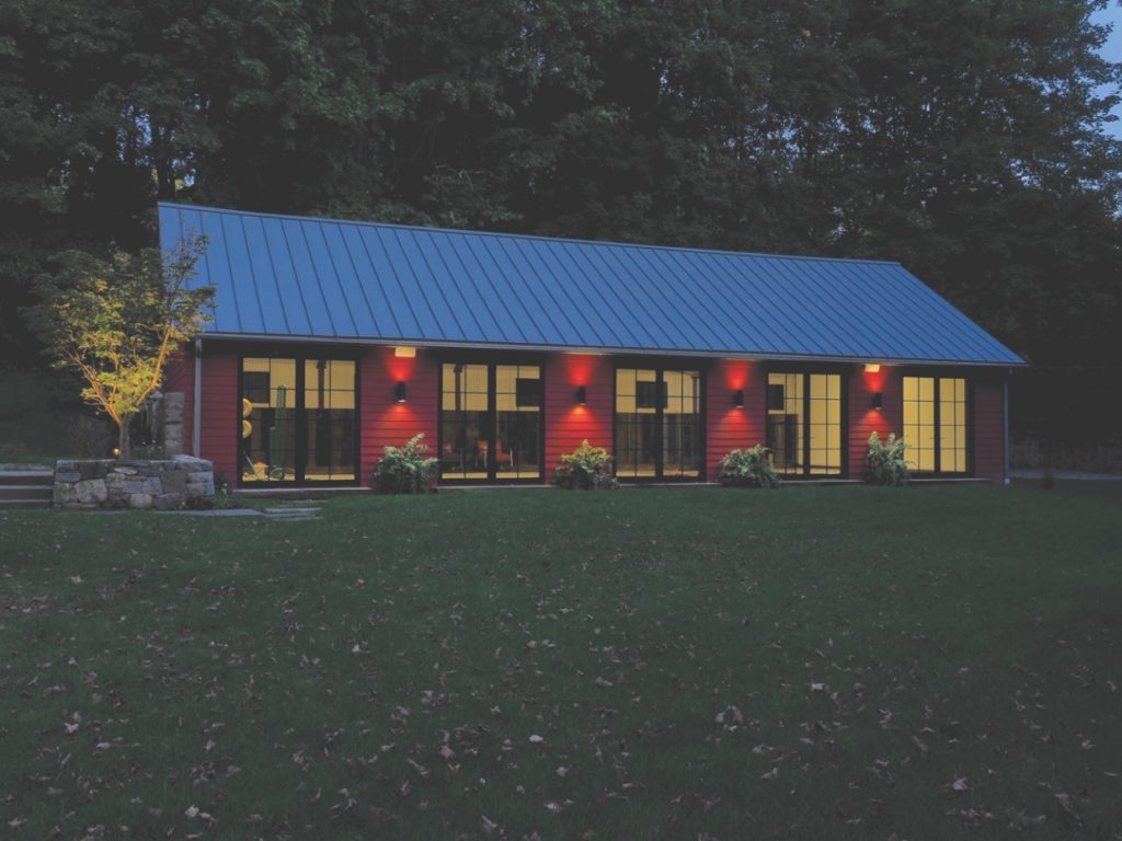
How do you create a multi-purpose space from a deteriorating old barn? Carol Kurth Architecture + Interiors designed this all-weather barn for a family with three children spanning infant to teen and a broad range of interests. “The indoor batting cage is the primary use of the barn,” says Kurth. “However, the plan is open so as to be flexible for multiple activities, from indoor sports to large scale entertaining to arts studio for the clients’ large-scale artwork.” Kurth mastered the design concept by prioritizing context and proportion of the interior and exterior in relation to the main house and other structures on the grounds. The firm preserved the footprints of several existing structures on the property and developed a material palette of reclaimed barn siding indoors, crisp clapboard and standing seam metal roofing outdoors, so the new space integrates seamlessly on the property. It’s all about serving the family’s spatial needs, adds Kurth. “Creating a structure that serves a wide range of purposes might seem a simple proposition, however that simplicity comes with considerable detail and design process.”
MOOD-SETTING BAR
The Lewis Design Group
Marco Ricca 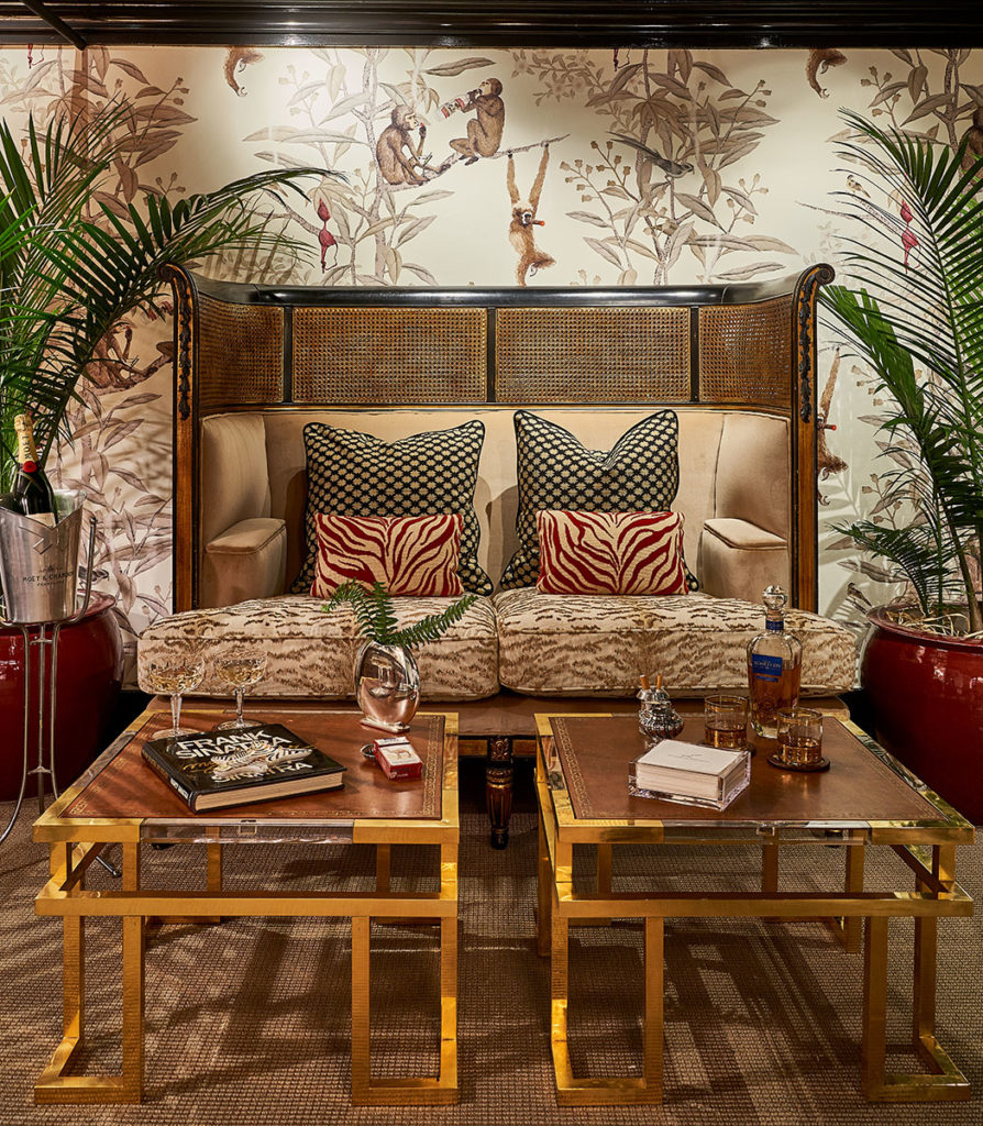
Marco Ricca
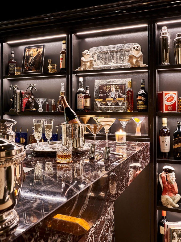
The Lewis Design Group was given carte blanche when designers were directed to transform a sleepy existing bar in this Upper East Side apartment in Manhattan. “Oftentimes the best rooms are the ones where the designer has the space to create something truly unique and exciting,” says designer Barbara Lewis. What better source for inspiration than the glam of the “Mad Men” days of the late ’60s in Manhattan. The homeowners were keeping the bar but Lewis freshened it up with mischievous monkey wall paper that sets the tone for celebrations and a vintage cane banquette from Paris recovered in reds and animal print. Mid-century bar accessories add to the Old New York vibe. “This is a place for those of us that embrace the sentiment that it’s always 5’oclock somewhere, and that life is short and every moment should be enjoyed,” adds Lewis.
SMALL BUT MIGHTY RENOVATION
DEANE
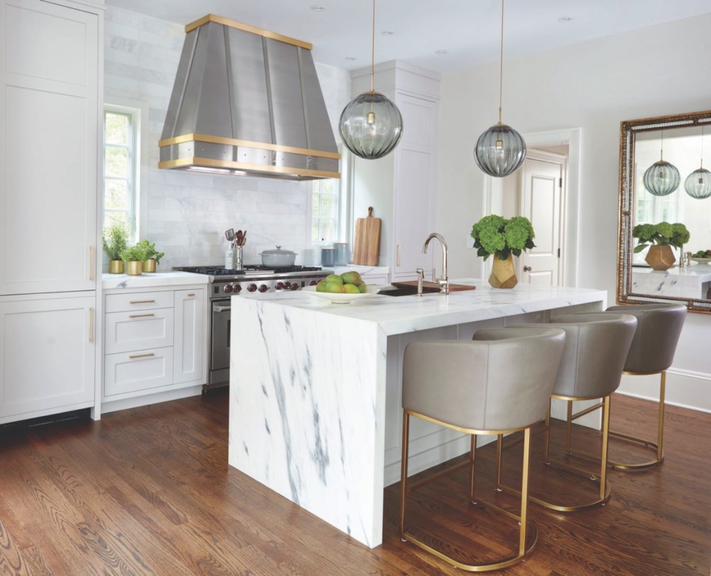
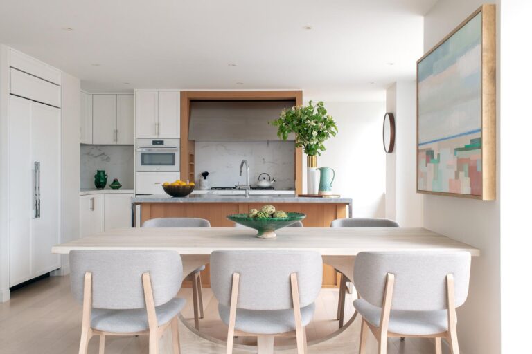
Transforming a small, dated kitchen into a modern jewel with lots of storage and lots of brightness was all about maximizing space. Buffy Goodwin, designer at DEANE, ran the cabinets to the ceiling and made a hood wall a major focal point. Two tall towers at both ends bring the eye up, emphasizing the ceiling height. “Although the space is small, it feels quite grand,” says Goodwin. “This project was an aesthetically important renovation to an otherwise functional but basic kitchen. The clients wanted a modern, serene space.” DEANE hid the appliances with paneled refrigera- tion and freezer columns, mirrored with stacked, flush inset Miele beverage station and speed oven to create a calm elegance. Imperial Danby marble countertops and waterfall edge island are counterbalanced by a backsplash in Dynasty White Italian Carrara marble. Hector Finch pendants in antique brass with gray, hand-blown Murano glass compliment the custom, brushed stainless steel hood, with satin brass and polished nickel rivets.
FORMAL ELEGANCE
My Gingerland
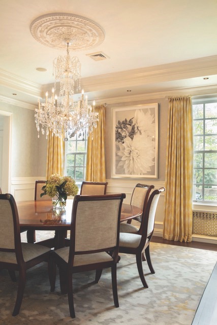
Artist and Designer Monica Lederman, founder of My Gingerland, took her inspiration from her clients’ artwork for this timeless living room and dining room by the water near Manhattan. “The Dahlias” photo by Lynn Savarese in the dining room and “Vessels” by Diane Pollack in the living room, were the springboard for a soft, rich mix of neutrals and color, giving the room “vitality without distraction,” says Lederman. The owners, restauranteurs with establishments in New York, Miami and Los Angeles among other prominent cities, wanted their home to honor tradition while welcoming an active family. “The innovation came in updating their home to feel sensual and inviting and at the same time, creating rooms that are livable,” says Lederman. Rich and textural fabrics and luxe rugs recall the glamour of the couple’s restaurants. “It’s pure NYC sophistication,” says Lederman.
BLENDING FORM & FUNCTION
Herman Miller
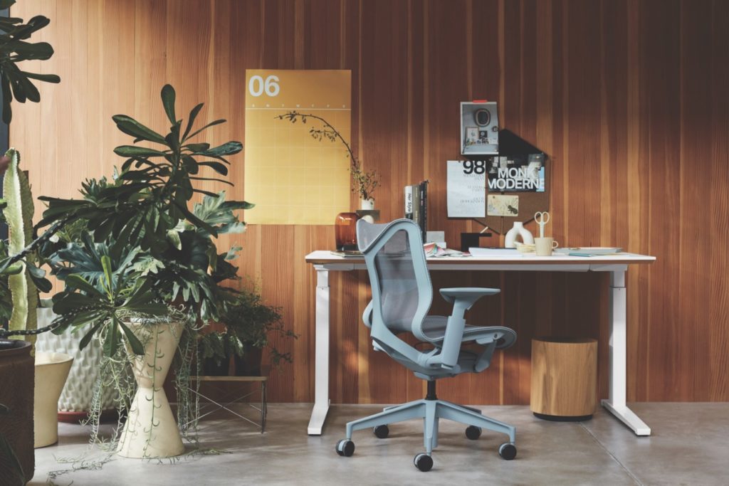
It’s the ultimate goal of any designer to create something that is not only beautiful to live with but enables you to live more fully, comfortably or luxuriously. It is with all these things in mind that Herman Miller created the Cosm chair, designed by Studio 7.5. The completely “dipped” chair comes in an assortment of lively colors and is the first automatic chair that follows natural movements of the human body. An auto-harmonic tilt mechanism provides the ideal tension for feeling supported when sitting upright or relaxed when reclining—as if you are suspended in space. The arms cradle the elbows while still allowing you to pull right up to a table. “The idea was to think about creating a unique experience,” says Amy Smith, director of high performance task seating at Herman Miller.
PERSONAL TOUCH
Sage & Ginger
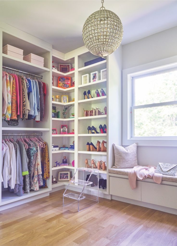
Color played a key role in creating this walk-in primary closet for a home in Armonk, NY. Beyond a place for storing clothes, designer Emily Fuhrman, founder of Sage and Ginger, designed this closet with open shelving in two corners to display personal belongings that make the space special. Personal keepsakes to the shelves in a rainbow of fun accents are a mix of old and new, yet all are meaningful. “We wanted the closet to be glamorous and feminine, which we achieved with the pink hangers, a disco ball light fixture, gorgeous fabric on the window seat cushion and a pillow with sparkly gold threads that all take this space to the next level.” A gold mirror (not pictured) and an Etsy-sourced lucite stepping stool, up the glam factor.
PLAYFUL KIDS’ SUITE
D2 Interieurs
Jane Beiles 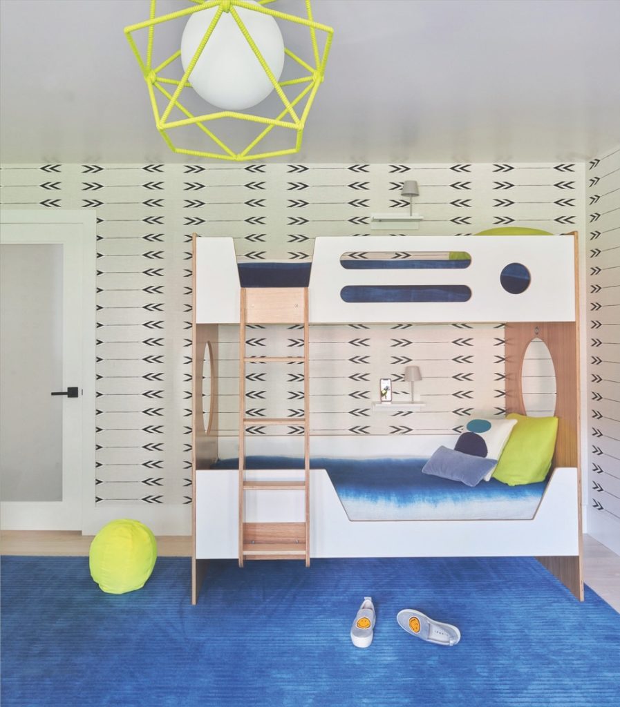
Jane Beiles
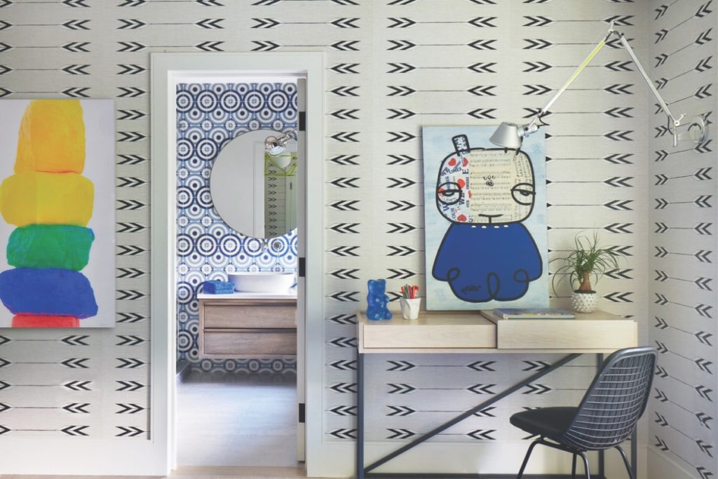
This bedroom in pops of blue and lime green was part of a two-year renovation of a lakeview 30-acre estate on Lake Lillinonah in Bridgewater, CT. “The house was designed to revolve around magnificent water views of the lake,” says Denise Davies, founder and principal of D2 Interieurs. The only directive was to make each room family and pet friendly, and use blue as an accent. The result is a fun, youthful suite that the kids won’t grow out of too quickly. “Having children can inspire the decor to be bold, magical and colorful and when done well, the rooms have longevity as little ones grow,” says Davies. She kept the bones of the room timeless: bed, rug, furniture, desk and window treatments. “A clean aesthetic meets organic details throughout.”
ATTENTION TO DETAIL
Courtney Hanig Interiors
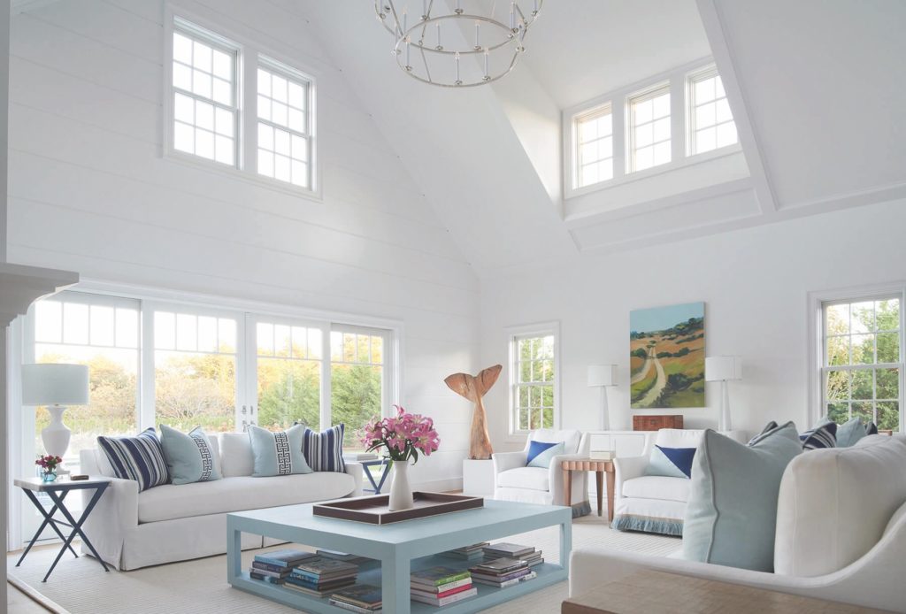
When Courtney Hanig bought her second home in Nantucket, she wanted it to have the vibe of a classic Nantucket whaling house without the kitsch. The experienced designer and principal at Courtney Hanig Interiors had never designed a home with aqua and white, but here the colors were exactly what she needed to reference the seascape around her. She bypassed the funny little statues of whalers and fishing nets on every wall and instead opted for a whale’s tail sculpture from a local artist who carves his work out of salvaged tree trunks found right on the island. In the front hall, she chose glass and warm wood for the staircase, paired with a carpet that recalls a waterfall. But the piece de resistance is the Dutch lap throughout the house. The challenge was to create texture that warmed the 25-foot ceilings without being too busy. While shiplap has mass appeal, she didn’t want the shadow it creates from the juncture between the boards. She chose 16-inch Dutch lap boards, which is joined differently so that you can choose how wide the seam is between the boards. She chose a wide one-inch cove that can be painted, thus eliminating the shadow lines created from shiplap. “The large scale also creates a more restful design in a space with very tall ceilings,” says Hanig. “It’s a big design element and we’re really pleased with the outcome.”
ENGAGING PLAYROOM
Smart Playrooms
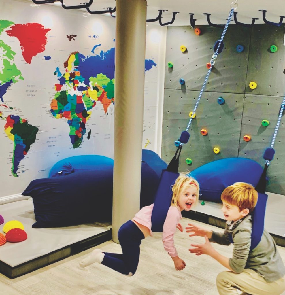
When Karri Bowen-Poole was called on by a Riverside, CT family to design a play space for three young children, including one with sensory needs, they held nothing back in doing an engaging basement redesign for little minds and hands. “When I design a space, I always gear our playroom design choices to the oldest as we want to make sure the space is inviting and engaging for at least the next five years,” says Bowen-Poole. One wall is a rock wall; swings and monkey bars hang from the ceiling, an abstract “playhouse” lets the youngest child play pretend and a Lego station provides entertainment for all. She adds: “The result was a screen-free space that engages the kids and grows with them over the years.”


