Andrea Sinkin has made a name for herself as an interior designer in Connecticut and beyond. One could easily chalk up the success of her Greenwich, CT-based firm, Andrea Sinkin Design, to the attention she pays to clients’ needs. But her popularity is also fueled by her singular vision, one in which color theory plays an integral part.
“I look at colors in terms of the mood you’re trying to evoke,” Sinkin shares. I don’t just say ‘I love red.’ Instead I try to understand what someone wants the abiance to evoke. What do you want to feel? Zen? Energized? Hungry? Happy? Do you want to feel serene?”
Sinkin learned about colors and patterns through her previous jobs in fashion and trend forecasting. Soon after graduating from Clemson University with a business degree, she began working at a job selling hand-painted European oils and acrylics to clothing and furnishing designers around the world. “My first job was in selling and giving direction for original textile art,” she explains. “The designers would buy the art and get the rights to it, and that would become their prints for their lines. While I didn’t know the language of Pantone then or specific terms of design and cultural shifts, I would look for clear examples. We would pour through magazines and convey thoughts using tear sheets. ”
Later she worked in trend forecasting, initially at a Parisian firm. “We actually mixed colors in the Paris office using pigments, and predicted trends before top fashion houses were producing them on the runway,” she said. Eventually, she helped companies such as Tesla and Revlon determine their design direction, the hot fabrics, prints and shades, for the upcoming seasons. This put her in close proximity with Pantone and its famed colors of the year, “so I have a true love and working knowledge of color,” she says. “I’ve worked with trends and color from for over 20 years. It’s part of the fabric of how I think, react and design plan.”
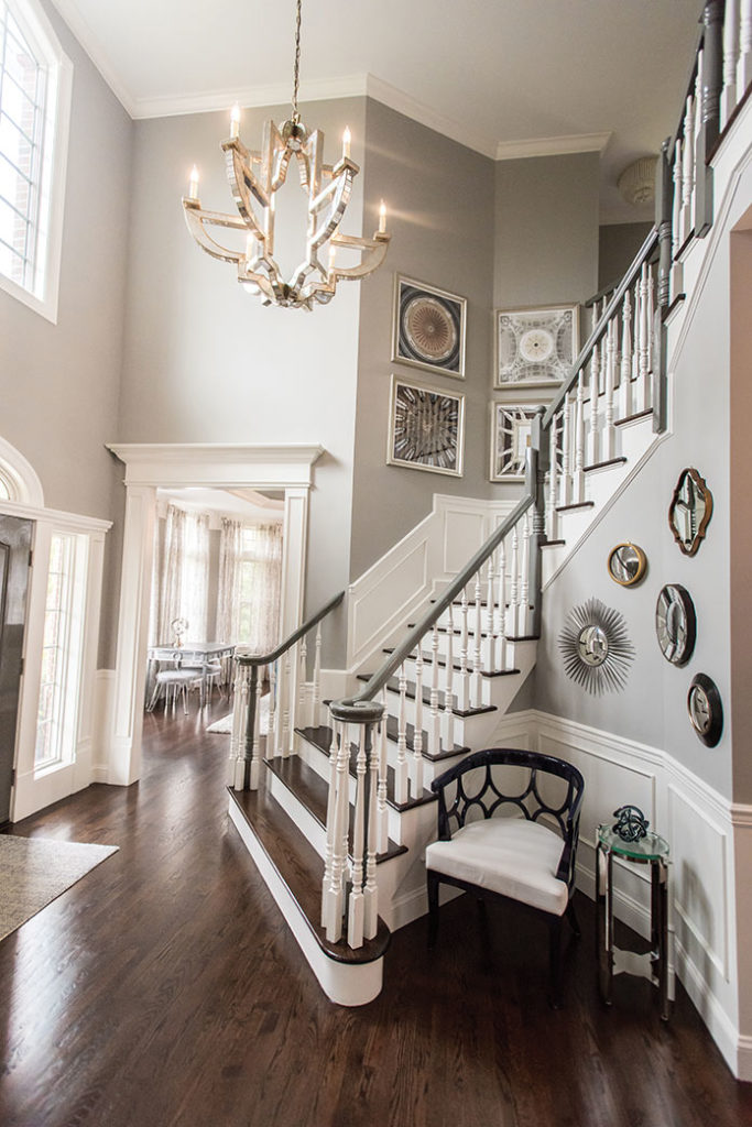
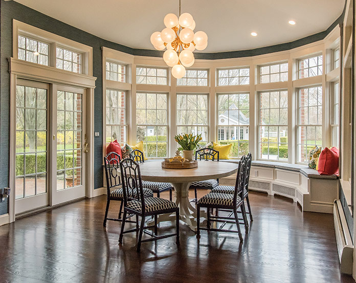
Sinkin selected Gray Huskie paint by Benjamin Moore for the foyer, “to give the eye a place to land and rest” 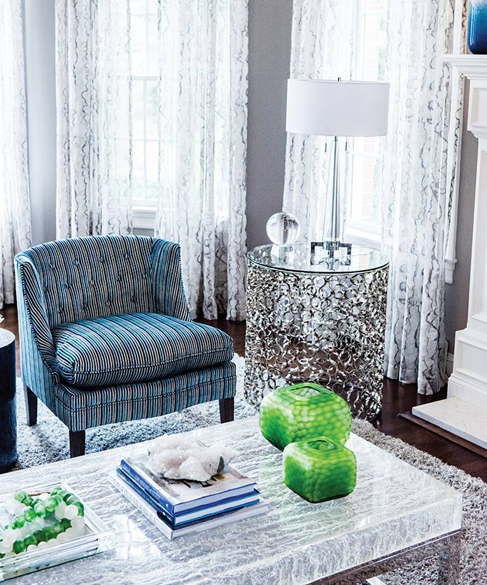
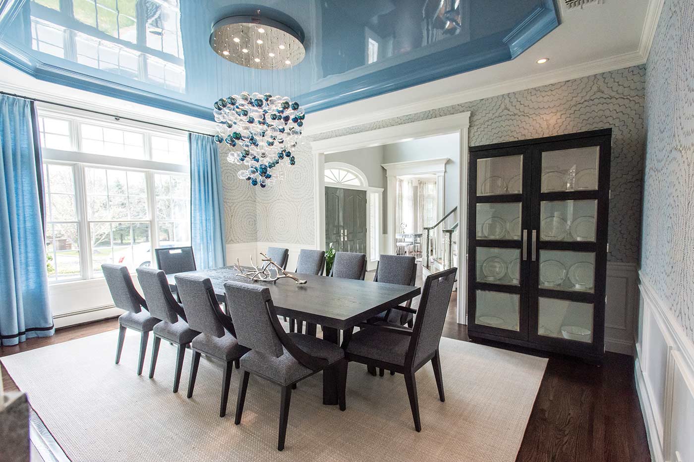
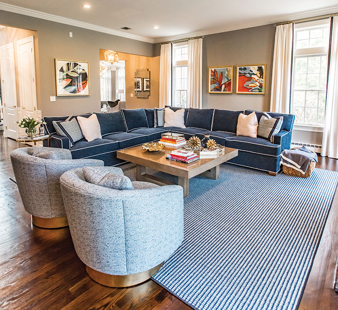
The blues and grays of the dining room and foyer carry over the living room. Green vases from Bungalow 5 provide pops of bright color.
Still, it took a leap of faith for Sinkin to combine her passion for color with her love for interior design. “I’d started on the committee for Under the Stars, [a fundraising gala] for Greenwich Hospital, which I’m now on my third year co-chairing. I hosted a few meetings at my house and people would ask, ‘Oh my God, who was your designer?’, and I’d say ‘me.’ Then they’d ask, ‘Would you please do my house too?’.” Finally, she enrolled in design classes at SUNY Purchase.
Sinkin is happy to share her approach to color. “I don’t typically design by choosing a palette [in advance],” she says. “Usually the way I pull color is by falling in love with a wallpaper, piece of art, family treasure or fabric, then that dictates the choices for the rest of the room and how it unfolds in the home. I try to pull a common neutral color and tie it through the rest of the home so the thread gives a visual consistency that is pleasing to move through.”
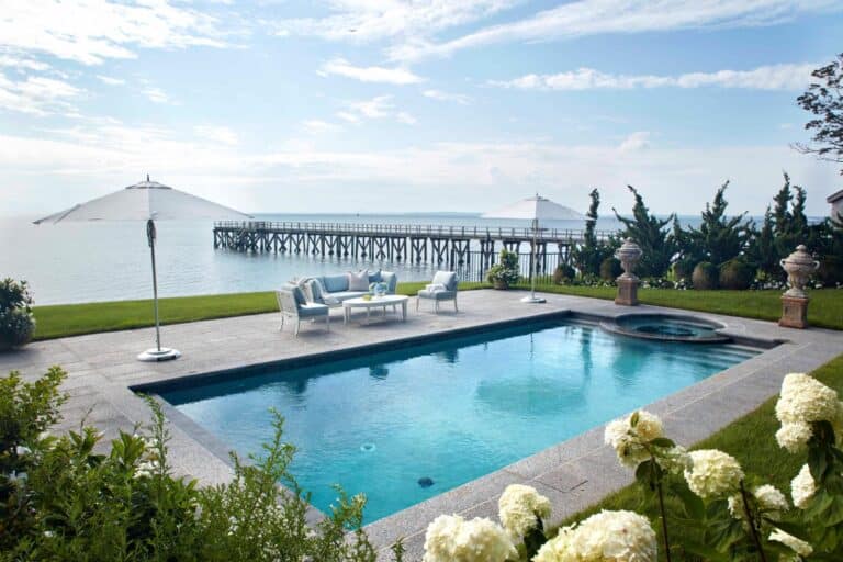
Case in point: the Head of the Harbor home illustrated here, in which blues and grays carry throughout the house’s dining room, foyer and den. “This is a very beachy, boat-loving family and I wanted to bring that vibe into the house, but in a modern way,” Sinkin says. The kitchen’s color scheme began with a lemon-print fabric she and her clients both adored.
If you love bright shades, she suggests being bold and using them in a powder room. “It’s just like that fun pop when you go in, but everything has to have a thread throughout the house,” she says. Sometimes, she helps her clients be bold with color. “I will start showing them things and suddenly there is a moment where we realize what they are loving. It is an ‘aha’ moment, as Oprah would say. Or oftentimes I can help them discover colors they love already just by knowing where they live, where they vacation, and where they are happiest.”
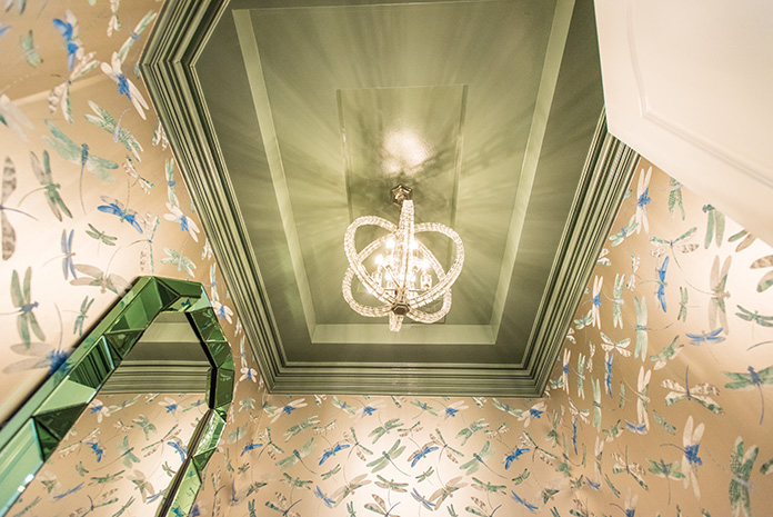
A mudroom is another prime location for brights: “It’s the first room you see when you come home and the last one you see when you leave,” she points out. (Her own mudroom is bright yellow.) Colors—soft ones—also work well in bedrooms and offices, she adds. But color isn’t only for walls. “I love painting a ceiling—the forgotten fifth wall—with a bright pop of color,” Sinkin says, as she did in the powder room of the Head of the Harbor home by painting it a cheerful sage green. “It makes the room feel open and infinite rather than closed. See the ceiling as an opportunity, not a risk.” Even dark hues, when applied to a ceiling, can make a room seem expansive.
While selecting colors, Sinkin works in harmony with the outdoors when possible. “You need to look out the windows, and that kind of dictates what you’re trying to bring in or pull out,” she advises.
A strong color, such as a red, is something she would consider for a library or dining room. “Red makes you want to eat and makes you feel lively, and you know it has a feeling of romance,” she shares. She is also a huge fan of wallpaper: “I love it and use a ton of it,” she says. “If someone’s not into wallpaper I’m probably not the right designer for them.”
If Sinkin wields color for show-stopping effect, she also knows when to reel it in. “Common areas are a great place for neutrals—think family room, kitchen or hallway. I gravitate toward grays or blues or creams. It’s a soft place to land when you’re between rooms.”