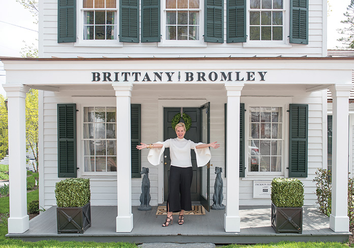
Accomplished interior designer Brittany Bromley operates her design studio and retail store, The Jackson House, out of a historic building built by George W. Jackson in 1857, on the green in Bedford, NY. She’s also surrounded by history at home, living in a 215-year-old house. So when she describes her design style as “classic with a kick,” the Tulane University grad has the pedigree to back it up.
 Stephanie Horton: What do you prioritize when you’re working on a home?
Brittany Bromley: I really try to make sure that all of the rooms I design have a sense of history and feel as though they’ve been curated over time. I’m not a fan of instant decorating. I like rooms to resonate historically, but also with the experiences of the people that live in them. So while I get a lot of my inspiration from classic design and symmetry, I try to infuse it with modernity, so at the end of the day it has a more eclectic feel.
SH: What’s inspiring you now?
BB: I’m finding a lot of inspiration lately in the restaurant and commercial spaces in Europe. There are some incredible lounges; I think Anouska Hempel really started something when she did the Blakes Hotel. I think all these institutions are feeling more intimate and specific. I love that very personal sense that you’ve arrived somewhere and an ambiance was created for you.
SH: Can you describe how you mix colors, neutrals and textures?
BB: I love color, and it is always the punctuation mark. Even if you love dark furniture, you always need contrast. You really need one to appreciate the other. If you have a neutral base and you pop color into it, both look better because of the juxtaposition of the two. I love a good pop of yellow; I love kelly green—I think it is sophisticated in almost any manifestation. Some people love primary colors, but I probably skew more towards mixtures and secondary colors.
SH: Tell me a little about Jackson House, your retail store.
BB: I’m so lucky because the reality is our design business had outgrown the office space allotted to it. When the opportunity to take over this historic building in downtown Bedford presented itself, at first I wasn’t sure I was up for it, because we did a pretty extensive facelift of the interior prior to opening in 2016. But clients always respond to being shown what you’re talking about when you’re creating an ambiance. It has become for us an incredible illustrative tool and a test kitchen. Each room is decorated like a home and the concept is that everything in it is for sale. That creates a dynamic atmosphere because it is always changing and evolving, and that gives me an opportunity to try new things.

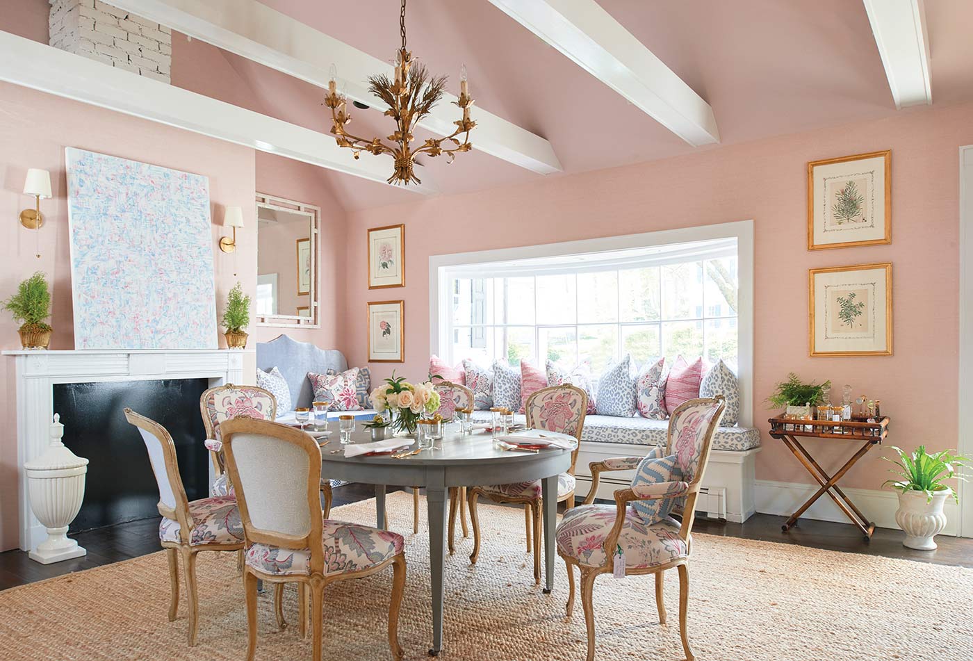
SH: I love the pink color you’ve used in the main room of the Jackson House.
BB: It’s funny because I think if you were to tell a group of husbands, in general, you were going to give them a pink room they’d run screaming for the exit. But in my experience thus far, it is the men that respond most favorably to that pink room, which is actually pink linen-covered walls. They say it feels warm and comfortable. I also do a lot of Farrow & Ball Pink Ground paint for ceilings in dining rooms, especially in high gloss. At night it feels like you’re inside a sea shell and it’s such a flattering color for everybody.
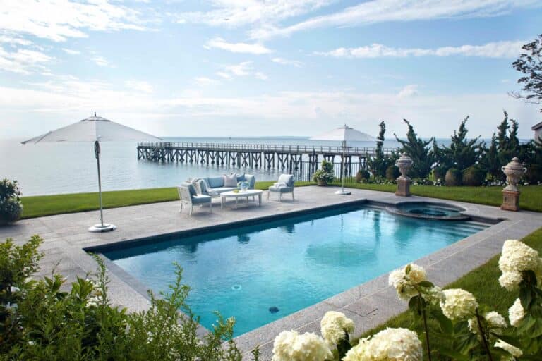
SH: Would you give us some background on your Guard Hill Georgian project, shown here?
BB: Guard Hill is the name of the road, and it’s kind of like the Fifth Avenue of Bedford. This brick Georgian home was built between the 1920s and ’30s. It has incredible, intricate wrought iron railings that are part of the second-floor balconies, so it has a bit of a Southern feel. I went to school in New Orleans and when I first saw it, it reminded me so much of the homes you see there. Yet it’s propped on a hill with rolling gardens.
SH: Can you describe the family who lives in this house?
BB: It’s an active young family with three children who had just moved from New York City. The wife is originally from the South and spent quite a bit of time growing up in Atlanta, so the feel of the house resonated with her. They had a lot of beautiful inherited pieces, but there was a desire to make those feel relevant to their young family. The challenge was to bring fine antiques, like the dining room table and chairs, into their 21st century life so they made sense for the family.
SH: What was your strategy to achieve a more modern sensibility?
BB: My vision and end goal was to give the historical pieces relevance by grounding them with natural textures and more graphic and ethnic fabrics. There’s a real bohemian vibe that runs through a lot of the things we redid. We wanted it to feel as though we hadn’t just bought new items and tried to mix them with the old. We wanted it to look like they’d been collected over time. And the sorts of things people buy on their travels often end up being tribal or ethnic or having that handmade feel.
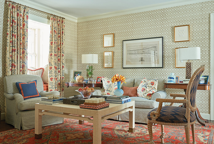
SH: Can you tell us about the updated living room design?
BB: The living room had great possibilities, with exposures to both the front and the back, but it had become a glorified corridor through which the family only crossed to enter the rooms on either side. The overall feeling of the room was darker and heavier. We lightened up the walls with graphic hand-printed grasscloth. We took our color scheme for this room from the beautiful Turkish rug that the family already owned, and pulled orange, navy, pale blue and brown accents from it. We also created two distinct seating areas, which can function separately or be combined for one large gathering.
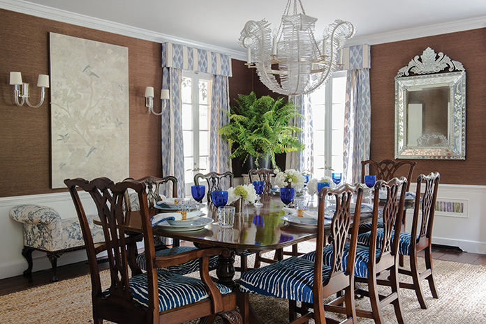
SH: How about the beautiful dining room space?
BB: The dining room felt like a space from a previous generation. It also felt dark and heavy. Light pieces such as a Venetian mirror, lucite console and abstract art were chosen to balance it out.
SH: So how do you juggle it all: design, retail, shopping for inventory?
BB: It’s very busy, but one really feeds the other. Whenever I’m doing something associated with the retail it’s generally because I’m already looking at it or thinking about it for clients. It has ended up being wonderful, and an added, unexpected side effect is we probably get one or two clients a week from people who just walk in.
Photos by Jane Beiles