Upgrade your space with these home design ideas – from adding wallpaper to incorporating 2020’s signature color, navy.
EUROPEAN-INSPIRED DETAILS
Westchester County, NY
by D2 Interiors
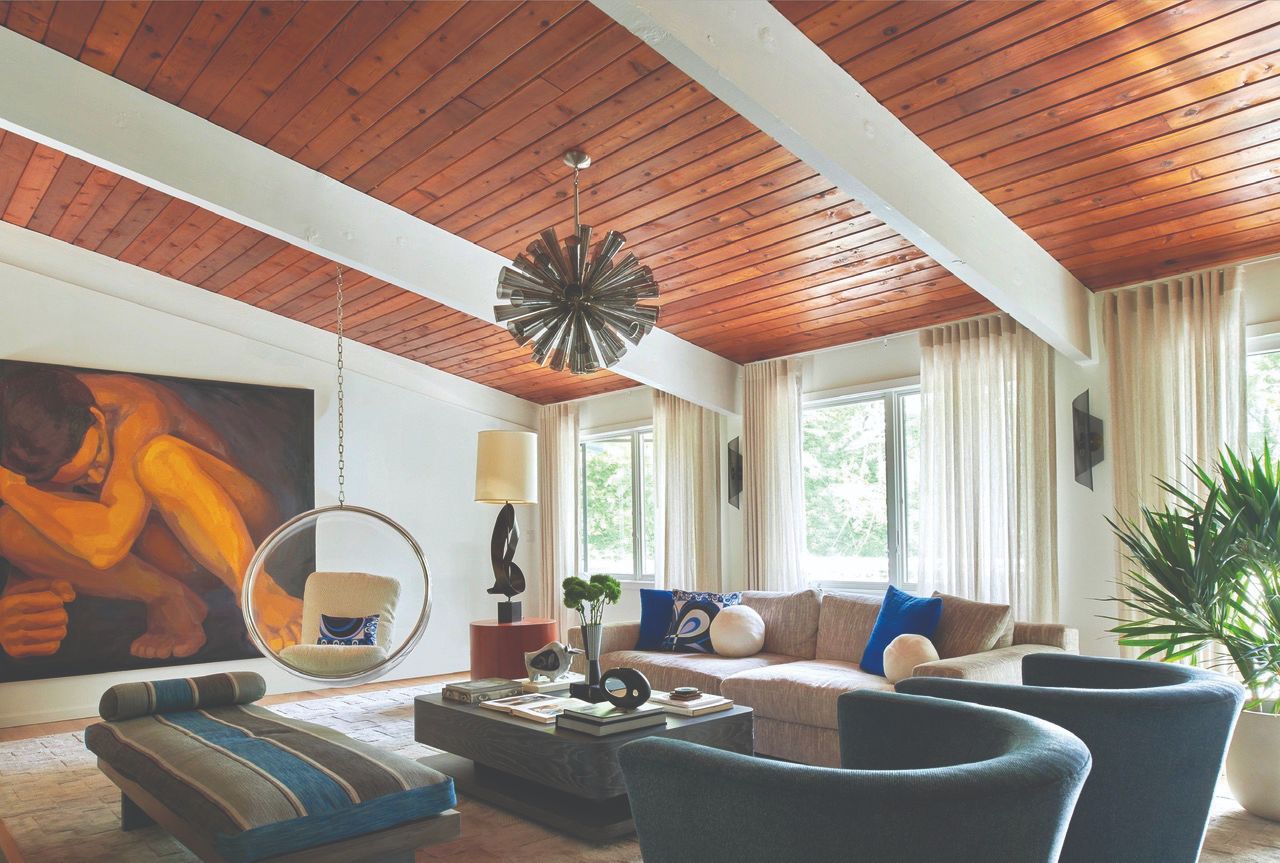
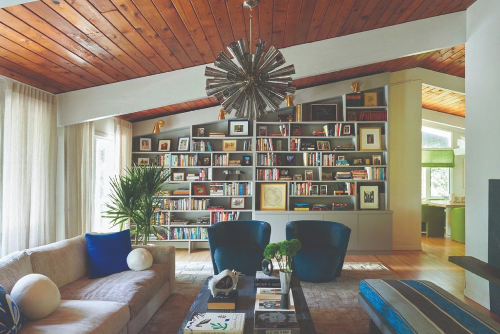
A total home renovation, Denise Davies of D2 Interieurs says, “Highlights include a light filled living room complete with a hanging bubble chair. It is a real showstopper and the first thing you see as you enter the home.” Davies included a mix of custom furniture, vintage picks and featured artwork—including pieces already belonging to the homeowner. “The clients love the home’s retro design and the flow of natural light throughout. We were able to realize the clients’ vision and also stay true to the classic midcentury modern design.”
Design Tip: “I always suggest for my clients to spend money on the things that they use the most and will get a lot of wear and tear—like a sofa or sectional. That is an item that you do not want to have to be replacing all the time and will get the most use—whether you are entertaining, watching TV or taking a nap! You want it to be comfortable and last a long time.”
MULTI-FUNCTIONAL SPACES
Sagapaunack, NY
by Guillermo Gomez Architect (GGA)
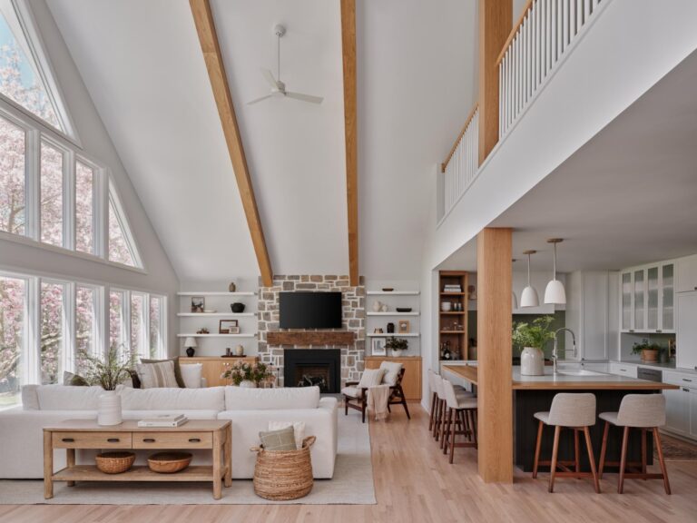
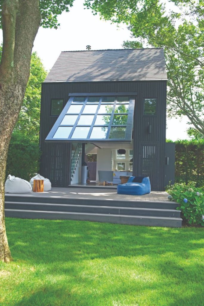
The homeowners were very specific in wanting this new structure to serve as an entertaining space and a guest house on their Long Island property. Gomez employed a great deal of modern technology to achieve this and maximize the functionality of this specific footprint on their property. “We designed a special airplane hangar glass door that, when lifted, served as an additional exterior covered porch,” says Gomez. Working with historic and coverage restrictions, they had to get creative with the angles and design of the building. For instance, an efficient cast iron modern stove, which burns wood slowly, heats up the space, including the upstairs bedroom, and at the same time, also serves as an interesting sculptural element.
PATONE COLOR OF 2020: NAVY
Darien, CT
by Prudence Home + Design
The homeowners wanted their rooms—specifically the family room and powder room—to reflect their love of the colors blue and white. “The family room needed to be super comfortable since this is where they spend most of their time as a family and with friends—yet they wanted it to be something that felt timeless, so they wouldn’t tire of the design in a few years,” says Prudence Bailey. “A mandatory item was the sectional sofa. They knew they wanted this in addition to the blue and white color scheme.” Using navy as a foundational color is something Bailey suggests everyone consider. “Navy is such a gorgeous and versatile color!” she says “I love how it balances all the white we used in this design yet still feels soft. Blue is a true neutral and I often use it instead of a gray or brown as a neutral for a space. It can feel soft and cozy as in this design, or dramatic and daring in other designs.”
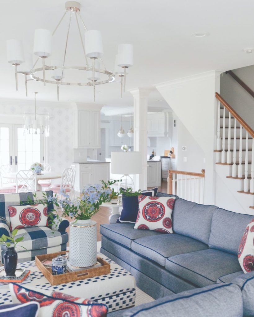
Design Philosophy: “I believe a home needs to reflect the people that live there in every way, as well as be timeless [and] functional, with high-quality furnishings and fabrics where needed so they last. Design is an investment so it’s best to cry once, as Miles Redd says. I also think it’s important to mix genres so the rooms have some friction,” says Bailey.
Sands Point, NY
by My Gingerland
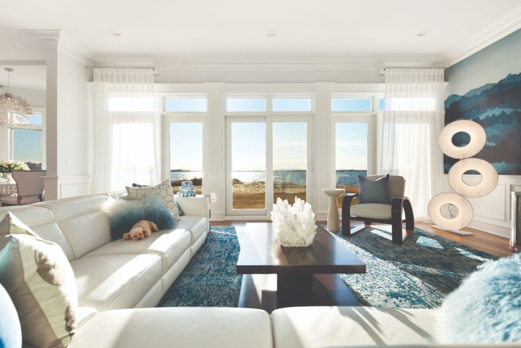
Designer Monica Lederman has been a working artist and designer for more than 20 years—and she’s able to bring a unique bonus to her clients: original works of art. For this client, the focus was on creating relaxed yet elegant space for the client and her family. The decision to use navy as a baseline color wasn’t hard since it is “a timeless color, perfect for incorporating depth, healing, and peaceful water energy into a space.” says Lederman. “It can be paired regally with gold and with monochromatic layers of blues and white to create the serenity that we all desire in our homes.”
Design Tip: “Let go of clutter and anything that represents a time of your life you are trying to move on from!” she says. “Our surroundings always affect how we feel, so we should evaluate and refresh often.”
CANOPY BEDS
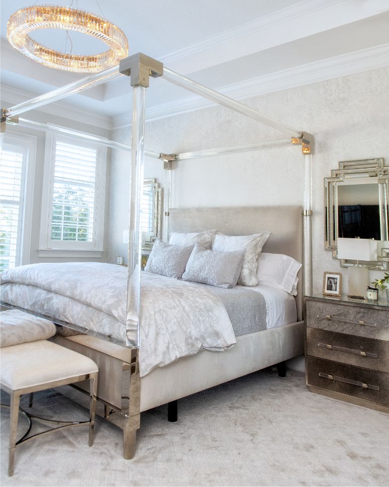
Rye Brook, NY
by Lara Michelle Beautiful Interiors
When Lara Michelle began working with this young family, their vision was clear: They wanted “a super glamorous, modern, chic design with an all-white, silver, and light gray color scheme and lots of bling and shimmering finishes,” says Michelle. But, their directive presented some inspiring challenges. “I had to look for luxury fabrics that would be stain resistant and hold up to the rigors of a young family,” says Michelle. For families with young kids, she usually sticks with darker fabrics and rugs, so she had to ensure that the light-colored materials would hold up. Luckily, she says, “the high performance, indoor/outdoor fabrics that are available today really make it possible to use light colors and not worry they will be ruined in a few months.”
Design Tip: Michelle advises homeowners to bring in a professional to avoid making costly mistakes. “There’s a million things that can go wrong when renovating, building or redecorating a new home,” says Michelle. “If you don’t have someone with a great deal of experience, as well as talent, to guide you, things can go wrong very quickly, which costs money and time.”
WALLPAPER
Greenwich, CT
by Muse Interiors
When Lauren Muse first met these homeowners, they had a home they were ready to completely redesign, and almost no existing furniture to incorporate—effectively a blank slate. With the idea of this becoming their forever home, they wanted a dining space that would be able to host special occasions with family and friends. With a significant art collection, Muse felt installing this Phillip Jeffries digital-printed grass cloth mural created an additional work of art in the room. “This wallpaper is a show-stopper—you see it from the foyer of the home, so they can enjoy it every time they come in the front door. Wallpaper in general provides texture and interest; we use it in a myriad of areas, including the backs of bookcases, just for an extra layer of interest.”
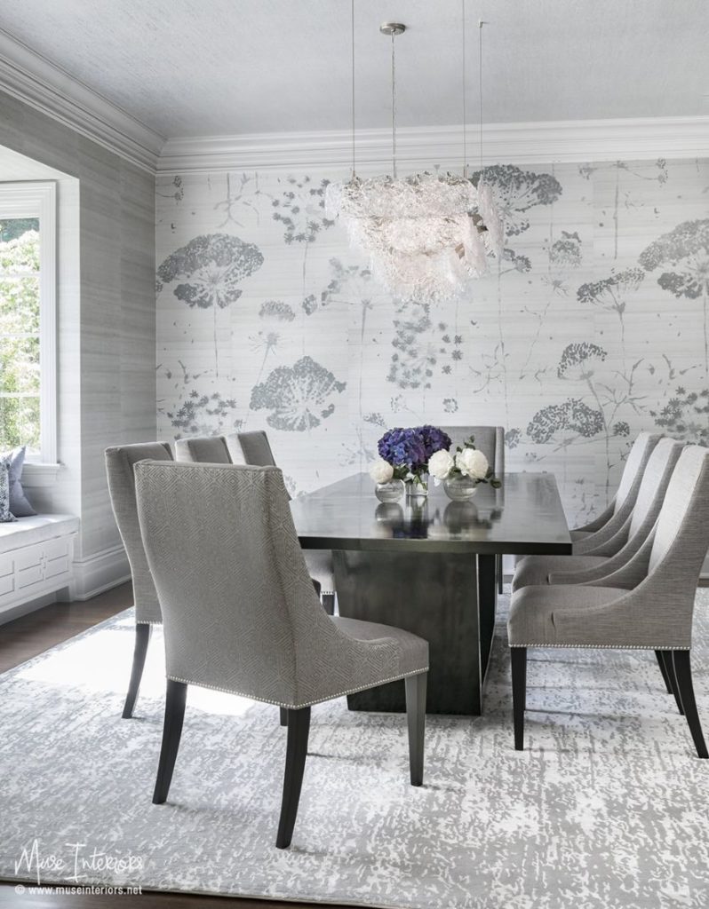
How Often Should a Person Update Their Space? “As often as that person needs to!,” says Muse. “We all have different needs and times when we could use a refresher. I’d suggest maintaining fine pieces of upholstered furniture by reupholstering when you start to see the first signs of wear.”
BOLD TEXTURES
Rye, NY
by Shannon Murray Interiors
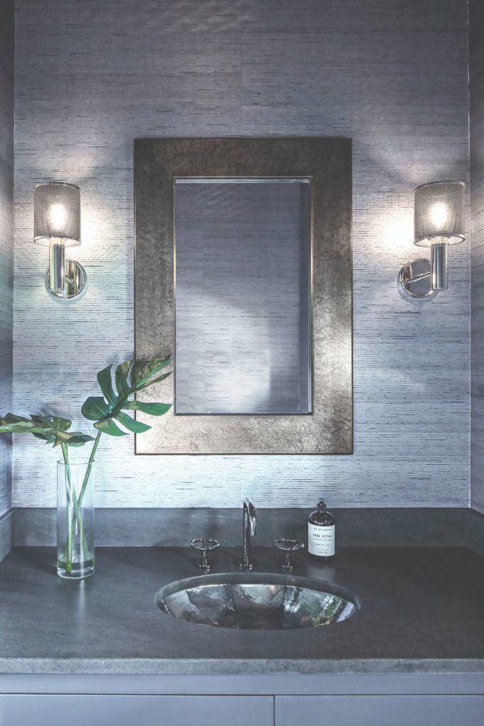
Collaborating with the architect and builder on this brand-new construction, Shannon Murray worked to bring the homeowner’s vision of “industrial-modern” to life in every corner of the house. “Balance and proportion is key in both pattern and materials,” says Murray. “Texture is my favorite element to play with in a room. Mixing texture gives surface interest when placed alongside multiple patterns. Painting a small room a bold color can make it seem larger and more interesting to the eye.”
Design Tip: A quick fix can refresh your space, like changing up lighting, including a new area rug by either adding or layering, or decluttering accessories. “Add a tray, re-arrange; less is more,” says Murray.
NATURAL MATERIALS
Darien, CT
by Mark Finlay Interiors
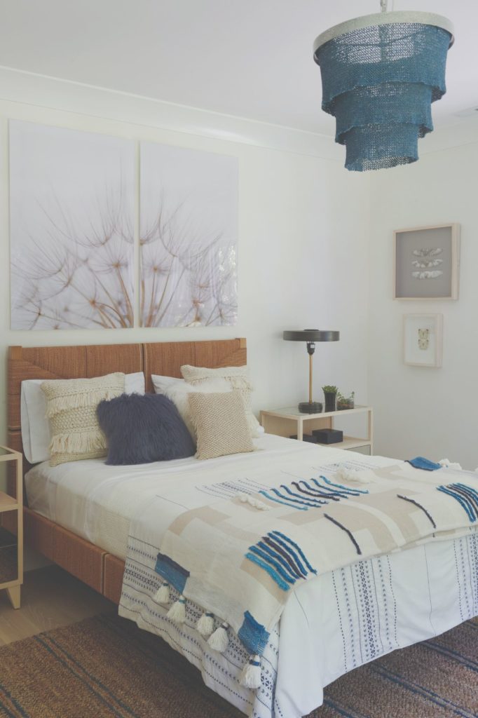
Bringing a beachy feel to this inland home was a huge part of the design process for Mark Finlay Interiors—as well as keeping the house as healthy as possible. “Some of the family members had severe allergies, so it was important to make sure there were no chemicals in the fabrics, and the furniture frames had the proper glues and solvents,” says Finlay. This guest room allowed the owners to push the envelope and make it a fun, inviting space for their guests. “The bohemian look afforded the design an opportunity to utilize natural weaves, colors and materials,” he adds. Finlay was able to help the homeowner see that neutral doesn’t have to be monotone. Says Finlay: “This client came in wanting an all-neutral palette. In the end she realized she really did love color.”
Design Trend to Drop: “Wave goodbye to the all-white kitchen.” says Finlay. “We are so ready to incorporate more texture/color/soul into kitchens.”
