Katie Ridder is a tour de force in the world of design. Her projects have recently captured the covers of Architectural Digest and House Beautiful among others, and she has authored two books by Vendome Press. Her first, Rooms (2011), is a monograph of her work, and the second, A House in the Country (2016), was co-written with her husband, 2017 AD100 classical architect Peter Pennoyer, and chronicles their collaboration on the family’s country house and garden in Millbrook, NY. Ridder has a bustling design office with eight employees on Madison Avenue and clients from Switzerland to Virginia. And she has expanded her reach with a wallpaper and fabric line, available to the trade at Holland & Sherry showrooms throughout the country and in Europe. Ridder is also an accomplished, passionate gardener, but what sets her apart is her openness and willingness to let everybody in. In fact, she has made her Millbrook property available for public tours as part of The Garden Conservancy’s Open Days program and was equally welcoming to Serendipity during our cover shoot at her Westchester residence, where we talked to the designer about color, inspiration and what she has planned next.
Stephanie Horton: One of the most striking aspects of your work is the extraordinary palette. What are your favorite color combinations?
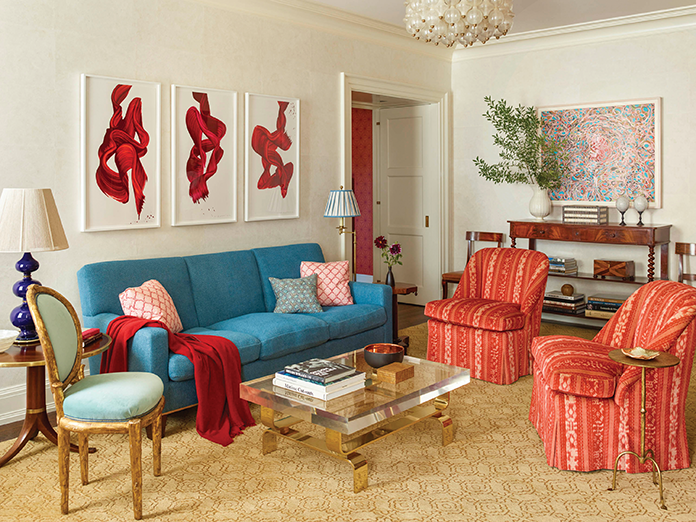
Katie Ridder: One of my very favorites is Indian pink with denim blue and touches of yellow. It’s funny, most people’s favorite color is blue so I combine that with complementary hues on the opposite side of the color wheel. But there’s really not a color I don’t like. I like greens with purples and magentas. Those are such great colors to work with, too.
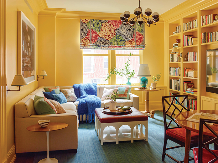
SH: Tell me about the background for this NYC Carnegie Hill project.
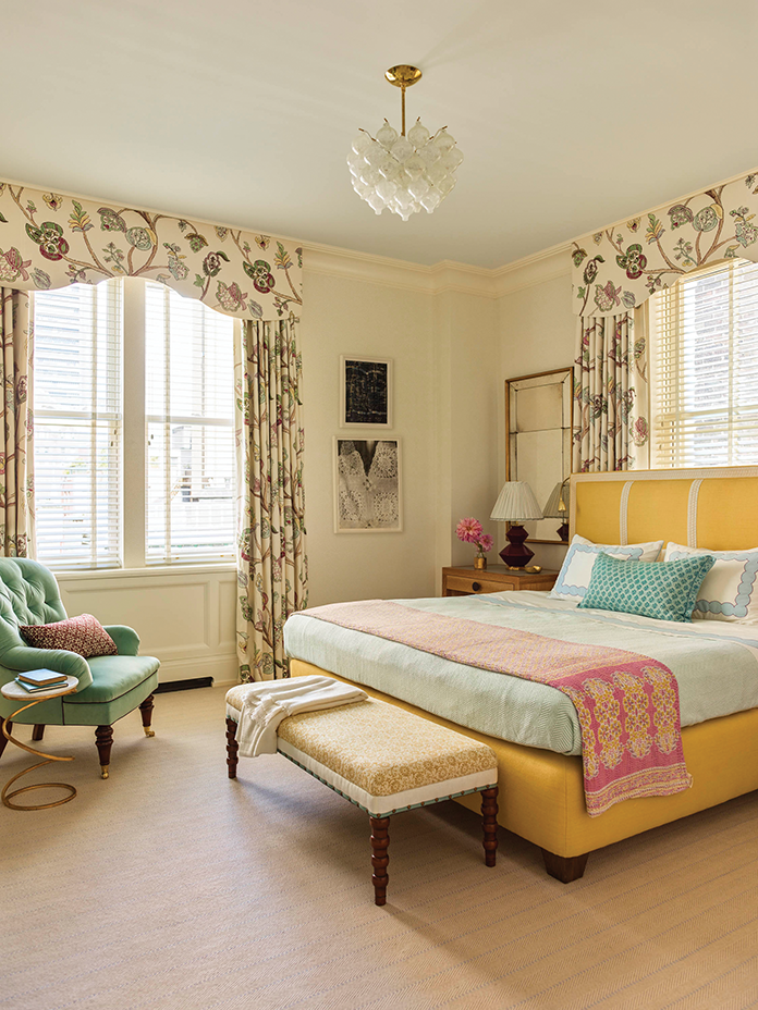
KR: In this project, the apartment faced North, so we wanted to warm up the rooms. We chose a lot of golden yellows, reds and warm tones to achieve this. It’s the main residence for a young family with two children. Both parents work and the kids are in school all day, so they’re mostly home at night. We strongly considered how the apartment would look in the evening and used bold primary colors.
SH: Do you have to encourage your clients to be bold and take risks?
KR: Yes, I do. Sometimes I’ll propose a scheme and a client will say, “I’m not sure,” so I’ll take a step back and tone it down to their comfort zone. If there’s something I feel is extremely important to the project, then I’ll fight for it, but I’m very collaborative and open. I always listen to what my clients want. I was, however, recently fired from a colorless project! The client wanted all white everything (carpet, walls, furniture). I tried to bring in some blue just for the dining chair seats. But no, she didn’t go for it.
SH: You previously owned a Turkish imports shop in Manhattan, Katie Ridder Home Furnishings. You were ahead of the curve…
KR: Yes, but I closed it 21 years ago when I had my first child. My shop was all Turkish, Moroccan, Spanish and Egyptian—Iznik tiles, textiles from the Grand Bazaar in Istanbul, they were so much harder to get back then. But those things don’t really show up in my work anymore. It’s part of my natural evolution as a designer—I’ve been there, done that. That was really fresh and new when I opened my store 27 years ago, but now you see it everywhere.
SH: What’s inspiring you now?
KR: Peter and I went to Stockholm twice in the last year, and it was amazing. I’m gearing more towards Swedish interiors and furniture now. I’m so inspired by the architects and furniture designers Karl Schinkel and Charles Voysey, and I love Svenskt Tenn in Sweden. So my direction is more European with Chinese accents.
SH: You grew up in California and there’s a relaxed American feel to your designs—an accessibility that is inviting, practical, family-friendly. How are you able to achieve that, even with the European influences and striking color palettes?
KR: First of all, I have budgets on every single project. I hate the idea that people think I’m so expensive. I’m very aware of pricing fabrics and sourcing practical things. I rarely use silk velvet. I love silk velvet but it’s not durable. I don’t want anything to feel untouchable. Most of my clients have children so nothing can be too precious.
SH: Tell me about your early professional background in the shelter magazine industry. You were first at House & Garden and then House Beautiful. What did you learn there and how did this influence your work?
KR: I had just come from California and it was intimidating because NYC editors were very sophisticated. But I learned so much through the photographers and editors. I did a lot of photoshoots as an assistant, and I worked for architectural editor Martin Filler and Style Director Carolyn Sollis at House & Garden. Just watching the flower arranging and the photographers moving things around, setting up the shot—it made me look at my interiors from the camera’s eye. Afterwards I moved to House Beautiful as a decorating editor and I was producing my own stories. It was an invaluable education.
SH: Arts and crafts have always been a big part of your life. To what extent do you incorporate these into your work?
KR: Jewelry making is my latest obsession. I found some conch shells in Antigua and had them polished, cut and made into the earrings that I’m wearing [in our photo shoot]. Also, I do a lot of stitching. I make my own pillows for my personal interiors. For clients, I’ll have items made from things I find. For example, I was recently in Switzerland installing a project, and I found a beautiful throw that had little animals stitched on it, so I used it to upholster a stool.
SH: How does gardening influence your work?
KR: I think living with scent and flowers is so inspiring. Gardening even influences my color combinations: You get chartreuse with red and black and deep purple. The chartreuse green really highlights everything around it. Flowers are also like art in an interior. In Millbrook, I grow dahlias from July until October, and I have roses and poppies. I always have flowers from my garden come into the house. That’s why I grow them: to bring them inside. I have a really big cutting garden.
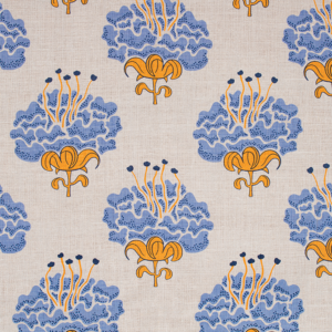
SH: Let’s talk about your fabrics and wallpapers. What was your favorite part about creating your textiles? What was the most challenging aspect?
KR: My favorite part was the lack of client approval needed. Although I love working with clients, this was an independent creative endeavor that’s 100% mine. It was exciting because it was exceptionally well received. I have about 15 patterns currently. The hardest thing was figuring out the repeats, because once you design the pattern, you have to get the scale right. You don’t want it to look dotty or busy or jarring. It can’t be too small or too big.
SH: I understand there are some new designs that are about to debut. Tell me about them.
KR: Yes, I have two more wallpapers coming out soon. One is for a Los Angeles project of mine. It’s called Mindy’s Stripe. It’s a metallic stripe with subtle color variations. There will be a few colorways. It’s my first time doing a metallic. The other wallpaper is called Menagerie and has camels, goats, donkeys, toucans and trees. It will be a one-screen design, so a single color printed on the paper. For example, a pale blue paper with chocolate brown print. These will be the first wallpapers I’ve released since Scraffito and Turtle Bay, which were done two or three years ago. Turtle Bay is my all-time favorite.
SH: What’s it like being married to an esteemed architect?
KR: I love working with Peter! We have a project together right now in Bridgehampton, and I really enjoy collaborating with Peter’s office. They think like decorators. You know, they think about the curtain stack and the furniture plan and if there’s a wall for a sofa. They consider lighting and outlet placement. Our styles are very different but we are great collaborators. We had three projects together last year.
SH: What’s up next for you?
KR: I kind of want to design jewelry. I found a black coral branch in Europe over Christmas that looks like a serpent and I want to have it made into a bracelet. I’m making pendants from coral I bought in Italy, and I found an old pin in Prague that I’m going to bejewel. It’s just something I love doing for myself, but people have started to ask me about buying it. It might become a separate creative endeavor. I would also love to have my own line of furniture at some point, but there’s only so much time in a day right now! My youngest daughter is still at home and we have squash tournaments every weekend. But I’m always thinking about what I can create next.
Get Katie’s recipe for her favorite Myer Lemon Marmalade here!
See what 10 Things Katie can’t live without here.
Interior photographs by Eric Piasecki.