The underlying concept of Elena Phillips Interiors is that great design is a lifelong, creative
process. The company successfully creates spaces that are predominantly classic—
balancing a traditional aesthetic with modern touches. Phillips works closely with architects, builders, craftsmen and artists to create environments where function, style and comfort reflect the personalities of the home owner. We talked to Phillips about her latest projects and secrets to a successful renovation.
What was the goal of the renovation?
The primary goal was to have a new, larger open kitchen. They also wanted a functional mud room and a place for their two dogs to hang out (we created built-in dog crates in the mud room for that). With the new plan, the flow of the house was reworked. The
outcome was much better circulation. And the bathrooms, laundry and bedrooms were updated and refreshed.
Talk to us about the kitchen.
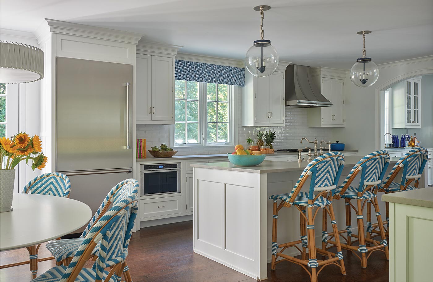
The kitchen is the most impactful change in this project. The prior kitchen was small, black, angular and very 1980s. It was located around the corner in what is now the first-floor mud room. By moving the kitchen to the other side of the house, we gained two exposures of light. The windows above the counter were a pair of French doors that stepped up to the
outside deck. We moved access to the deck to the left of the refrigerator. The layout of this kitchen is user-friendly, open and practical. There is ample storage and plenty of counter space. The countertops are Caesarstone, the appliances are Thermador and the custom navy and nickel globe pendants above the island are from The Urban Electric Co.
Another advantage to the new kitchen location is the proximity to the bar and family room. Prior to the renovation, doors closed off the bar and the family room from the rest of the house. With the renovation, we decided to remove the doors, making the kitchen the hub of the house; from the kitchen, you can access the mud room, exterior space, family room and dining room.
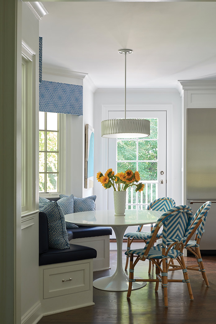
The breakfast table nook in the kitchen is ‘Grand Central’—the area is high traffic during the morning and evening rush. The windows in the bay were replaced and I designed the banquette and had it upholstered in a wipeable faux-leather. The bistro chairs and Saarinen table with white laminate top are easy to maintain. The pendant from The Urban Electric Co. is lightweight and delicate. I used the same fabric for the hard valance and pillows, an attempt to keep the space clean and uncluttered.
The mud room was an important part of the renovation. Tell us about that.
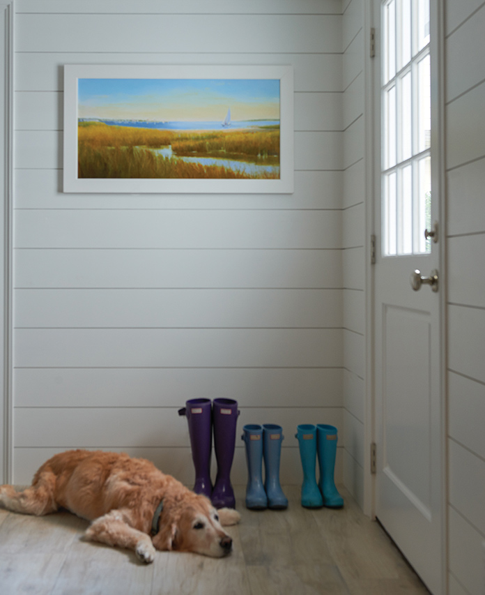
There was a mud room here prior to the renovation, but it was not as bright, airy or efficient. We used large ceramic tiles that emulate wood flooring and are durable and easy to clean. The shiplap walls are bright, simple and hard-wearing. The hardware is polished nickel. Access to the mud room is either from the garage or an exterior door from the driveway.
How did you update the dining room?
Prior to the renovation, the current dining room was a den. We decided to move the dining room to a space that was a little larger, had a fireplace and was a better focal point as you entered the house from the front door. It also made sense as a dining room, since we took over a small office adjacent to the space and turned it into both a walk-in pantry and a small butler’s pantry leading to the kitchen. As a dining room, this room needed to be dressed up. I added the wainscoting and redesigned the mantel surround. The clients bravely went ahead with my choice of a bright, Kelly green Phillip Jeffries wall covering. The chandelier is brass and gives off a good deal of light, yet is on a dimmer. I had the dining table made and we kept the client’s previous dining room chairs, bought two more and reupholstered them in the periwinkle pattern.
What about the family room?
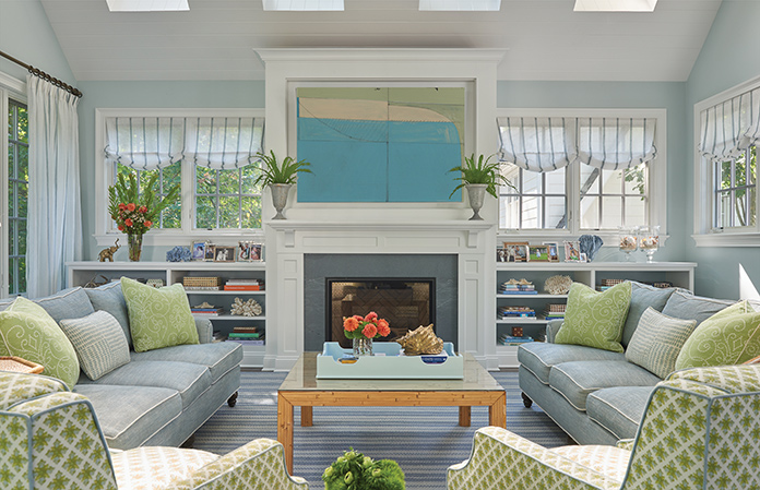
The family room was an existing space added on in the 1980s. Significant changes include the new gas fireplace and surround, new bookcases flanking the fireplace and the lighting. Prior to the renovation, there were large, recessed cans in the ceiling and white, generic ceiling fans. The ceiling boards were also fleshy-pink knotty pine with painted white ceiling beams running across the span of the room. By painting the ceiling, removing the large, clunky recessed lights and sconces (from the side walls) and adding two chandeliers, the space instantly became brighter and more cheerful. I also wrapped the existing ceiling beams in reclaimed wood which created another layer of interest. The sofas were reupholstered and I made new chairs and an area rug in a pale blue, soft green and white.
How has the family’s use of this room changed with the renovation?
The client had a family room that previously was seldom used. By understanding the client’s interests, we were able to update the room and integrate it into their lives better: for hosting guests or a cozy night of board games with the kids.
How did you renovate the powder room?
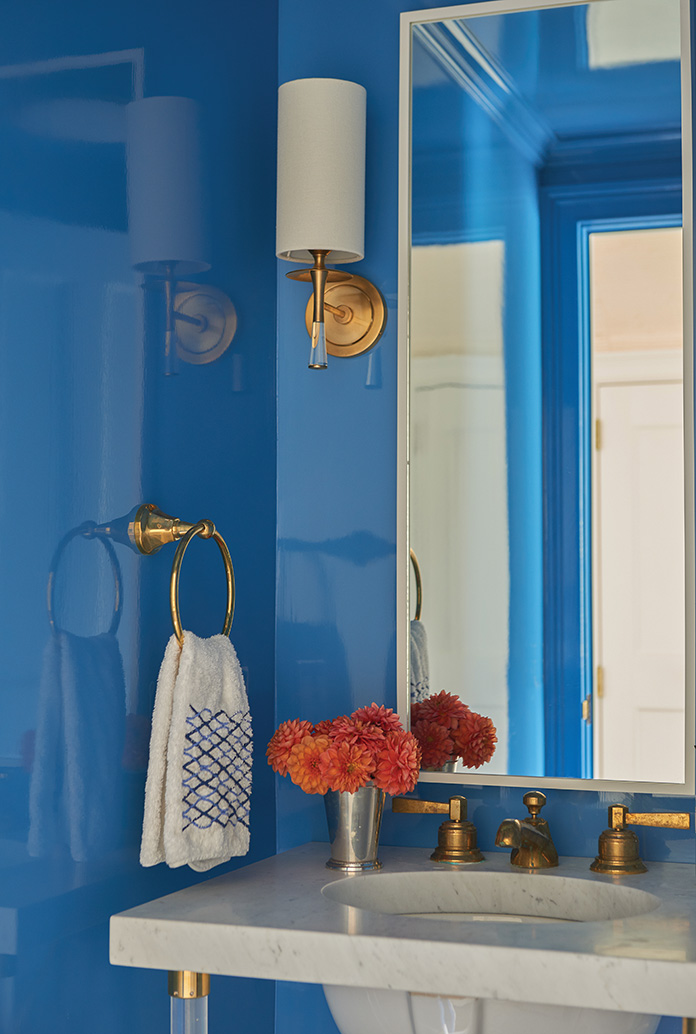
The powder room was originally located on an exterior wall off the old kitchen and we relocated it off the dining room in a newly created hallway. Since there was no natural light in the powder room, I wanted the room to sparkle and be “jewel-like” and I feel this was achieved by the meticulously hand-applied lacquer finish to the walls and ceiling. Lacquer is not only shiny but also durable and this is a high-traffic room where the walls can be wiped down as needed. I designed the marble-topped lucite-and-brass-leg vanity to feel airy yet substantial. Brass fittings were used throughout the bath and I had a custom white mirror made for the narrow space.
What changes did you make to all the bedrooms?
My client’s son took over his sister’s old bedroom. We started from scratch and made it boy-like and a room he could grow into. He loves navy, white and red, and I wanted to give him his favorite colors punctuated with a fun, nautical print for the shams and lumbar pillow in addition to the wave-like pattern on the roman shades. The chest of drawers and bedside table were custom made in navy, white and bleached walnut with leather pulls. I kept the nautical theme going with a round, rope mirror, a poster of Rowayton and one of the neatest treasures from the project—a painted riser from the old basement stairs. We asked the contractor to carefully remove it and we framed the riser as sailboat artwork.
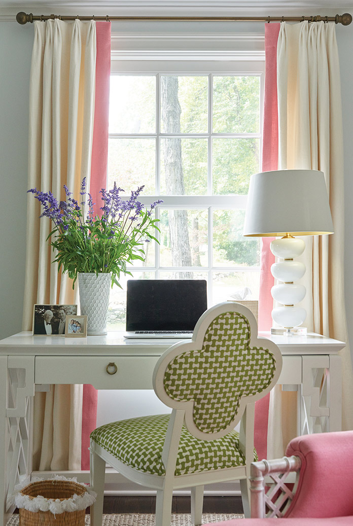
The daughter’s bedroom was the former guest bedroom. She requested that I work with turquoise and I added the white and pops of pink. The carpet is a custom-made pink and white pattern that compliments the pale pink walls.
The master bedroom is a calm oasis of various blues and white. I added blue grasscloth wall covering and had the rug, king-size headboard, bedskirt and bedding custom-made. The Prussian blue lamps ground the generously sized bedside tables. The patterned curtains are blackout lined and the pendant offers a bit of texture to the serene space.
How did you select the fabrics, textiles and window treatments in each room?
My clients have two small kids and two big golden retrievers so practical materials were a must! I chose durable fabrics—the kitchen banquette material is an easy-to-care-for faux leather. Another example would be the nubby, multi-colored texture on the sofas in the family room that hides stains. Also, small scale prints are good camouflage when it comes to hiding dog hair and kid messes. For window treatments, I really wanted the family room to feel light and airy and I used a sheer fabric with a band of blue for interest. Since the kitchen had a lot of white, the blue patterned fabric cornices added a pop of color without taking away from the natural light. And lastly, in the children’s bedrooms, functional window treatments were a must. Blackout was my client’s priority.
Where did you splurge and save?
The budget didn’t need to be huge given what the owners wanted. One splurge was the custom oval dining room table. We needed a table that was small in scale given spacial restrictions, yet could accommodate enough guests to seat a dinner party or holiday gathering comfortably. We were cost-conscious in high-traffic/high-use areas such as the kitchen chairs and stools and kids rooms’ furniture.
Photos by Jane Beiles
