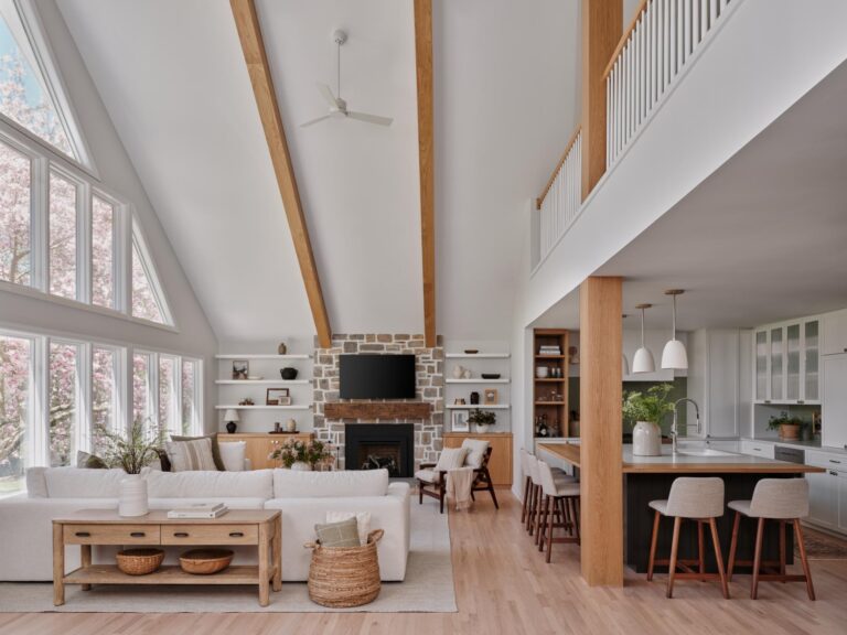
Andrea Sinkin, President of Greenwich, CT-based interior design firm Andrea Sinkin Design, knows the importance of connecting with her clients, especially when taking on a new project. “When someone hires me to design their home, I take it seriously—it’s a huge sign of trust,” says Sinkin, who founded the firm in 2017. “Because I work so closely with my clients, it’s best if personally we enjoy one another’s company. This makes the journey more entertaining and meaningful.”
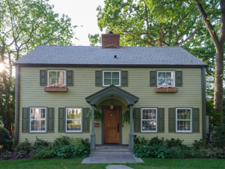
And that’s exactly what happened when—through a referral from old friends—she first spoke with the owners of a home on Candlewood Lake in New Fairfield, CT, who were looking to redesign the 8,000-square foot space. “The homeowner, Ruchi, called me and I liked her immediately. I looked up the house online and I was hooked. It had incredible bones and clear potential,” says Sinkin.
That connection flourished when she met Ruchi and husband, Keith, in person. “During that first meeting, we spoke of everything but the job,” says Sinkin. “I knew I wanted to part of this beautiful dream they had to build this warm, welcoming respite for friends and family.”
STARTING FROM SCRATCH
Built in 2002, the homeowners purchased the lakeside home in 2018—and it came complete with all the furniture. Though Sinkin had hoped to keep some of those pieces, they were mostly “heavy and dated,” she says. In the end, they kept just a few key items: the piano, pool table, and a game table.
But the upside was that it left plenty of room for a revamp. “When we rolled up our sleeves at Candlewood Lake, we were on the same page in many ways from a design and function point of view,” explains Sinkin. They tackled every room in the home—adding two mud rooms to the main level and one on the lower level, changing kitchen cabinets, redecorating the foyer, living room, laundry room, family room and dining room, as well as all five bedrooms and six bathrooms, adding a second walk-in closet to the master bed- room and renovating the home office and the outside entertaining space. All in, it took about five months to complete.
Sinkin describes her style as transitional. “I love classic lines and architecture and craftsmanship, but I also make sure to bring in more modern elements through art, fabric, lighting and accent furniture,” she says.
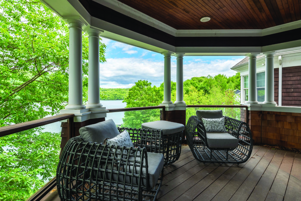
And with this home? “My inspiration for the design of this house was to bring the natural elements inside and to let the property speak for itself,” she explains. “The back side of the house has sweeping lake views. My jaw hit the floor the first time I went to the home—every window on the back possessed the same picturesque view,”
SHOWCASING THE HOME
“The design process for a project of this scope is the same process for even a single- room project,” says Sinkin, who has a background in trend forecasting. “Get to know the homeowners and dig for clues, then take into account how they live and how they imagine the space functioning.”
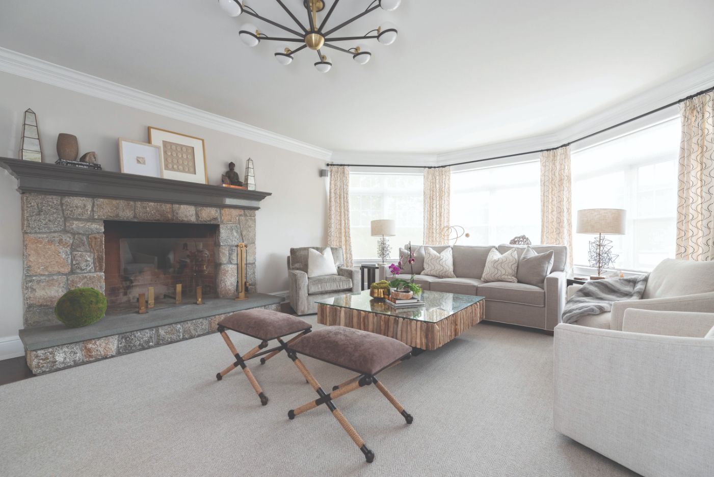
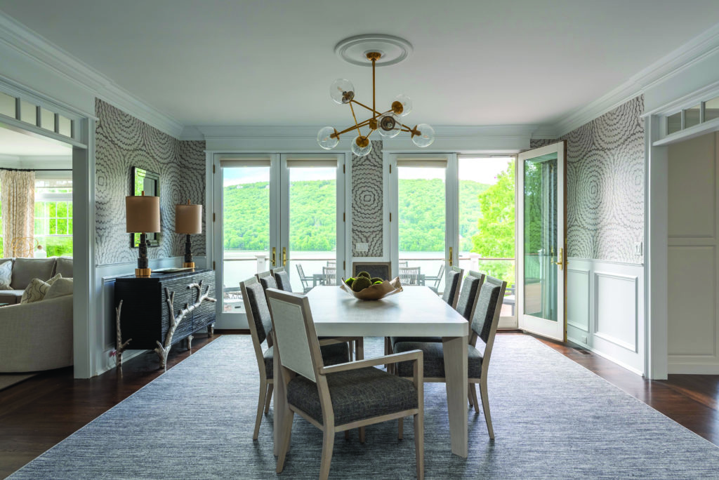
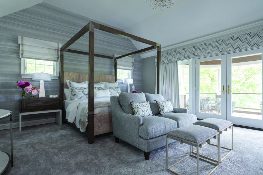
The house has views of nature in both directions: the front overlooks a collection of trees, and the back those gorgeous lake vistas. “For the back, we stuck to neutrals to pull your eye directly to the water, and brought in a lot of organic materials like grass cloth, natural fibers and earth elements, cerused wood and untreated wood, stone and furniture accents,” she said.
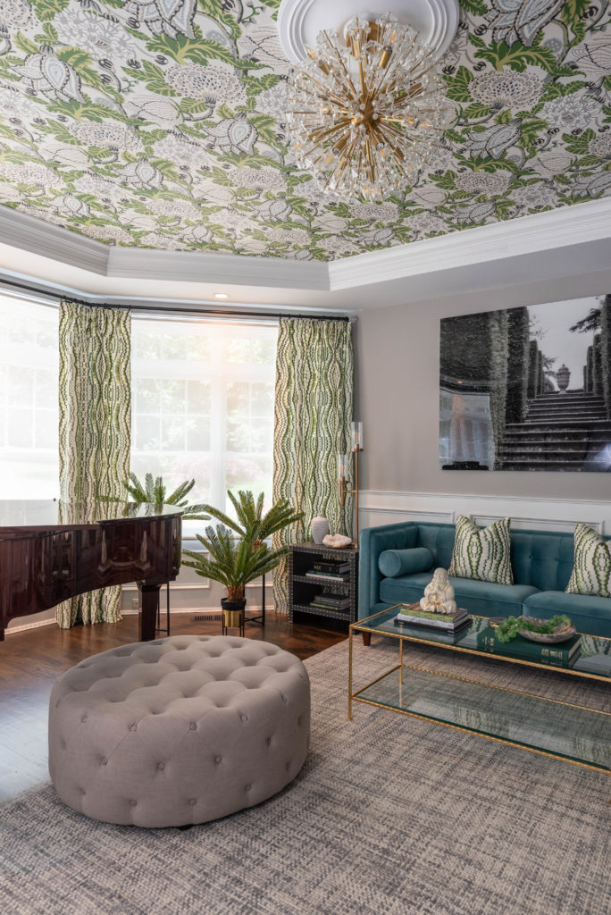
In the front, Sinkin says they were a bit more playful. The living room, for instance, is full of bright greens and aqua. “The view of that room is all trees, so it felt fitting to tie the colors together,” she explains. In that same room, Sinkin added a bar cabinet and kept the original piano.
And both there and throughout the home, Sinkin weaved in pieces that truly reflected the homeowners’ personalities and interests. “A home should be an expression of the family who lives there, so I always leave room in the budget for accessories, antiques, art, textiles, books— pieces that tell the story of those who will enjoy the room,” she explains.
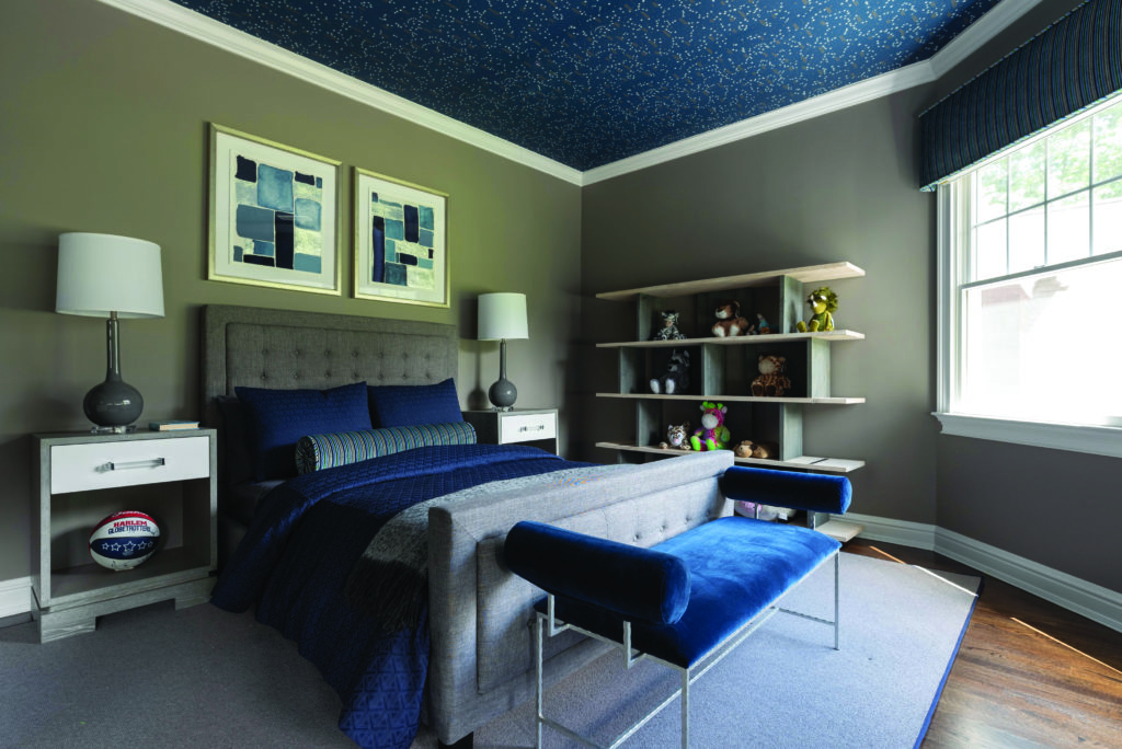
The living room, for instance, includes a collection of Ruchi’s Tibetan singing bowls, while their son’s room features constellation wallpaper from Ralph Lauren and a modern light fixture that “looks like something from outer space,” says Sinkin. “He can lay in bed and let his eye run across the ceiling, right to the night sky.”
CREATING A KITCHEN
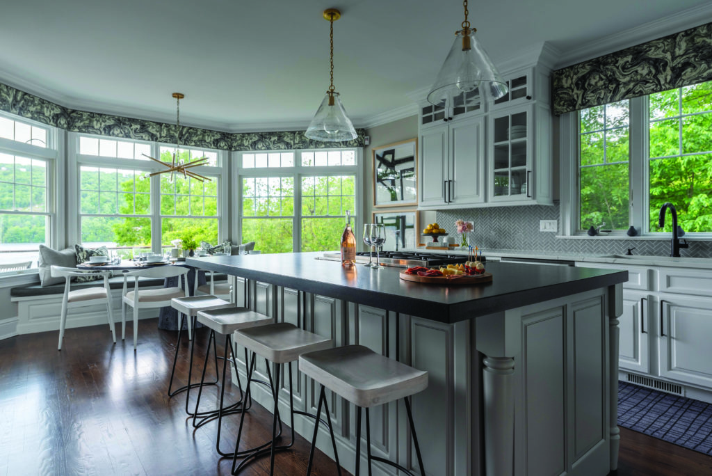
At the start, the kitchen had a 90s feeling, even featuring the quintessential built-in desk from that era, says Sinkin. “We redesigned some of the layout and create custom cabinets that matched the existing cabinetry,” she explains. Along with painting, they swapped out the back- splash and countertops, and put in a built- in bench, among other changes. Plus, they included special requests, like a built-in espresso machine and refrigerated drink drawers. “The island didn’t have a place to sit, so we created an overhang to allow for bar stools,” said Sinkin. The built-in desk and the original cabinets were moved to the garage to serve as built-in storage.
CUTTING COSTS
When they first started on the project, Sinkin created a budget they could stick to, while ensuring the homeowners got every- thing they wanted. To that end, she found creative ways to stay within budget and still maintain the design integrity of the home. The home features custom bedding, custom living room sofas, and custom din- ing room chairs. “That awesome teal sofa in the living room? Wayfair!” she says. For rooms that don’t get as much use as busier spots, “you can still make it beautiful, but without spending as much.”
LIVING IN THE HOME
The house was intended as a weekend retreat—it sleeps up to 16—but the family has been using it as their main home since March. “The homeowners have appreciated this house so much, but even more since Covid,” says Sinkin. Ruchi—whose business, Watch Her Prosper, helps female-owned businesses with their finances—has “texted me many times sitting at her desk in the office we designed together,” says Sinkin. “This fills my heart with happiness to see them using the space and home to its full potential.”
